
Expansion Panel Title — PAM Native UI
PAM Native UI · Android evidence
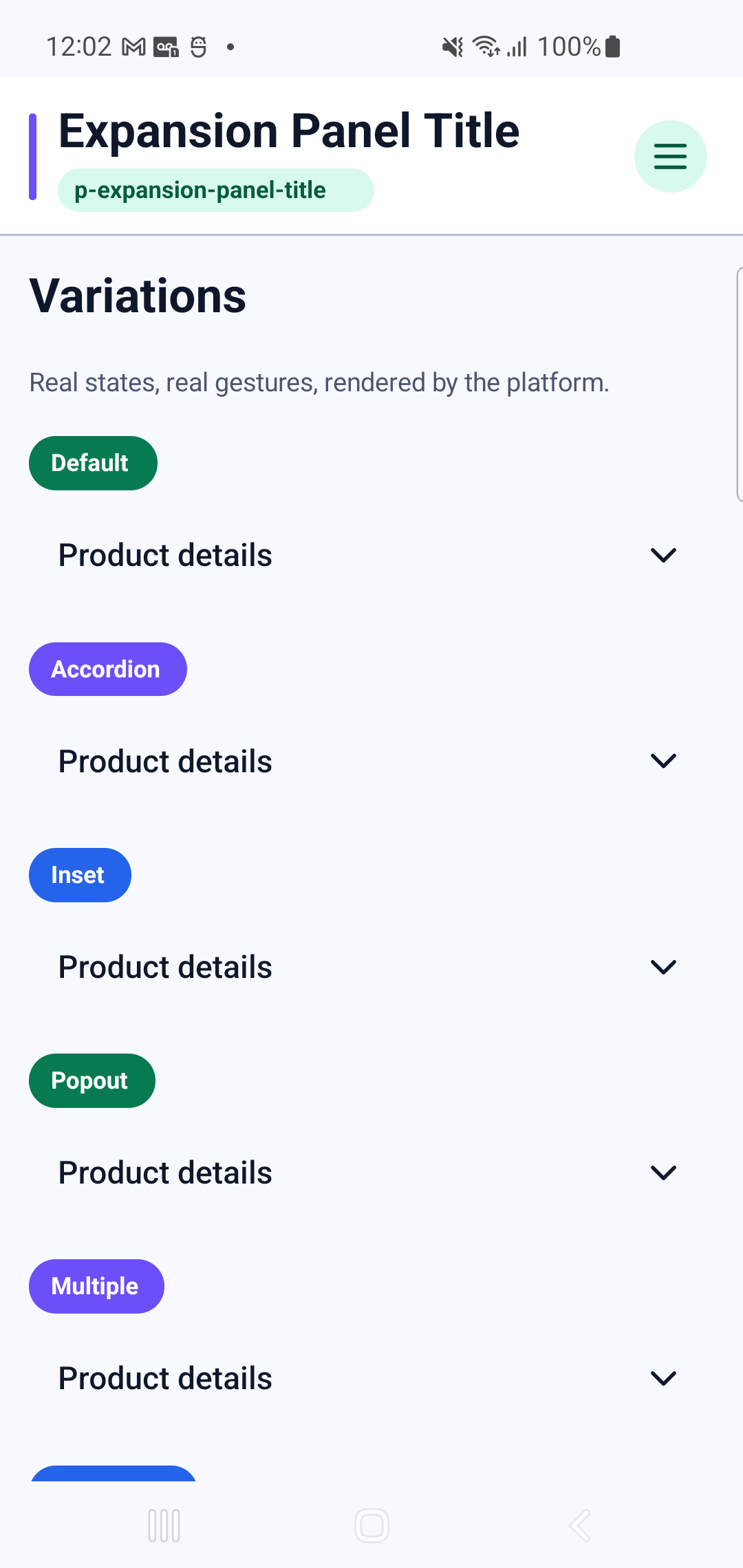
p-expansion-panel-title rendered by the production retained-native pipeline. The specimen below is a real Physical Samsung SM-G973F Android 12 (API 31) capture at 420 dpi, not an HTML recreation.
Physical Samsung layout, route and native interaction verified
- Family
- Surfaces and media
- Module
expansion-panels- PHP facade
PExpansionPanelTitle- Native targets
- Android · UIKit
Surfaces and media component rendered through the retained-native Android and UIKit pipeline.
Android specimen
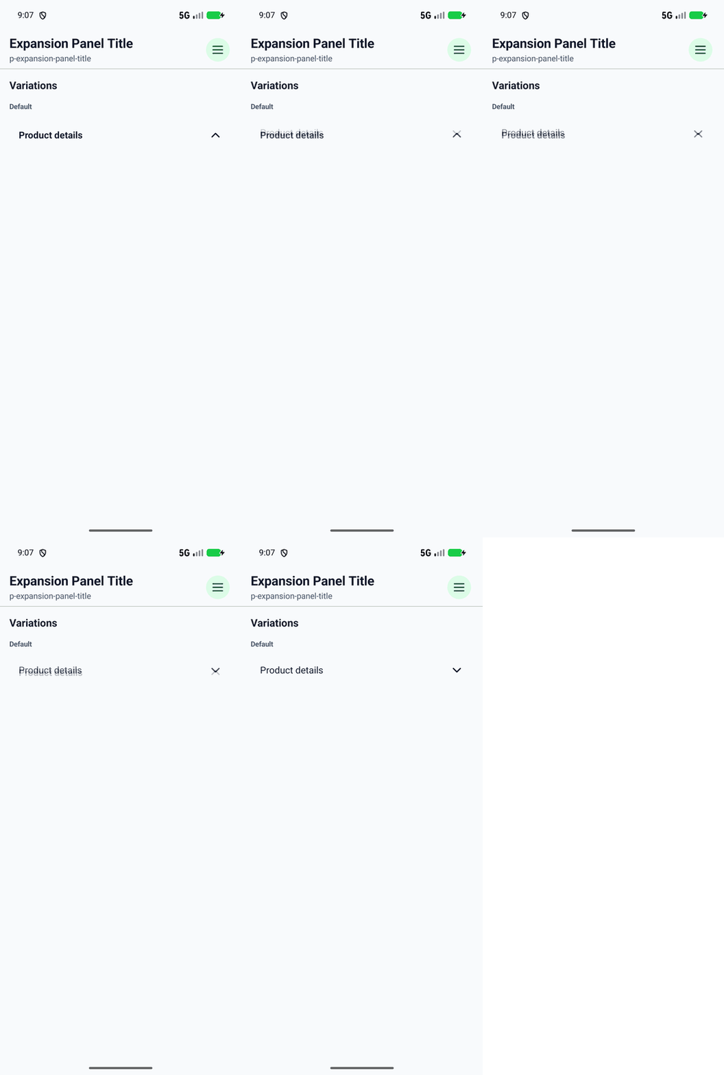
Interaction recording
The touch trace was captured from the Android application while exercising the native component.
Showcase profiles
Every profile below is rendered by the Android catalog route shown above.
- Default
- Accordion
- Inset
- Popout
- Multiple
- Mandatory
- Readonly
- Disabled
PHP usage
use Pam\MobileUi\Material\PExpansionPanelTitle;
use Pam\Native\UI\Text;

PExpansionPanelTitle::make(
    [
        'variant' => "accordion",
        'accessibilityLabel' => "PExpansionPanelTitle preview",
        'disabled' => true,
    ],
    Text::make('Expansion Panel Title'),
);
The equivalent PAM template entry point is <p-expansion-panel-title>…</p-expansion-panel-title>.
See the PAM Native UI guide for event, state and styling conventions, and the quality contractfor native behavior requirements.
Component properties
| Property | Observed type | Showcase values |
|---|---|---|
accessibilityLabel | string | "PExpansionPanelTitle preview" |
disabled | bool | true |
mandatory | bool | true |
multiple | bool | true |
readonly | bool | true |
variant | string | "accordion", "inset", "popout" |