PAM Native UI component catalog
Every tag below creates or configures retained native UI. The release parity manifest is the source of truth for this verified surface: 62 modules and 84 component parts, on both Android and iOS.
The README, generated map, parity schema and executable release gate all use this same 62-module/84-component contract.
Android showcase application
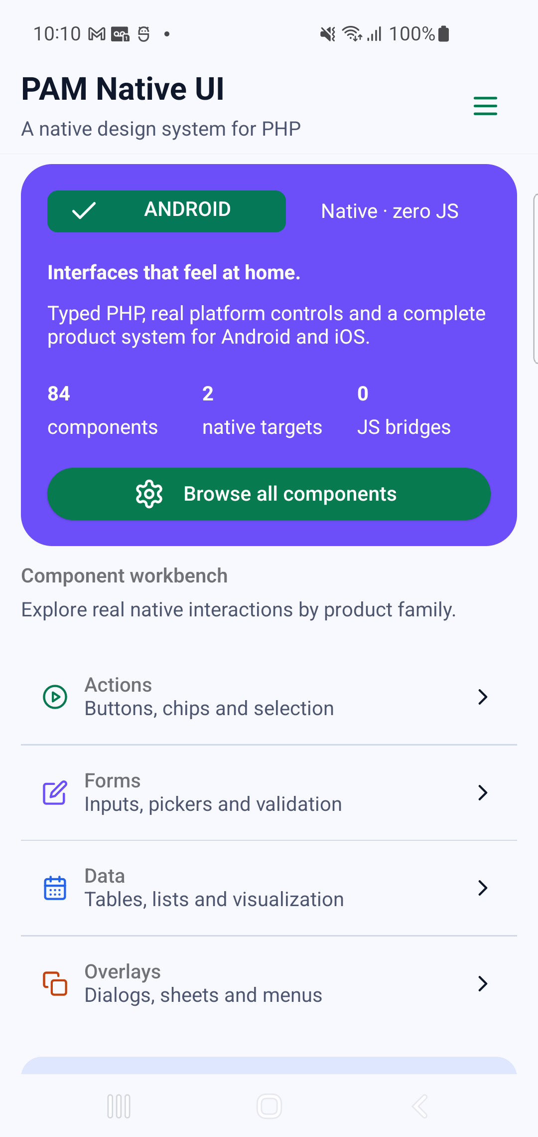
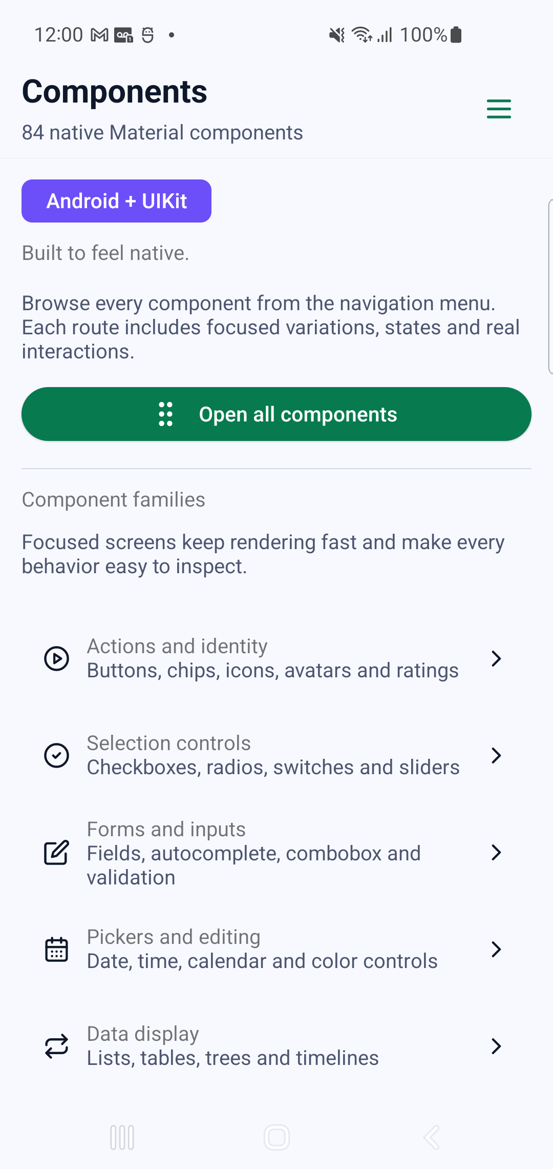
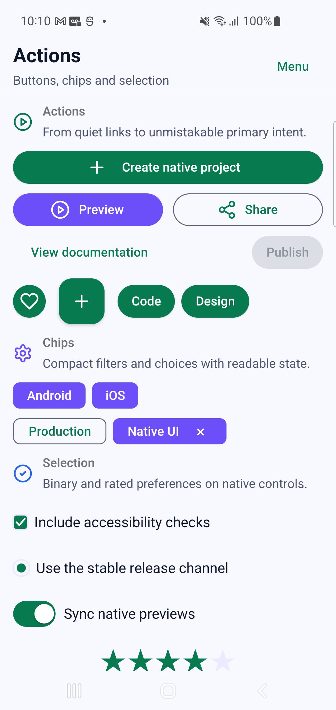
Section titled “Android showcase application”The catalog below is also a real Android application. These images were captured from the release renderer on a physical Samsung SM-G973F running Android 12 (API 31) at 420 dpi—not from HTML, an emulator or a design mockup. The publication gate verified 90/90 screens and real interaction on 84/84 component routes, including input, selection, drag, scroll and native overlay flows. No blank render, invalid viewport or overlapping text is accepted into this page.
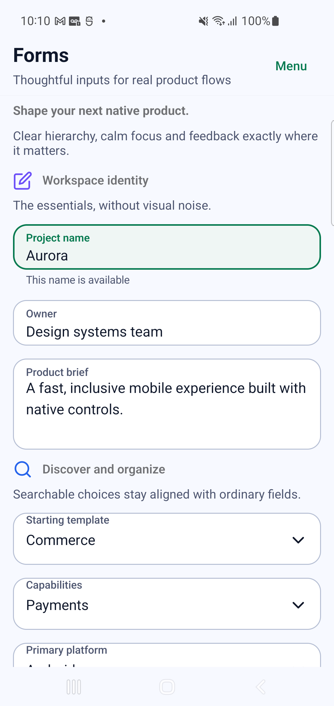
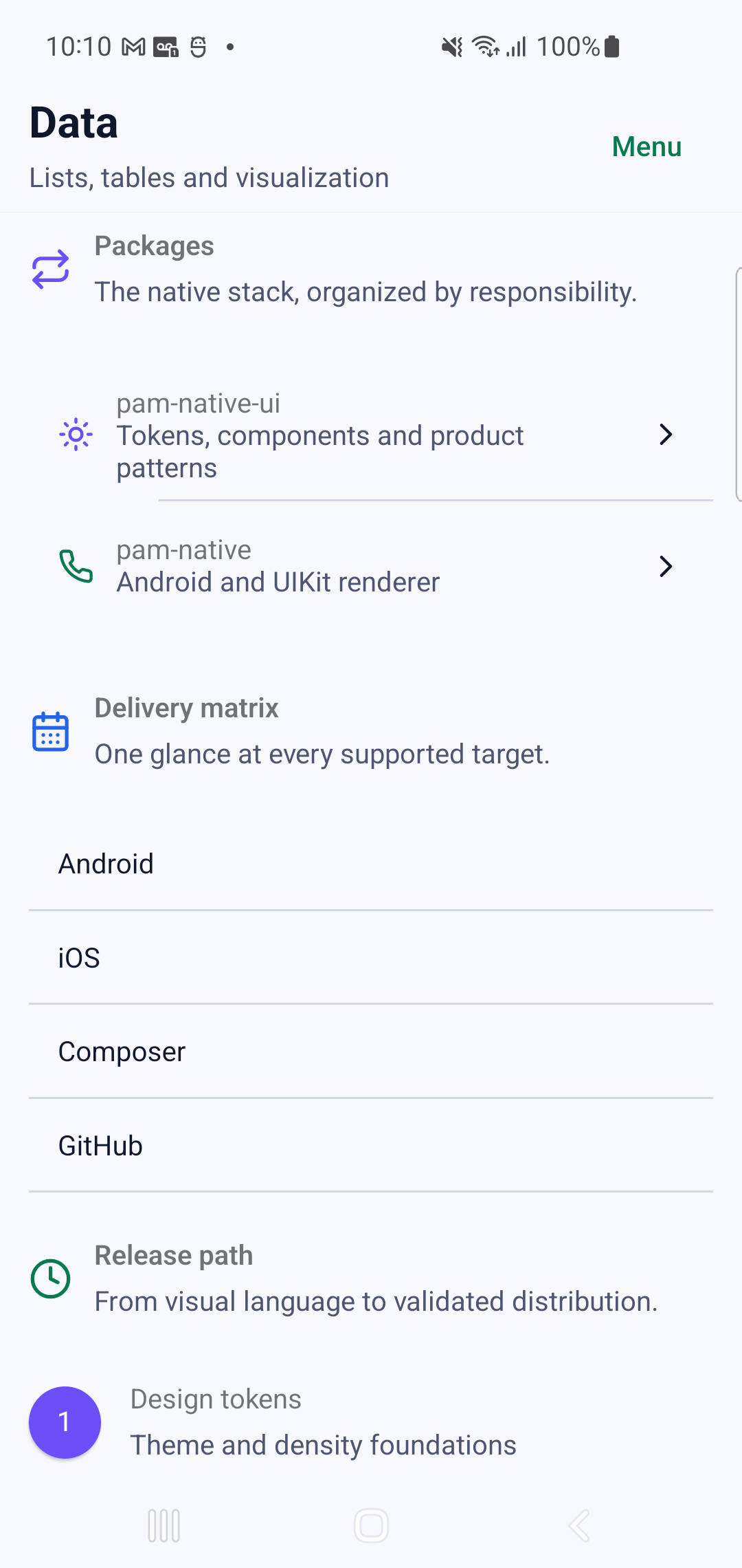
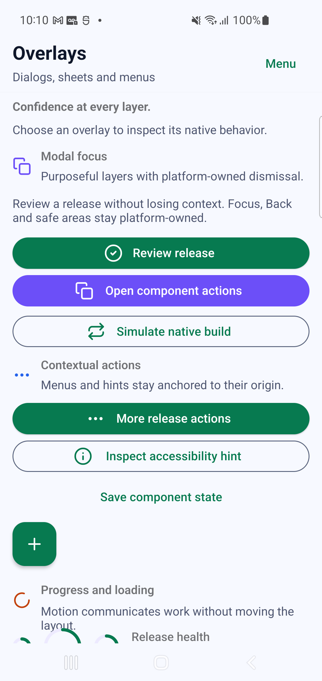
Actions, feedback and status
Section titled “Actions, feedback and status”| Module | Tags |
|---|---|
| Buttons | p-btn, p-btn-group, p-btn-toggle, p-icon-btn, p-fab |
| Status | p-alert, p-badge, p-chip, p-chip-group |
| Feedback | p-snackbar, p-tooltip, p-progress-circular, p-progress-linear, p-skeleton-loader |
| Overlays | p-dialog, p-bottom-sheet, p-sheet, p-overlay, p-menu |
Input and forms
Section titled “Input and forms”| Module | Tags |
|---|---|
| Form | p-form, p-text-field, p-textarea, p-number-input, p-otp-input |
| Choice | p-checkbox, p-switch, p-radio, p-radio-group, p-select, p-autocomplete, p-combobox |
| Range | p-slider, p-range-slider, p-rating |
| Date and time | p-calendar, p-calendar-day, p-date-input, p-date-picker, p-time-picker |
| Color | p-color-input |
Content and data
Section titled “Content and data”| Module | Tags |
|---|---|
| Content | p-avatar, p-icon, p-img, p-divider, p-empty-state |
| Cards | p-card, p-card-actions |
| Lists | p-list, p-list-item, p-item-group, p-item |
| Data | p-data-table, p-data-table-virtual, p-infinite-scroll, p-sparkline |
| Expandable | p-expansion-panels, p-expansion-panel, p-expansion-panel-title, p-expansion-panel-text |
| Timeline | p-timeline, p-timeline-item |
Use the virtual table and infinite-scroll components for large collections. Keep stable item keys and bounded event payloads so native reconciliation can reuse views rather than recreate them.
Navigation and layout
Section titled “Navigation and layout”| Module | Tags |
|---|---|
| App chrome | p-app-bar, p-app-bar-nav-icon, p-toolbar, p-banner, p-banner-actions |
| Tabs | p-tabs, p-tab |
| Carousels | p-carousel, p-carousel-item, p-slide-group, p-slide-group-item |
| Steppers | p-stepper, p-stepper-header, p-stepper-item, p-stepper-window, p-stepper-window-item, p-stepper-actions |
| Vertical steppers | p-stepper-vertical, p-stepper-vertical-item, p-stepper-vertical-actions |
| Trees | p-treeview, p-treeview-item |
| Floating actions | p-speed-dial |
Product composition
Section titled “Product composition”Typed forms bind schema, values, errors, loading and submit behavior without inventing a second state model. Async content should model loading, empty, error and ready states explicitly. Navigation chrome belongs to the platform navigation primitives; component tags provide the visual and interactive content inside those destinations.
For app-owned reusable tags, register a PHP component with
TemplateRegistry. Keep public tag inputs serializable and treat native events
as an explicit, versioned contract.
Native interaction recordings
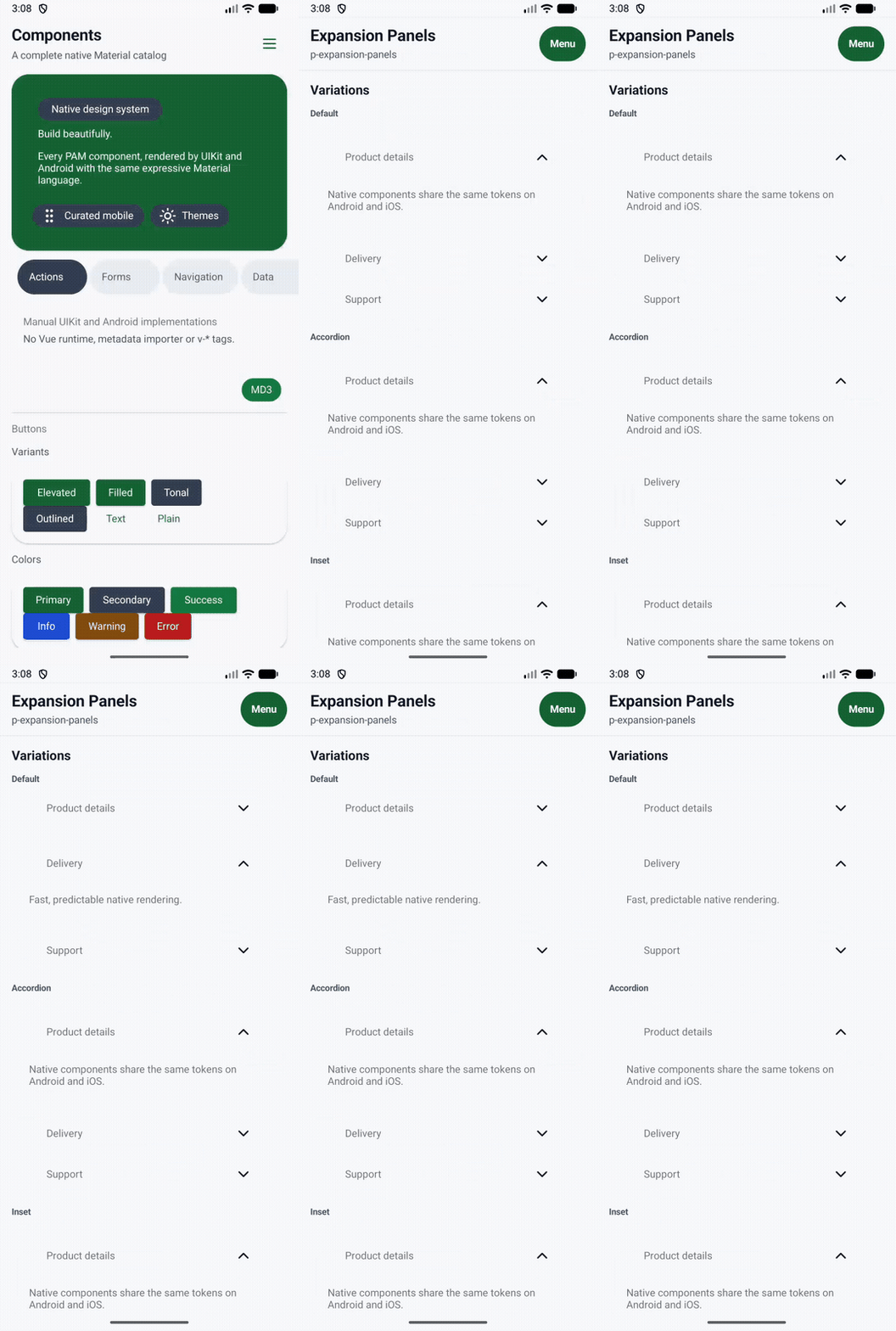
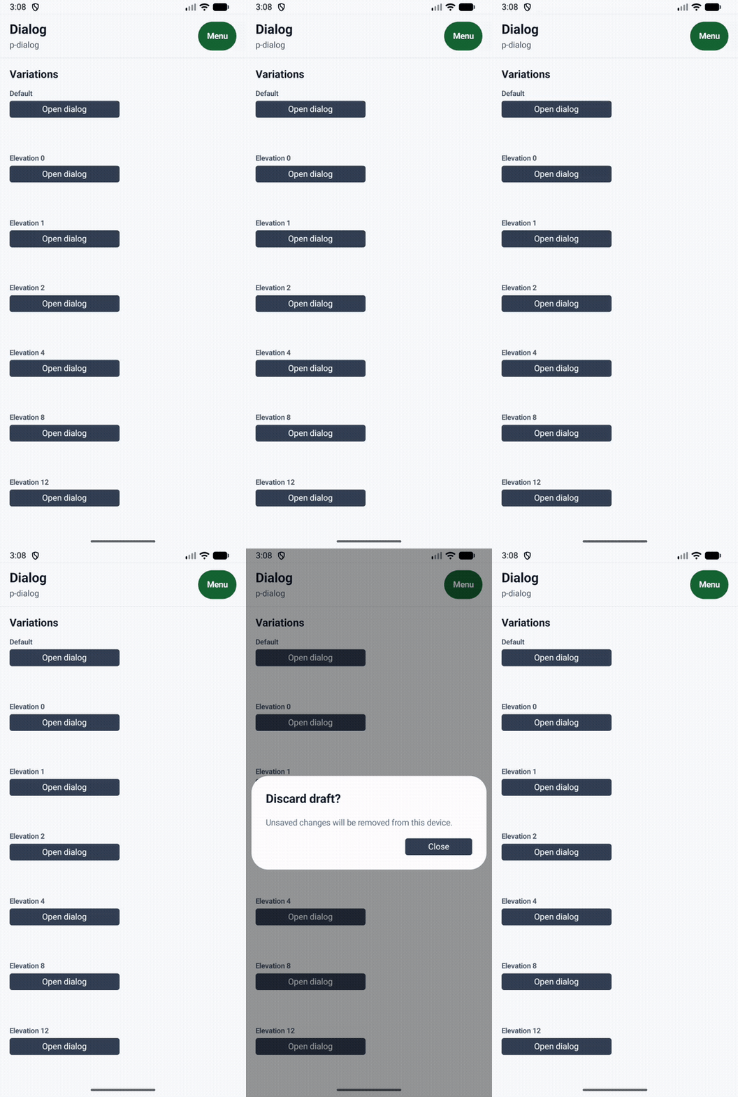
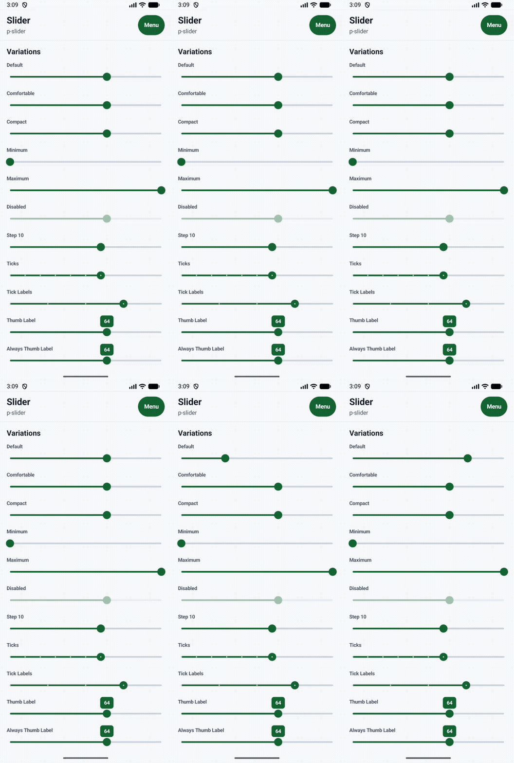
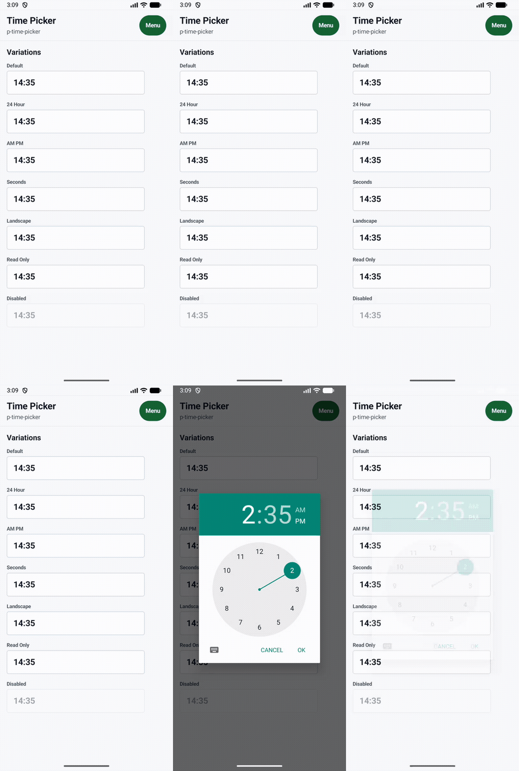
Section titled “Native interaction recordings”The touch markers in these GIFs are emitted by Android while the catalog is running. The examples exercise local native state, overlays, gestures and a system picker instead of replaying a prepared animation.
Verified navigation and surface flows
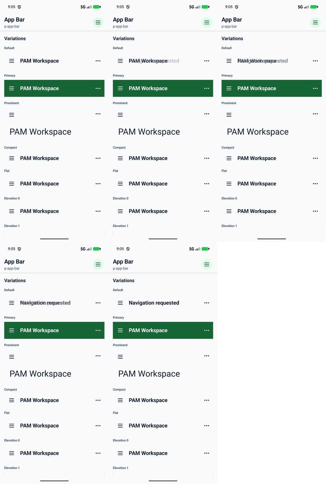
Section titled “Verified navigation and surface flows”These captures exercise the retained Android views themselves. Navigation state survives configuration changes, overlays use native windows and safe areas, and gesture-driven controls update without a WebView or JavaScript bridge.
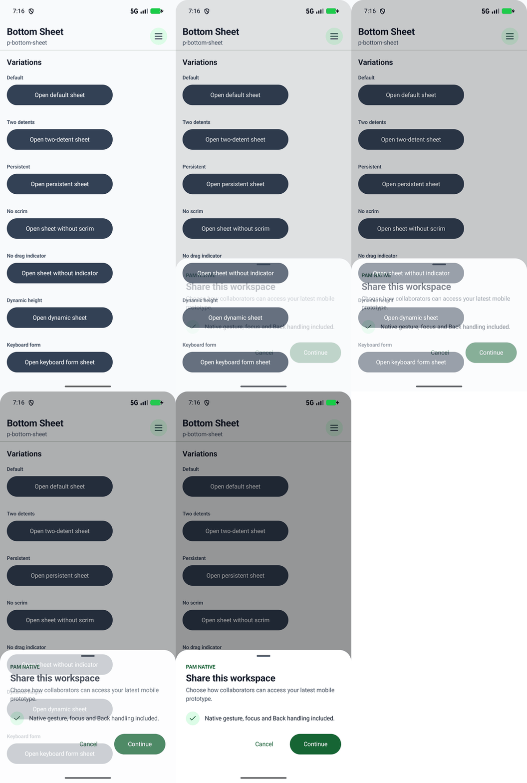
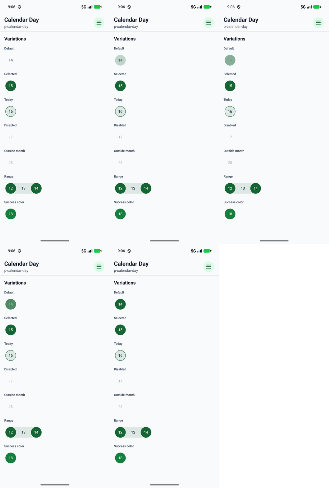
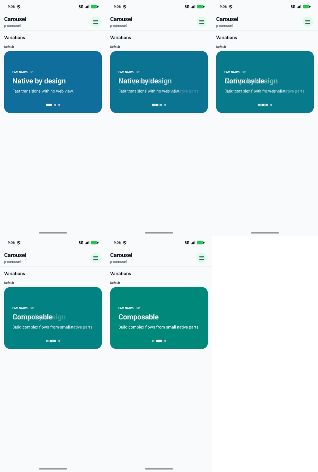
Complete Android visual catalog
Section titled “Complete Android visual catalog”Every specimen opens the original full-device capture. Anatomy tags remain listed separately even when they intentionally share the same composed example as their parent component.
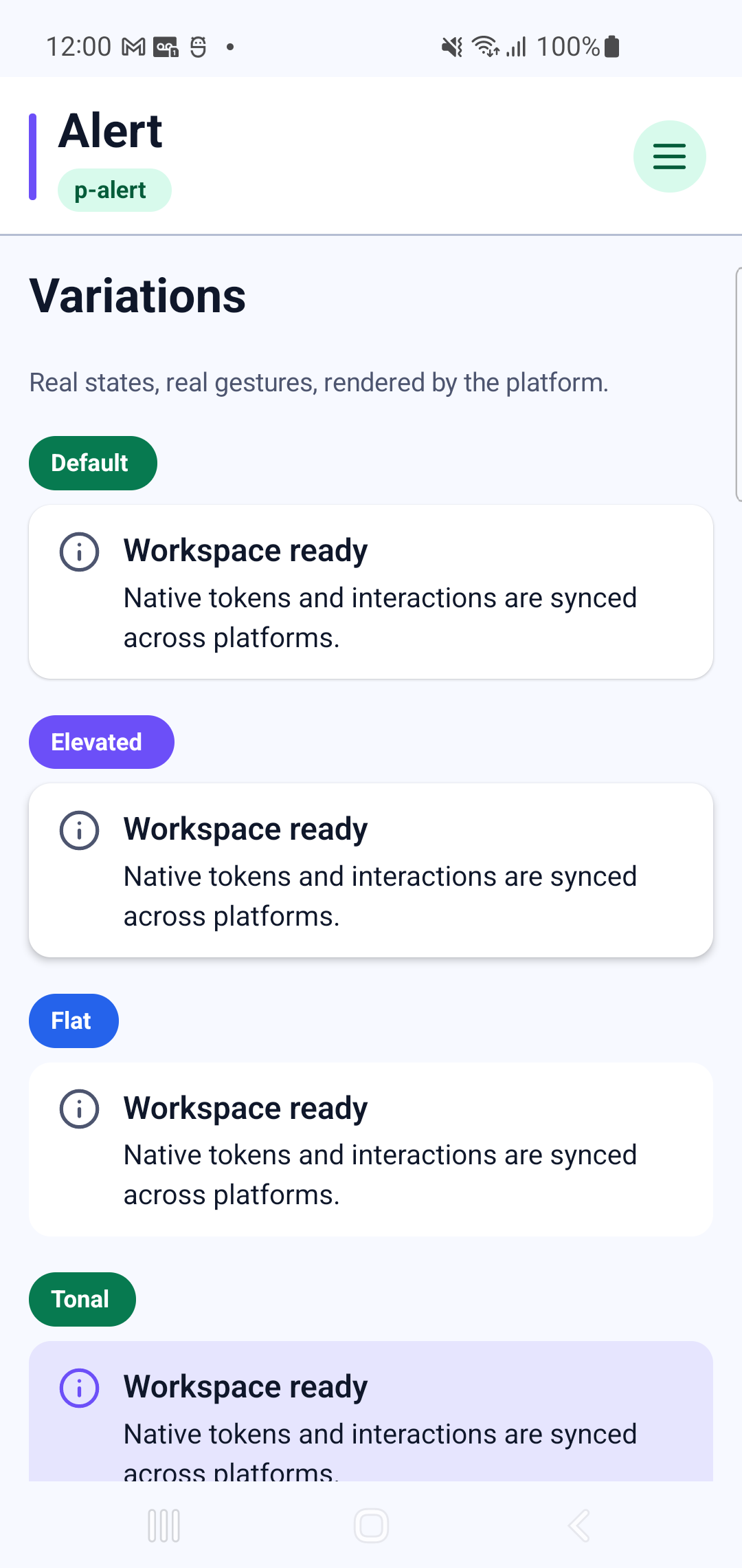
p-alert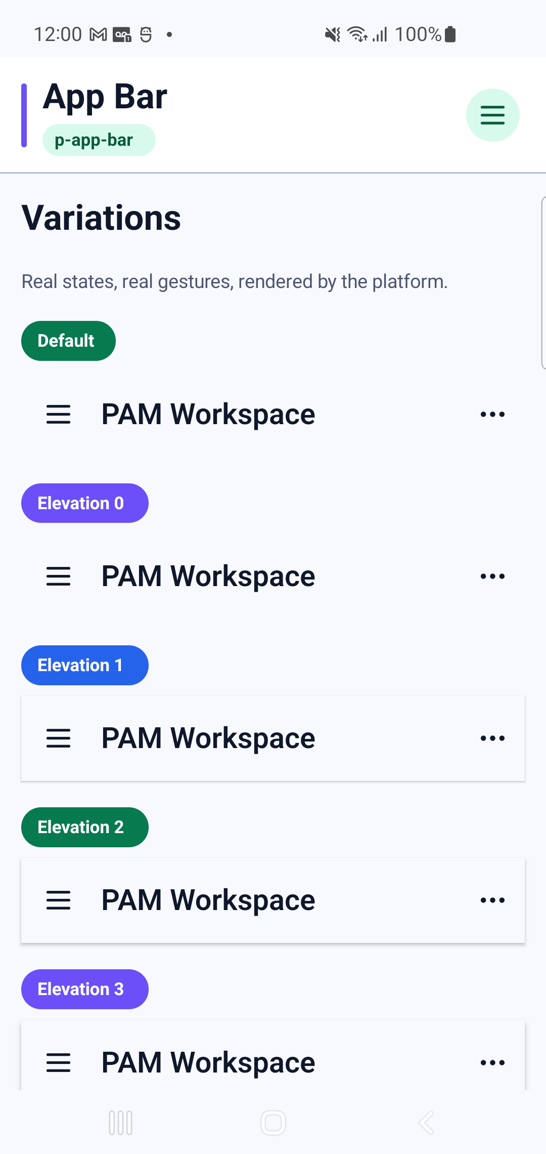
p-app-barInteraction GIF 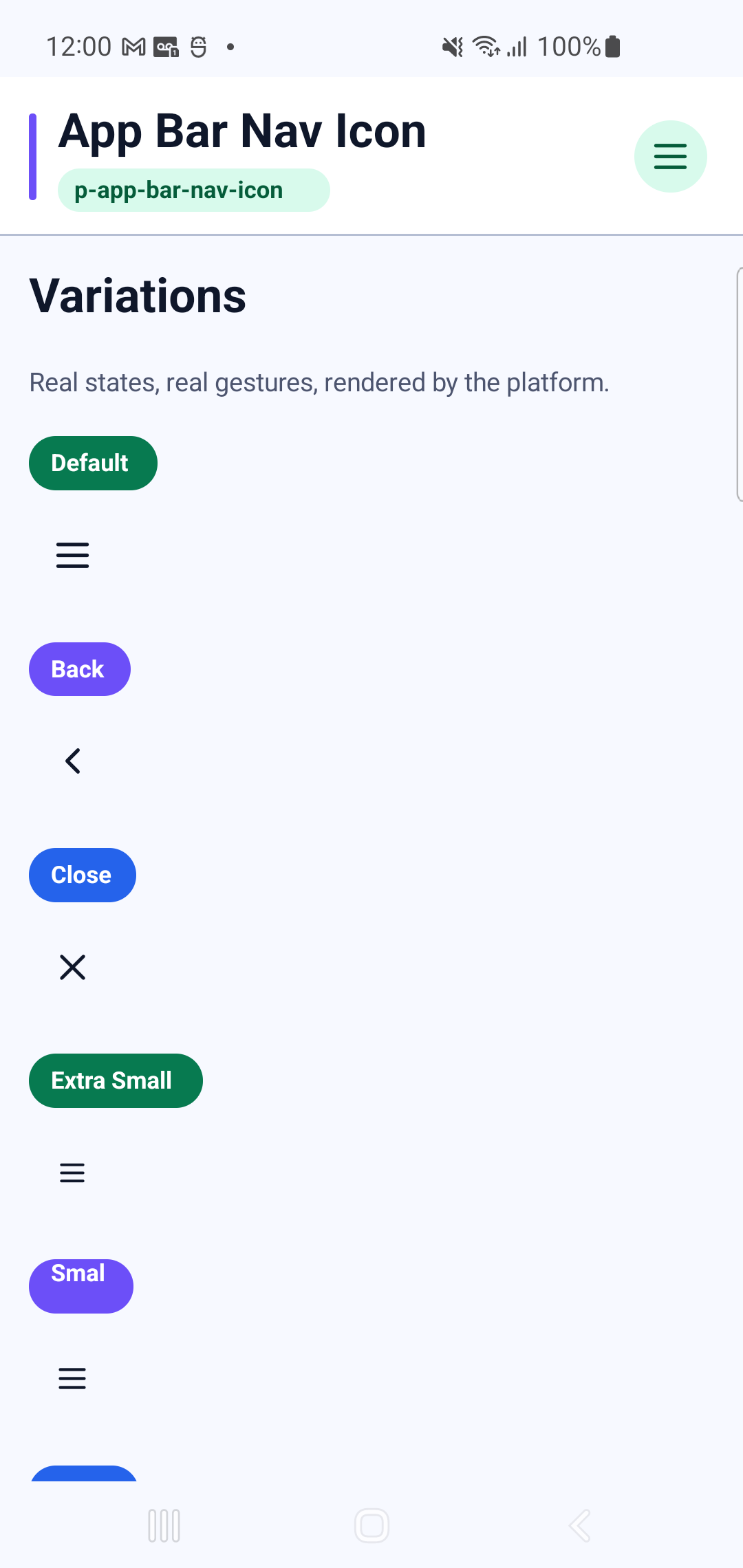
p-app-bar-nav-iconInteraction GIF 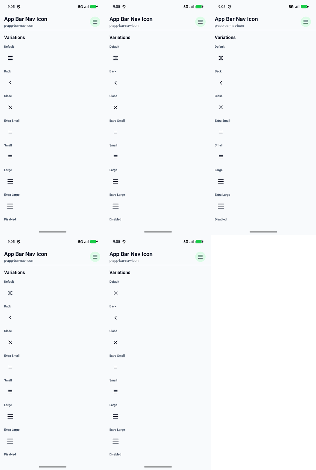
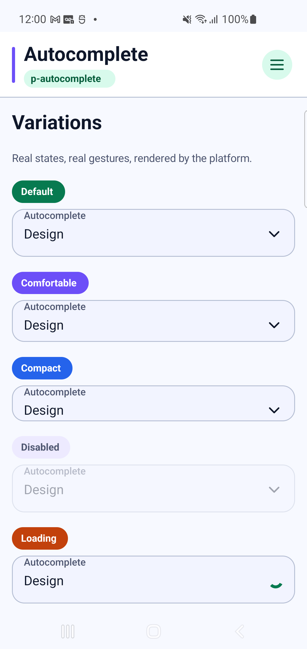
p-autocompleteInteraction GIF 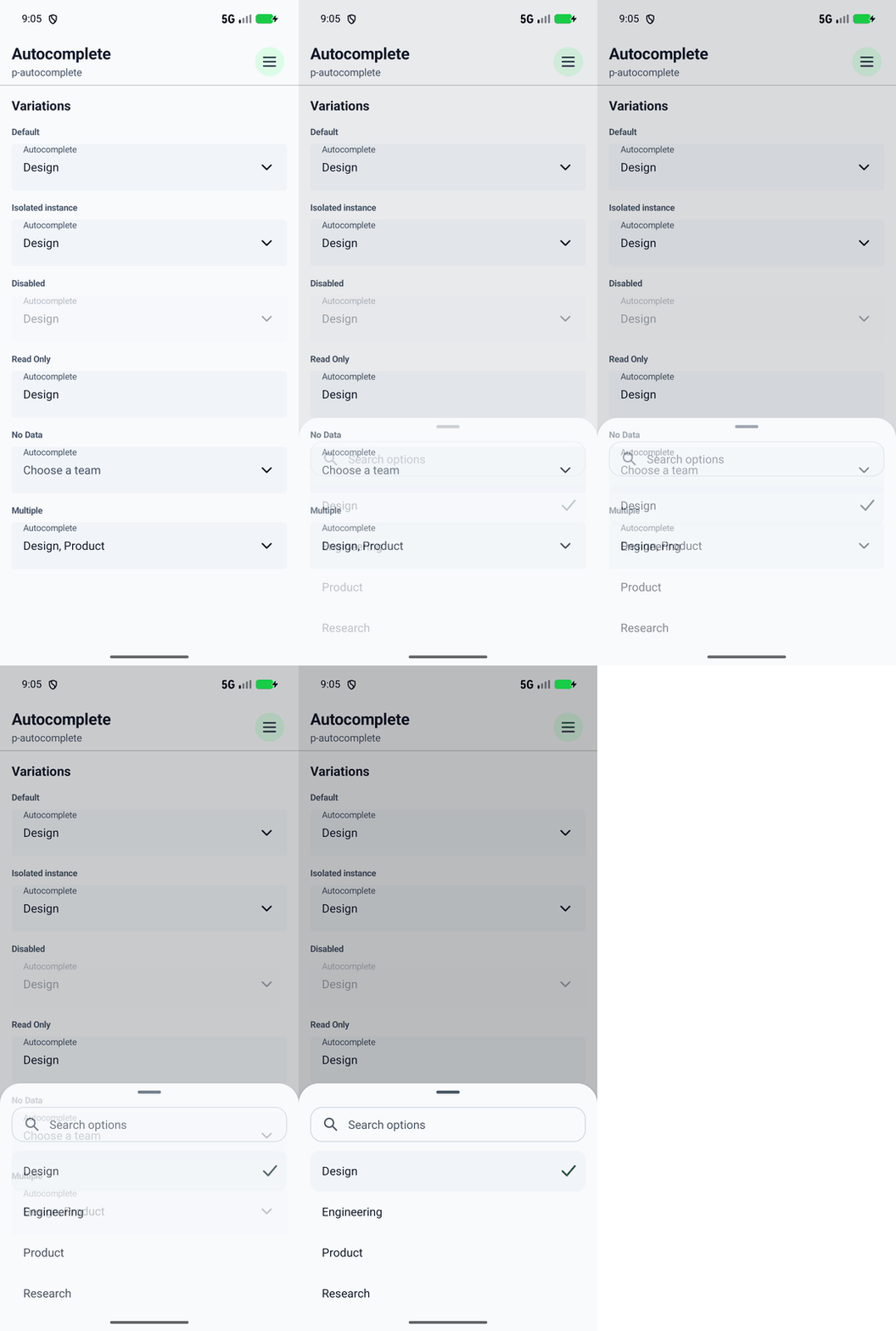
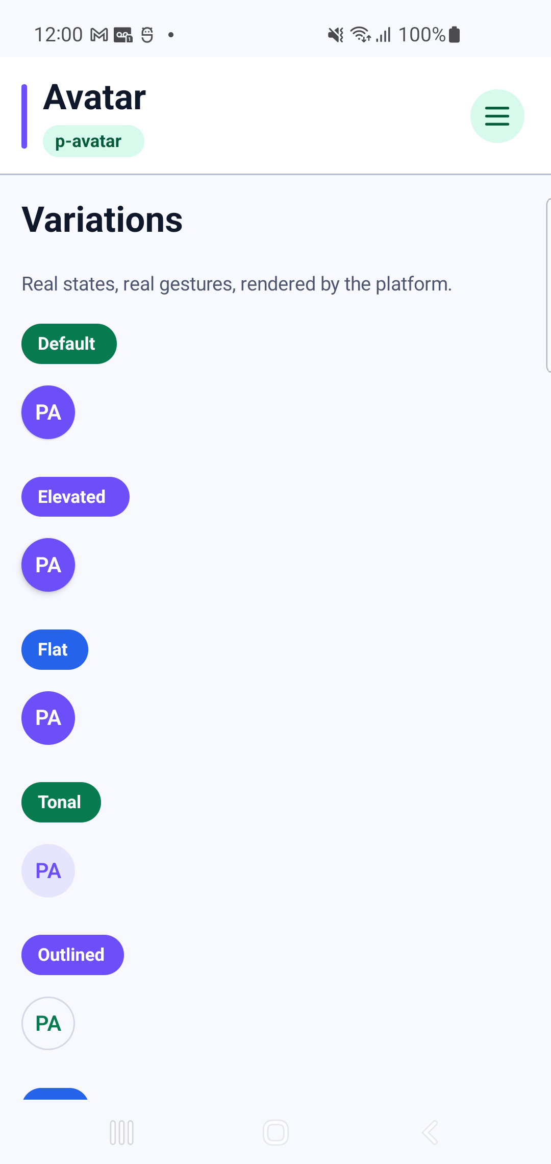
p-avatar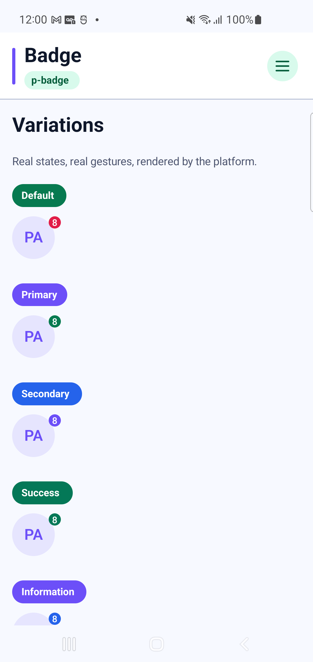
p-badge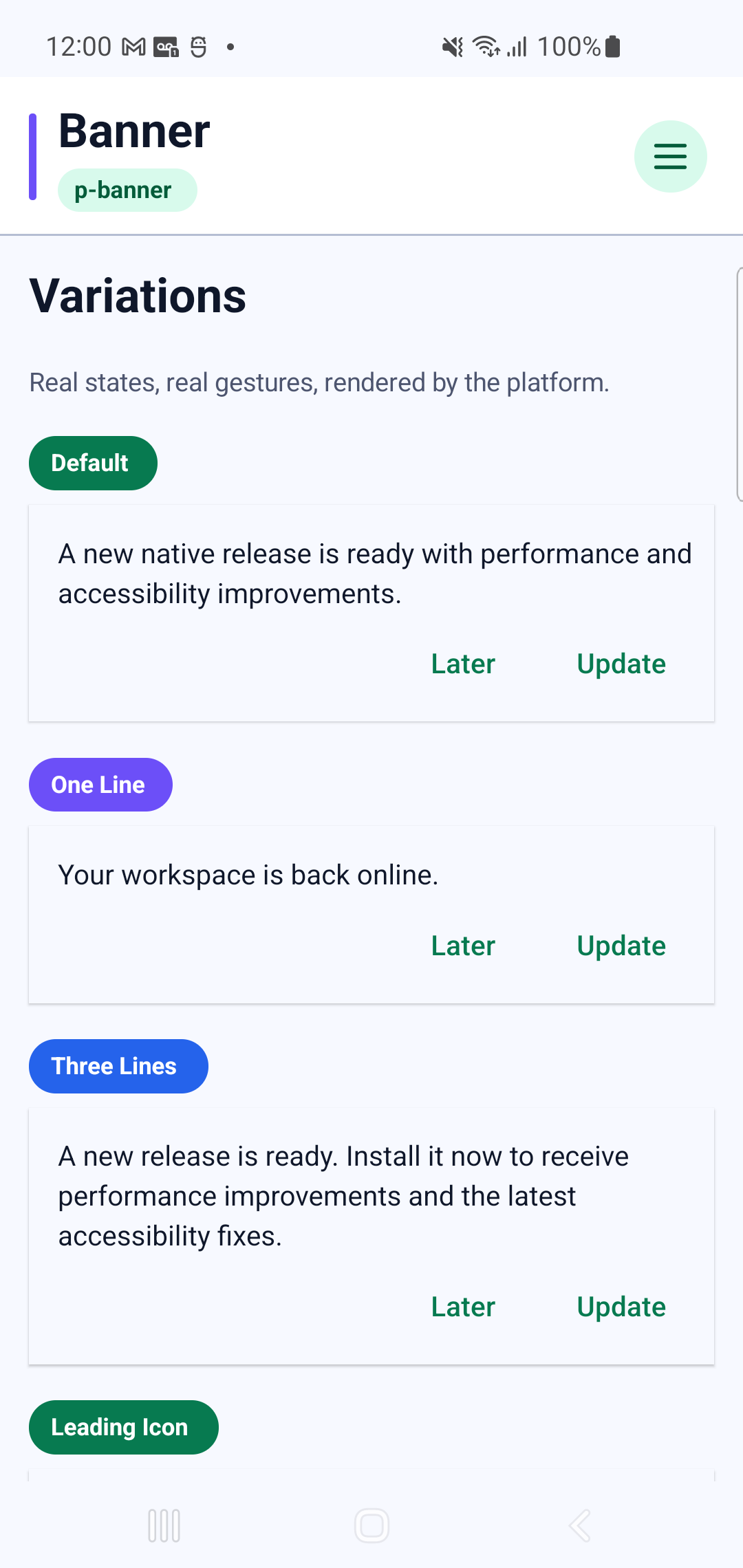
p-banner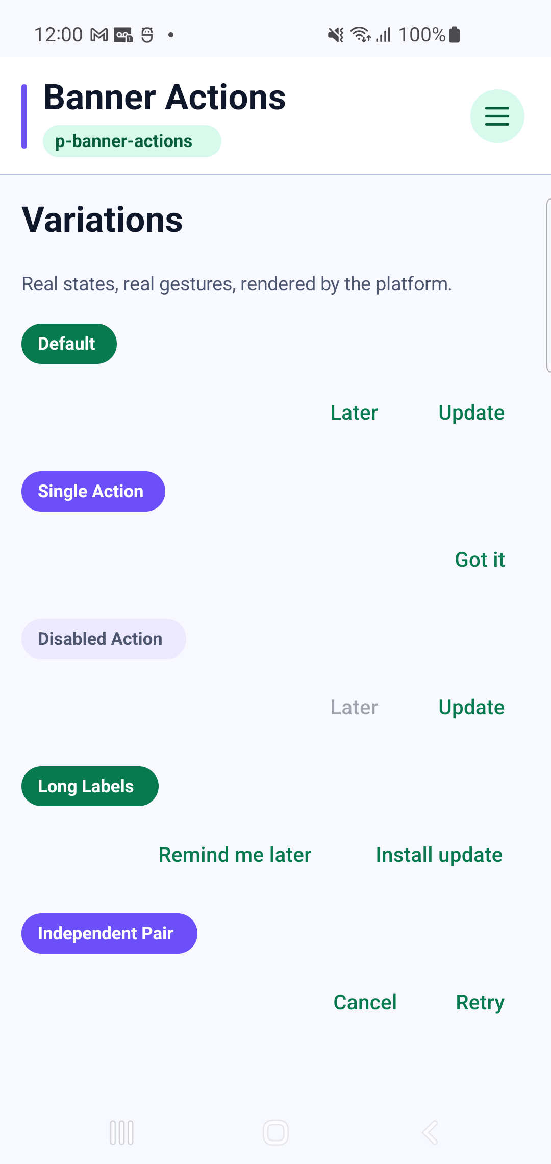
p-banner-actionsInteraction GIF 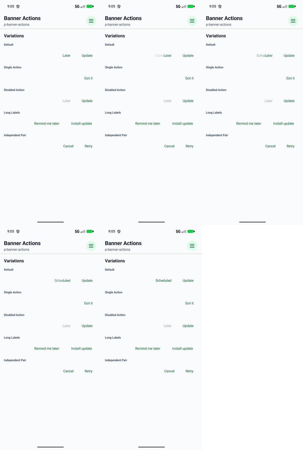
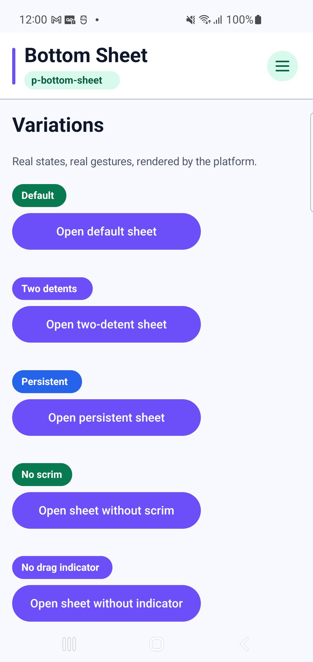
p-bottom-sheetInteraction GIF 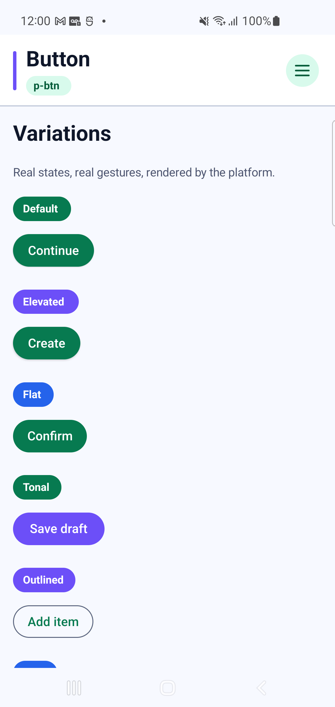
p-btnInteraction GIF 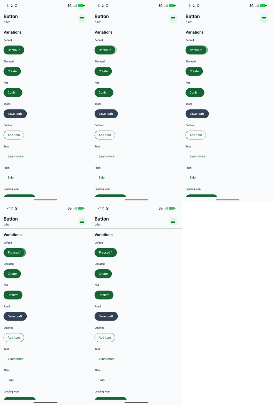
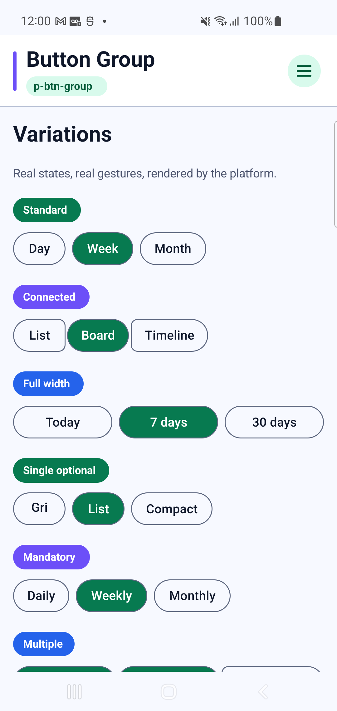
p-btn-groupInteraction GIF 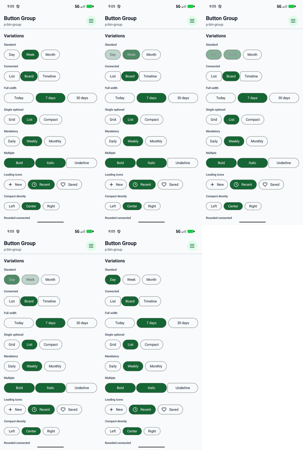
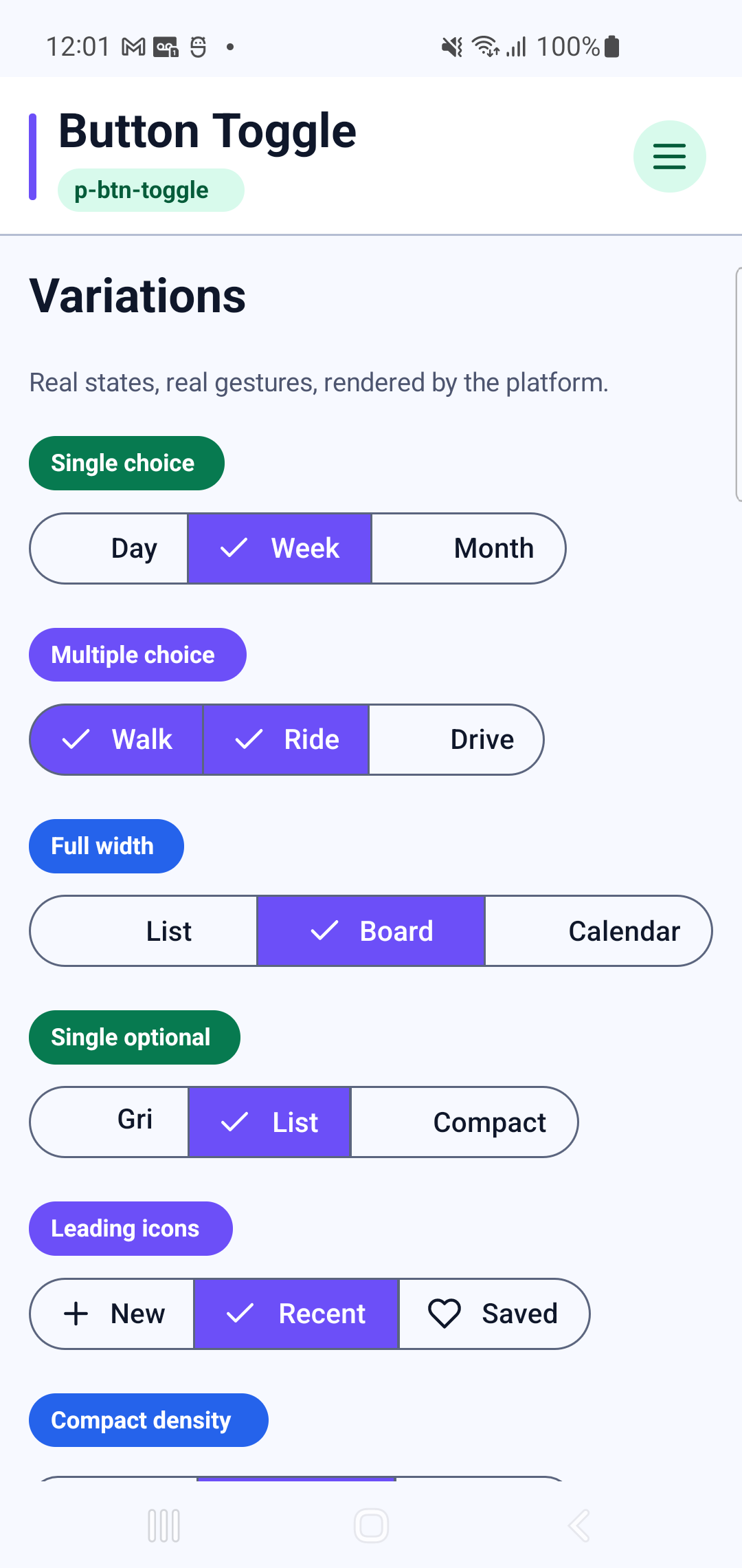
p-btn-toggleInteraction GIF 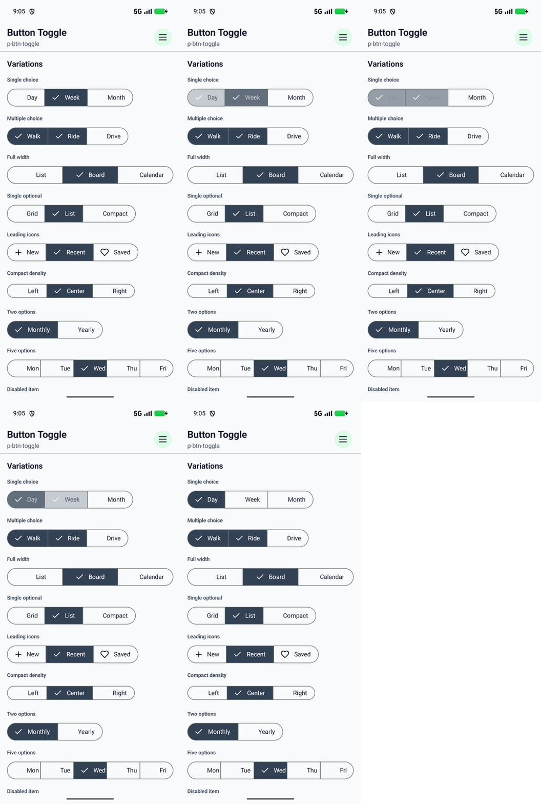
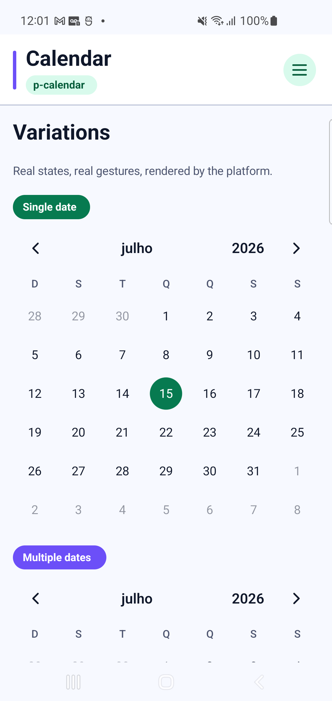
p-calendarInteraction GIF 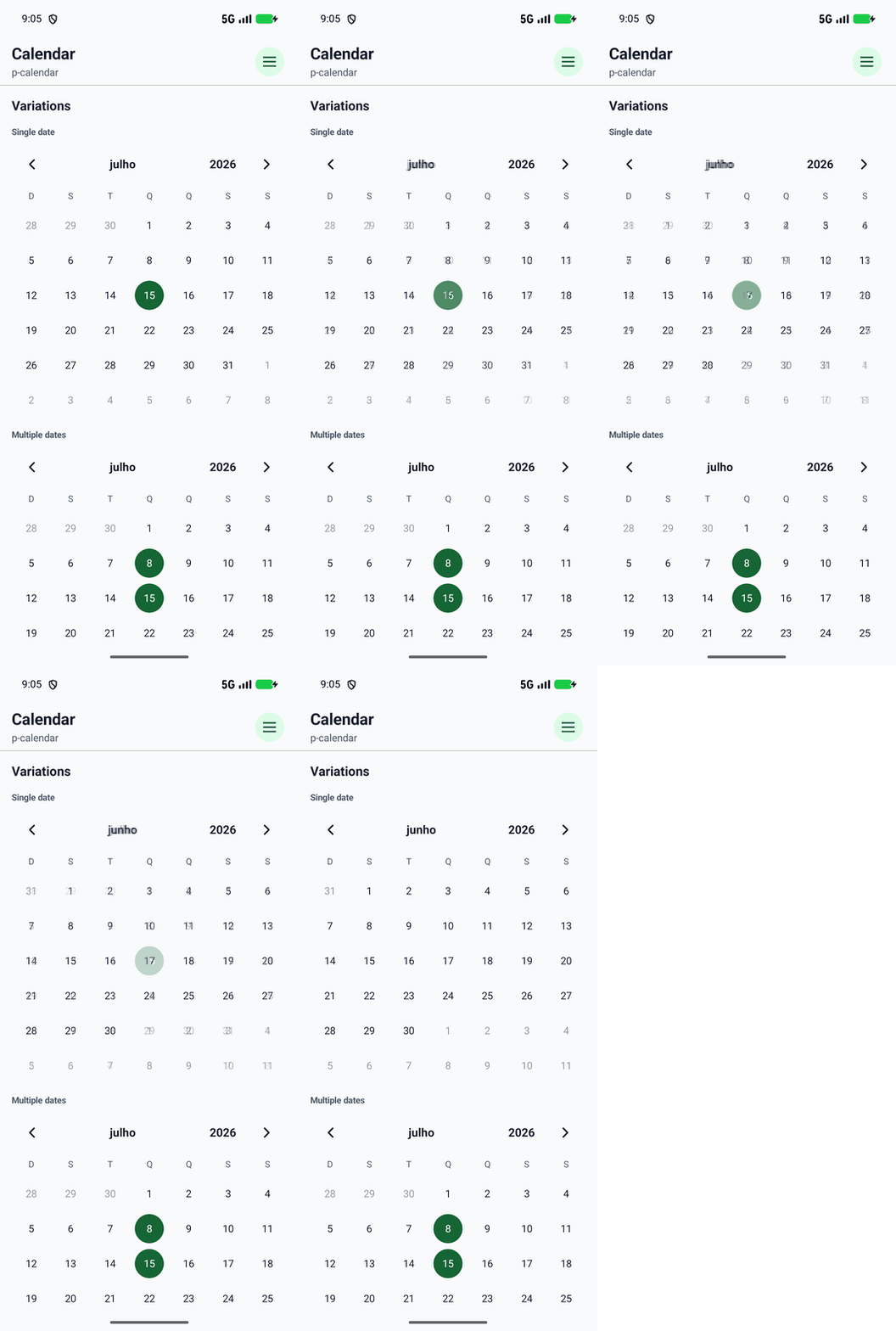
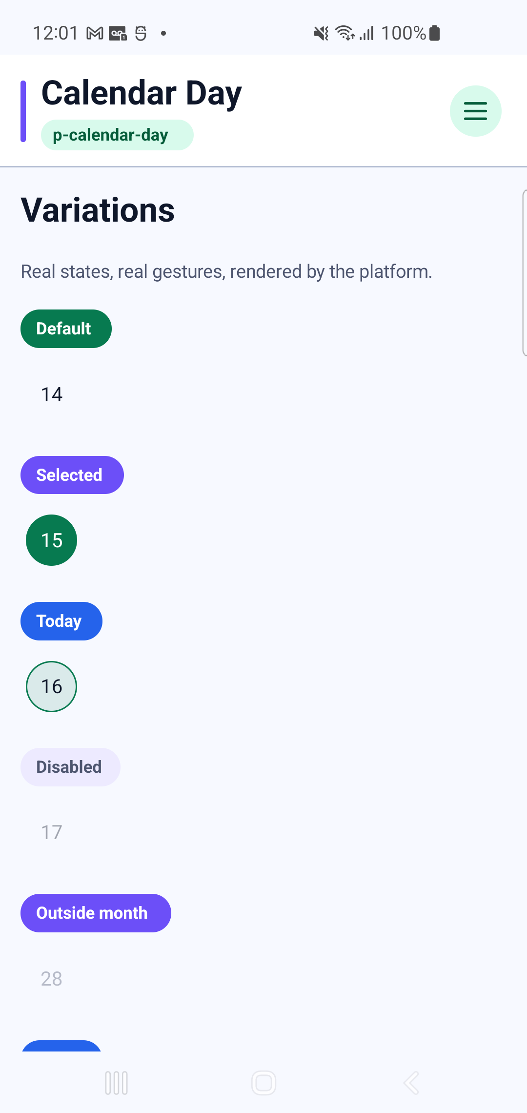
p-calendar-dayInteraction GIF 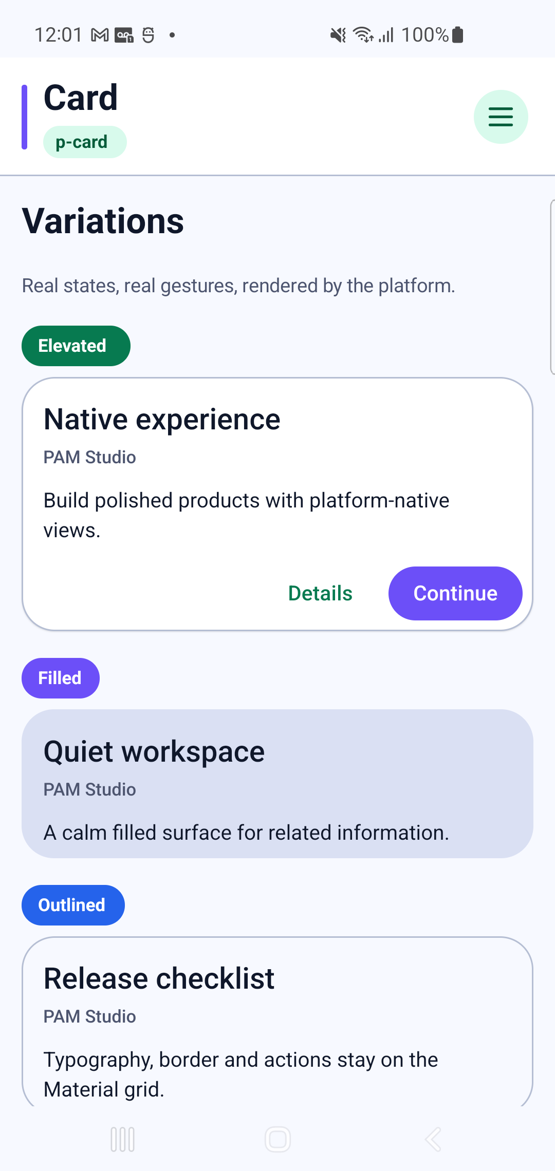
p-card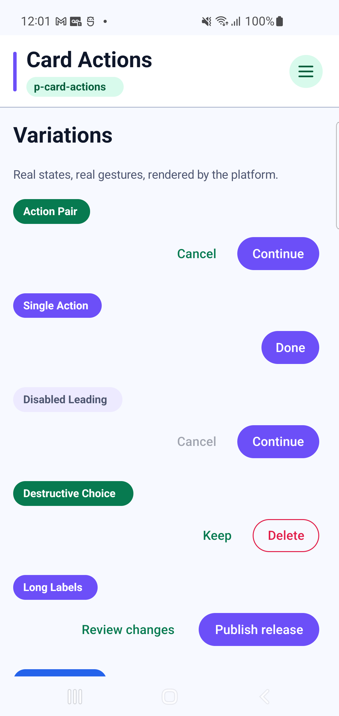
p-card-actionsInteraction GIF 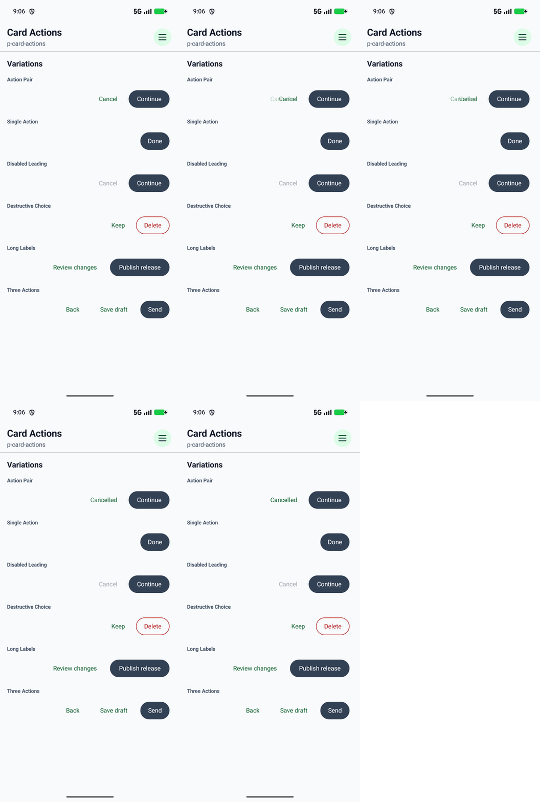
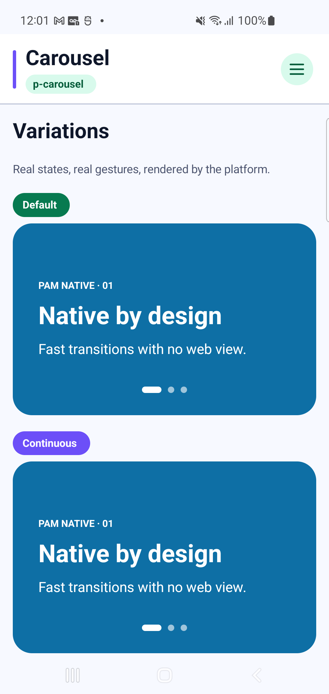
p-carouselInteraction GIF 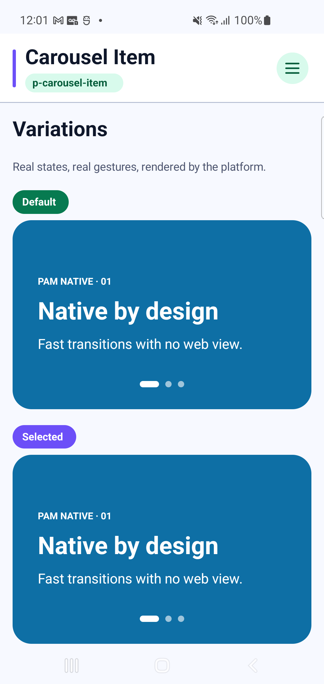
p-carousel-itemInteraction GIF 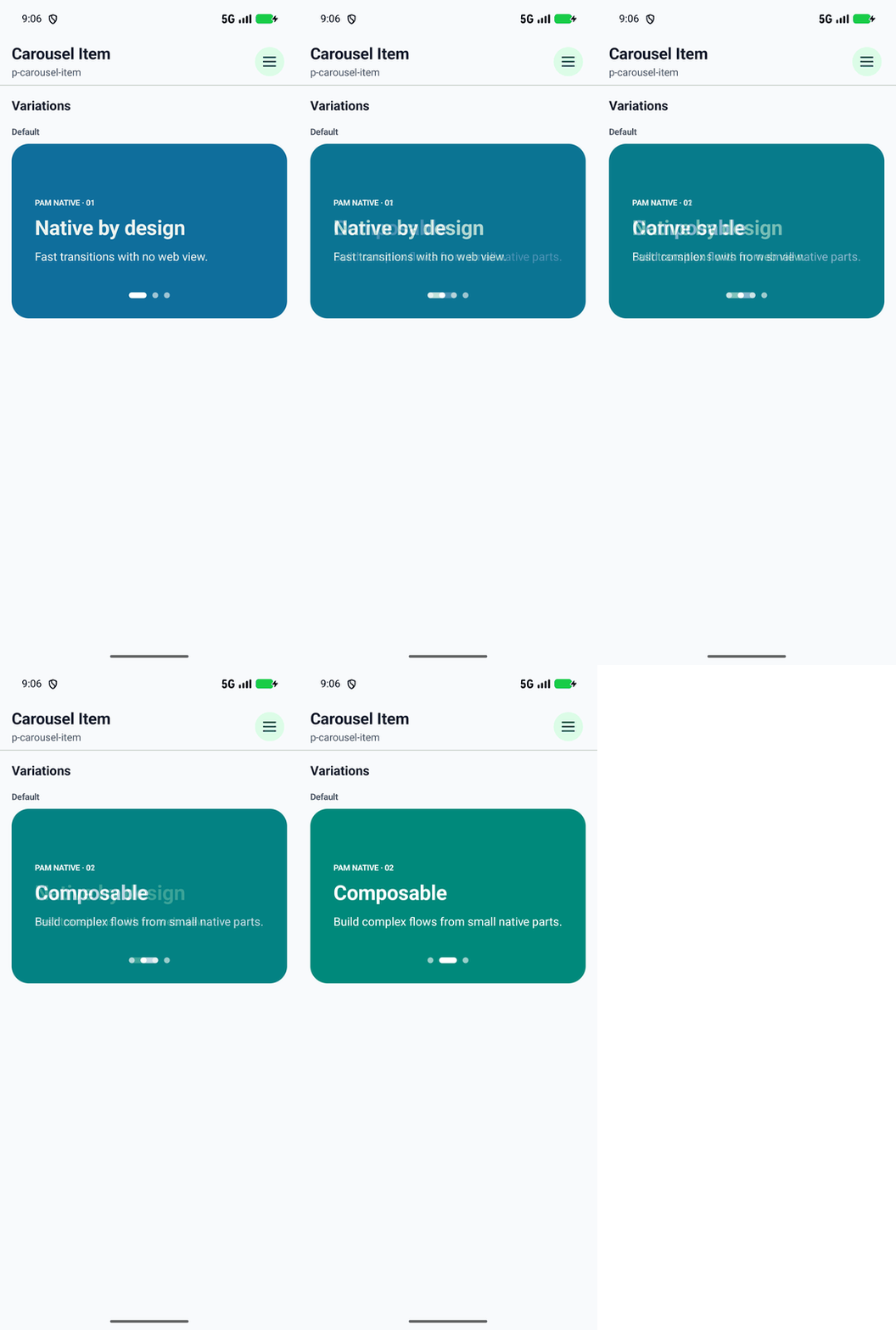
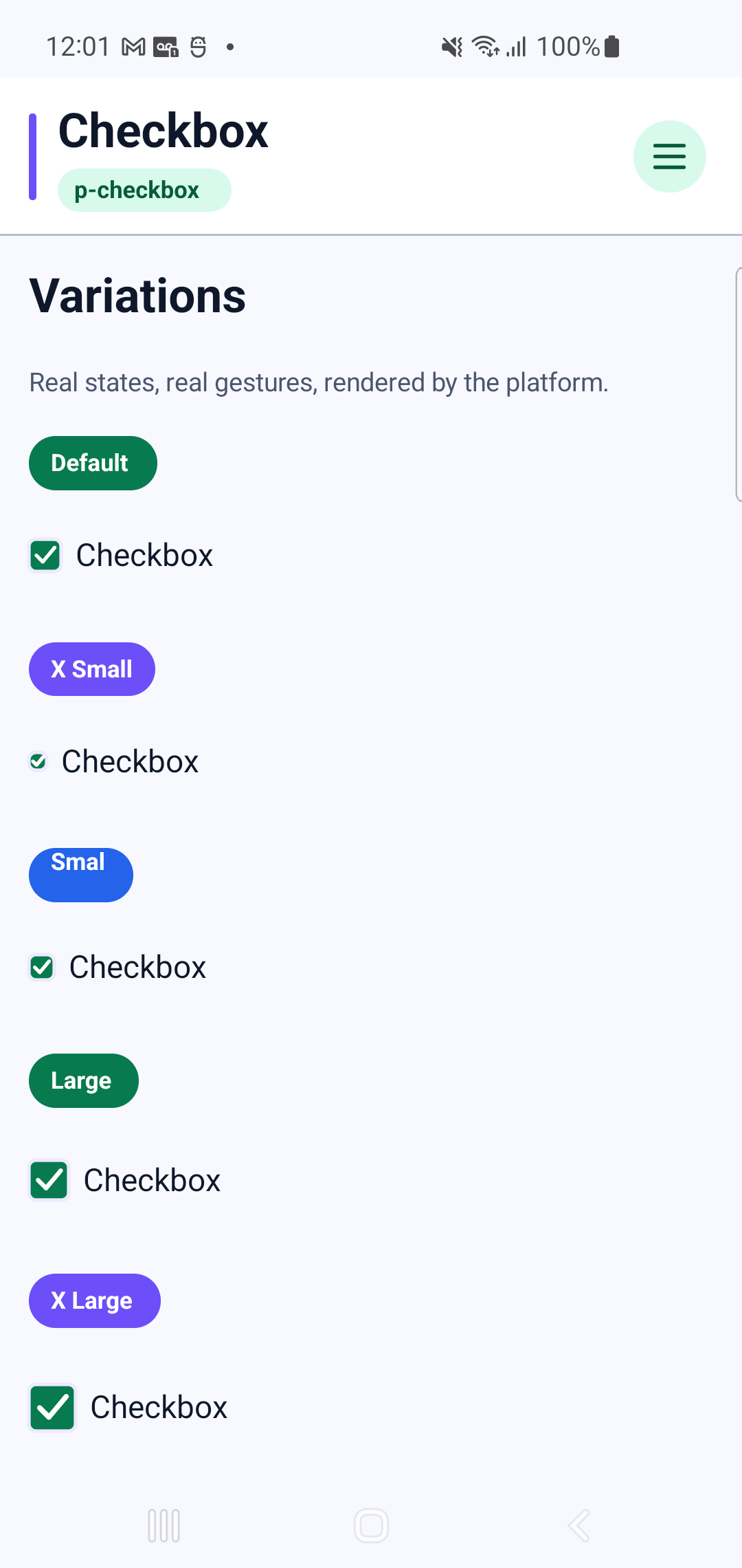
p-checkboxInteraction GIF 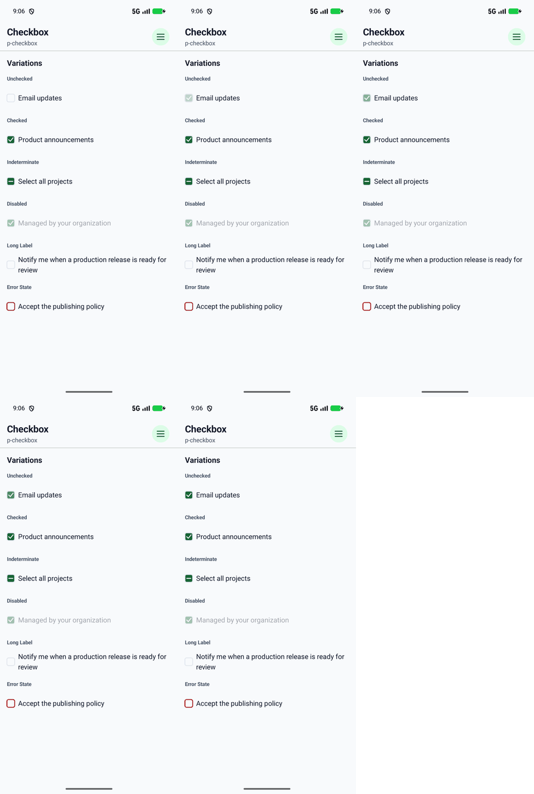
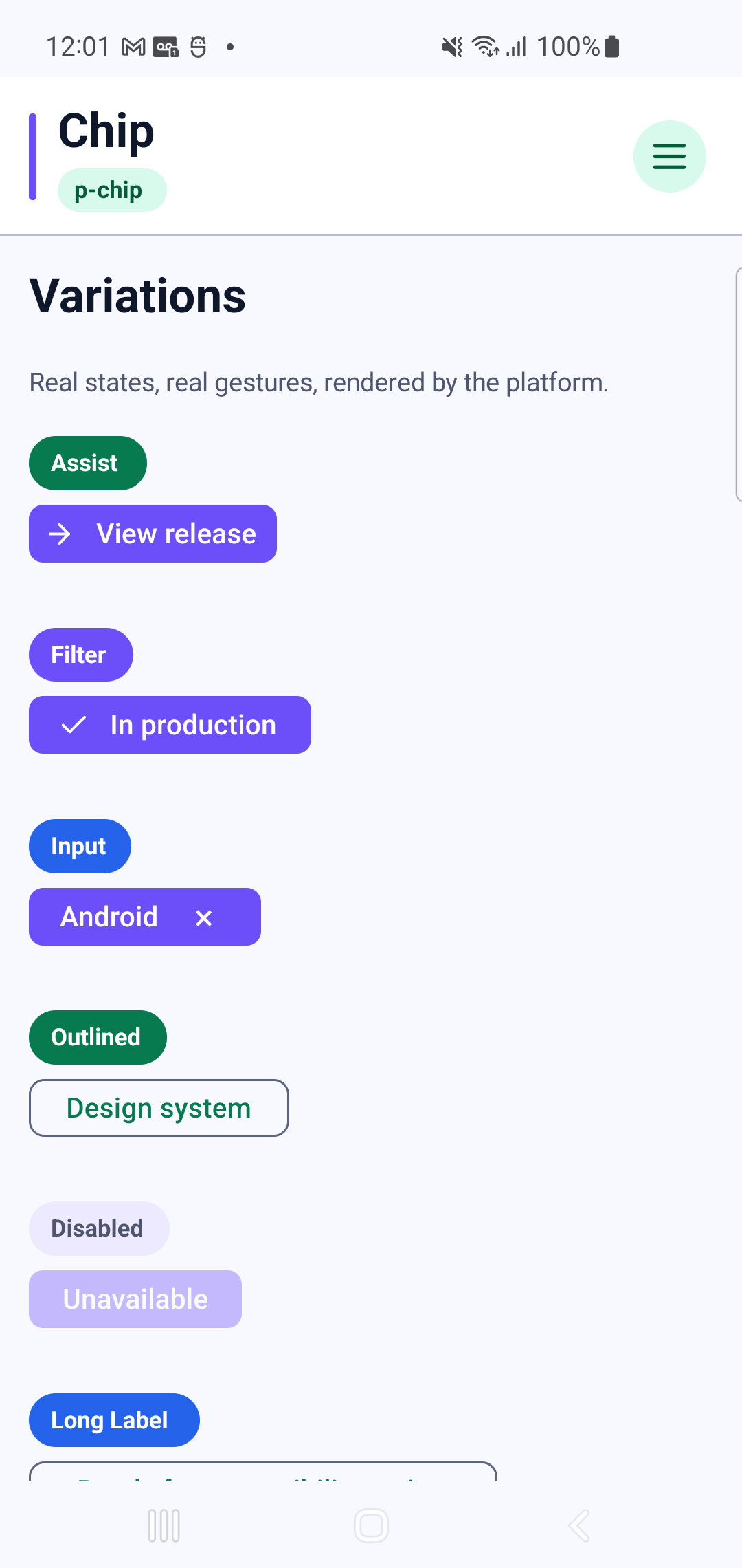
p-chipInteraction GIF 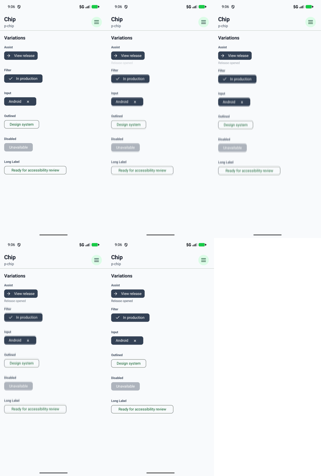
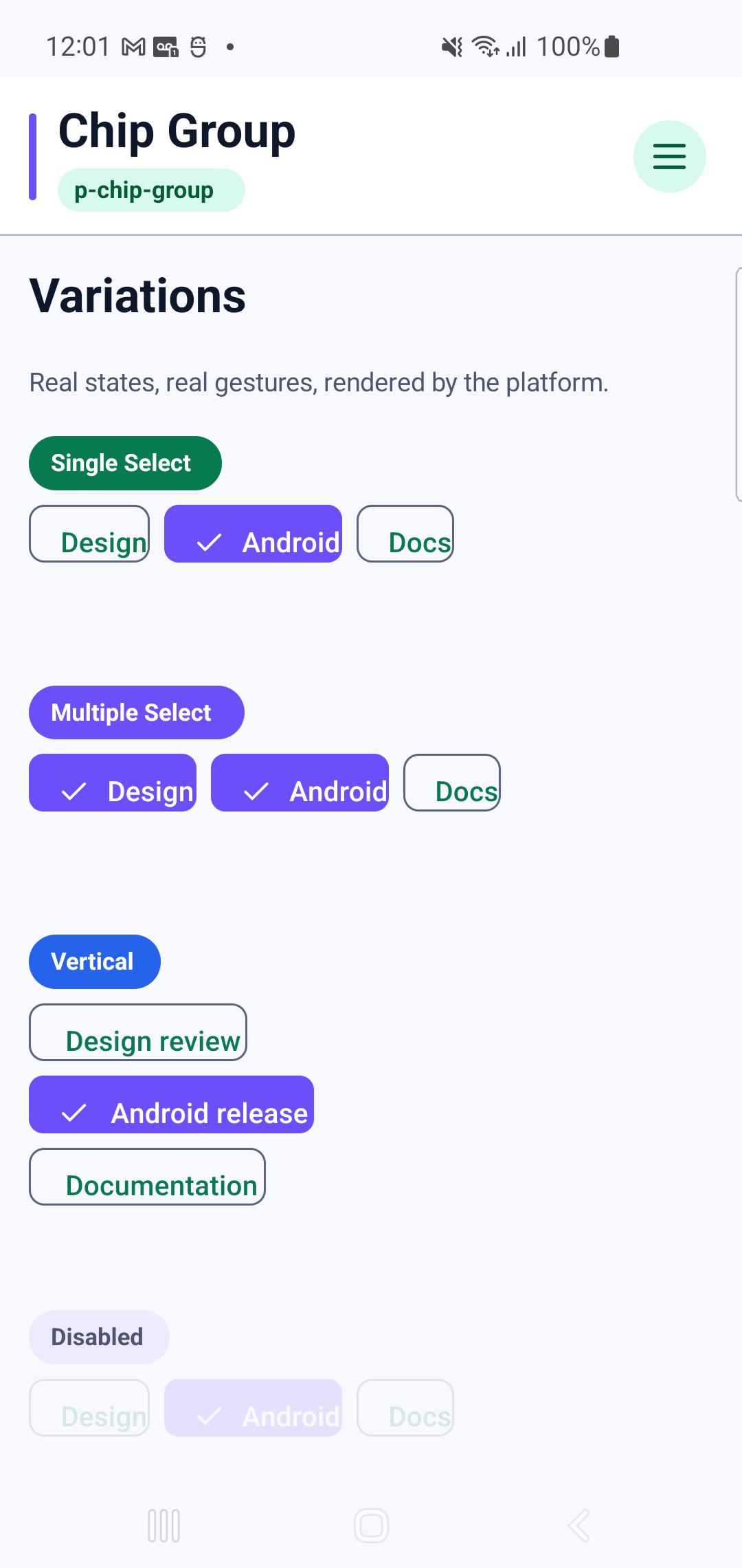
p-chip-groupInteraction GIF 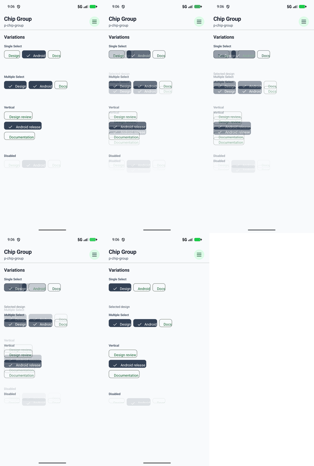
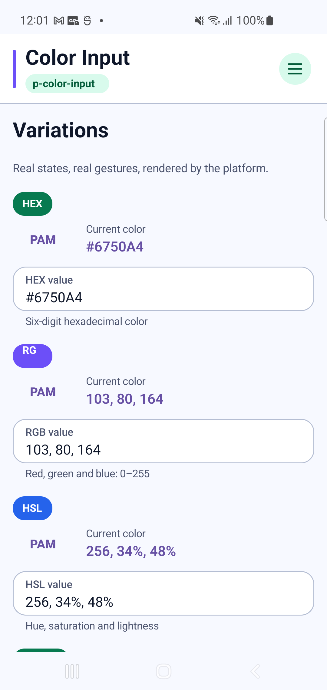
p-color-inputInteraction GIF 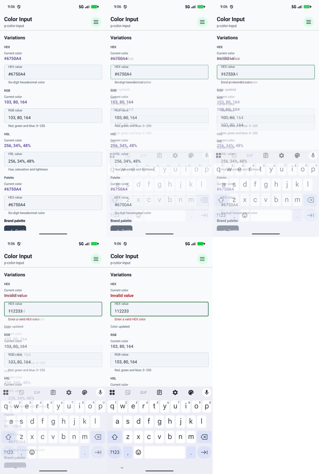
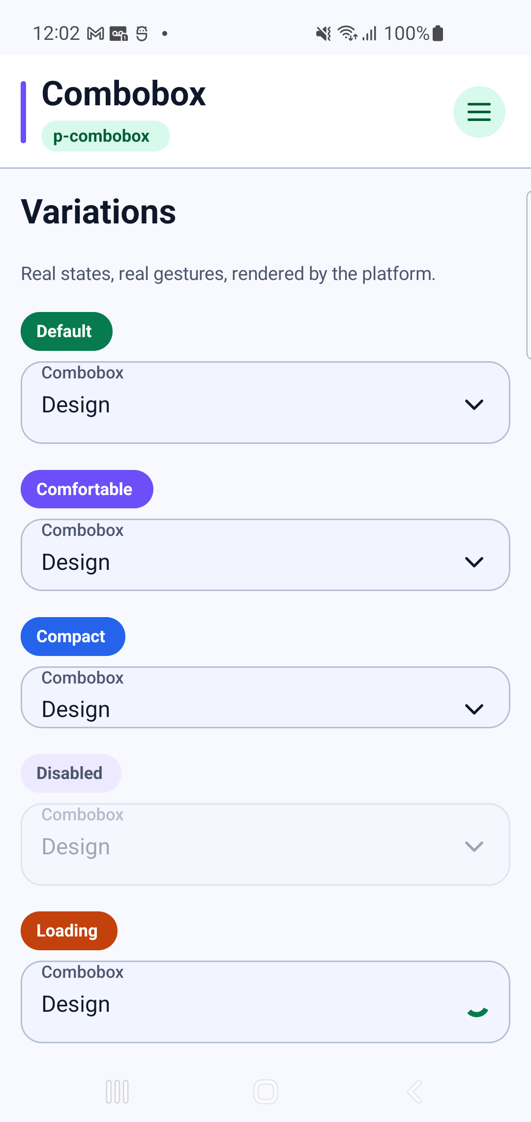
p-comboboxInteraction GIF 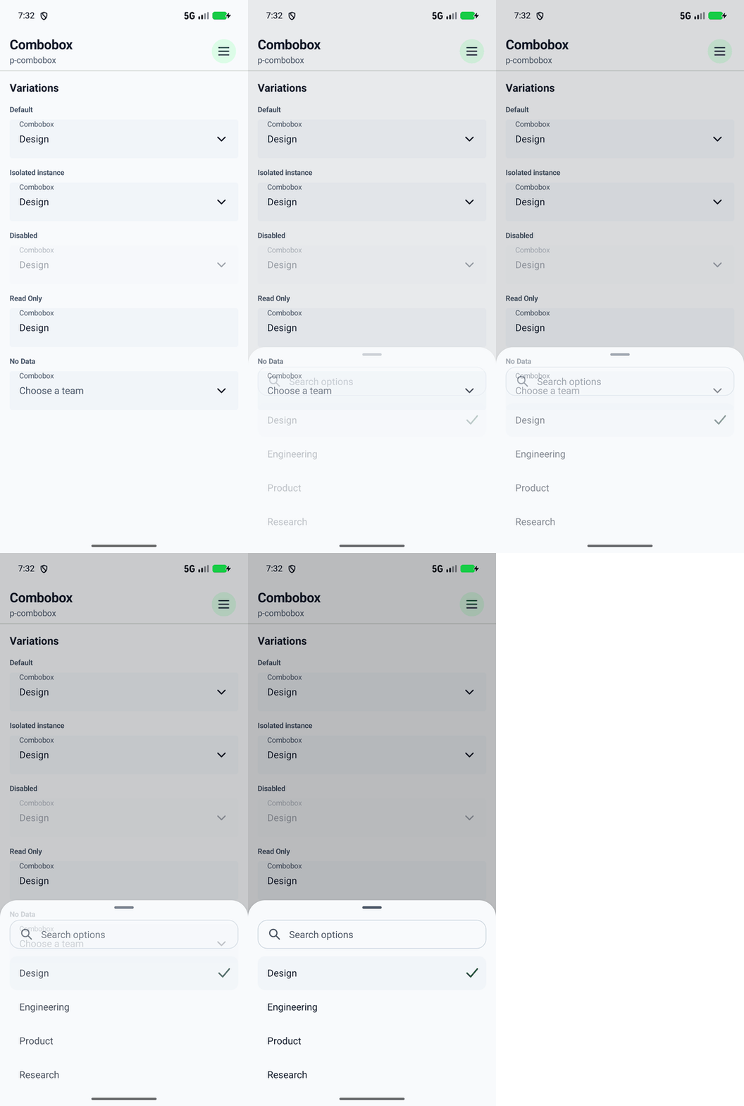
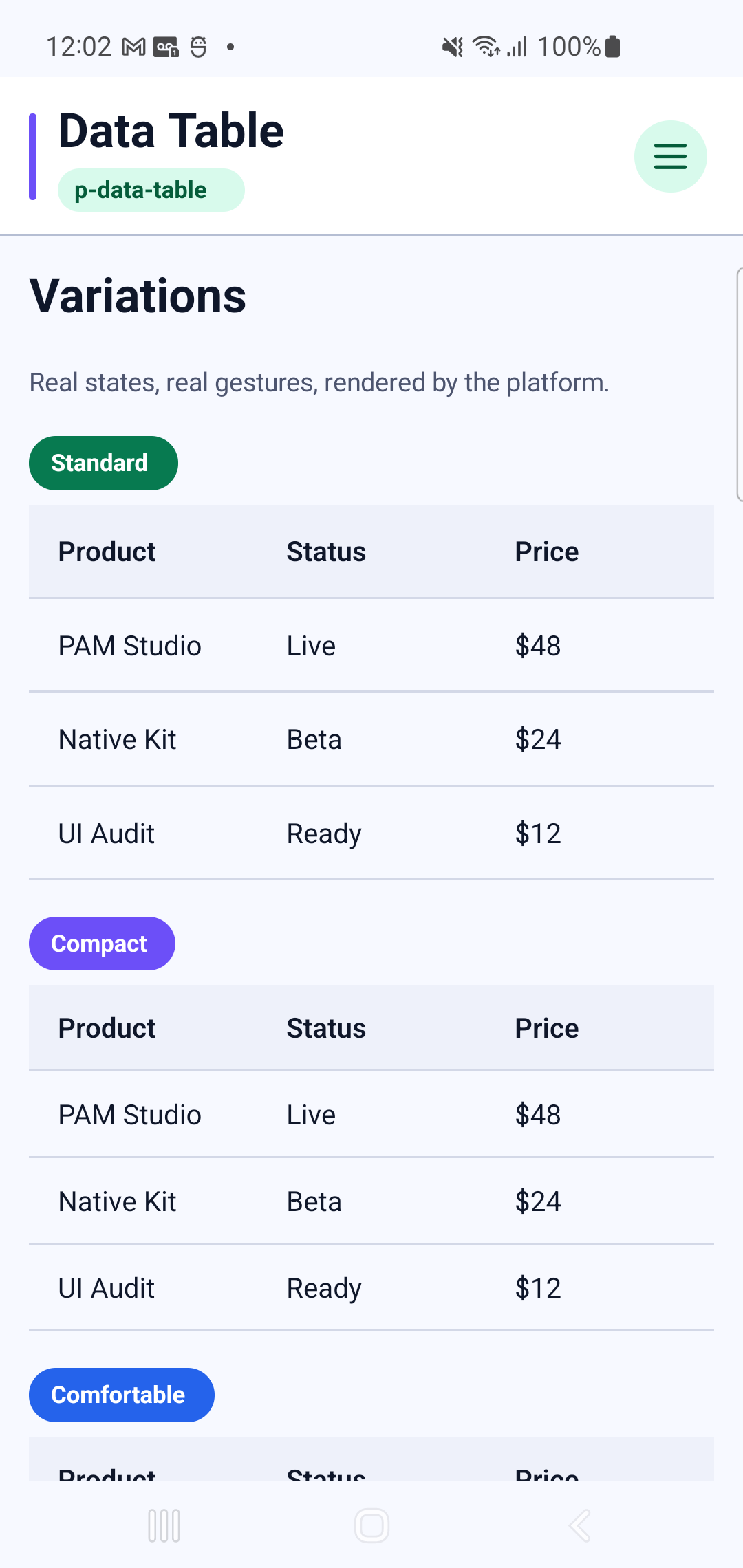
p-data-table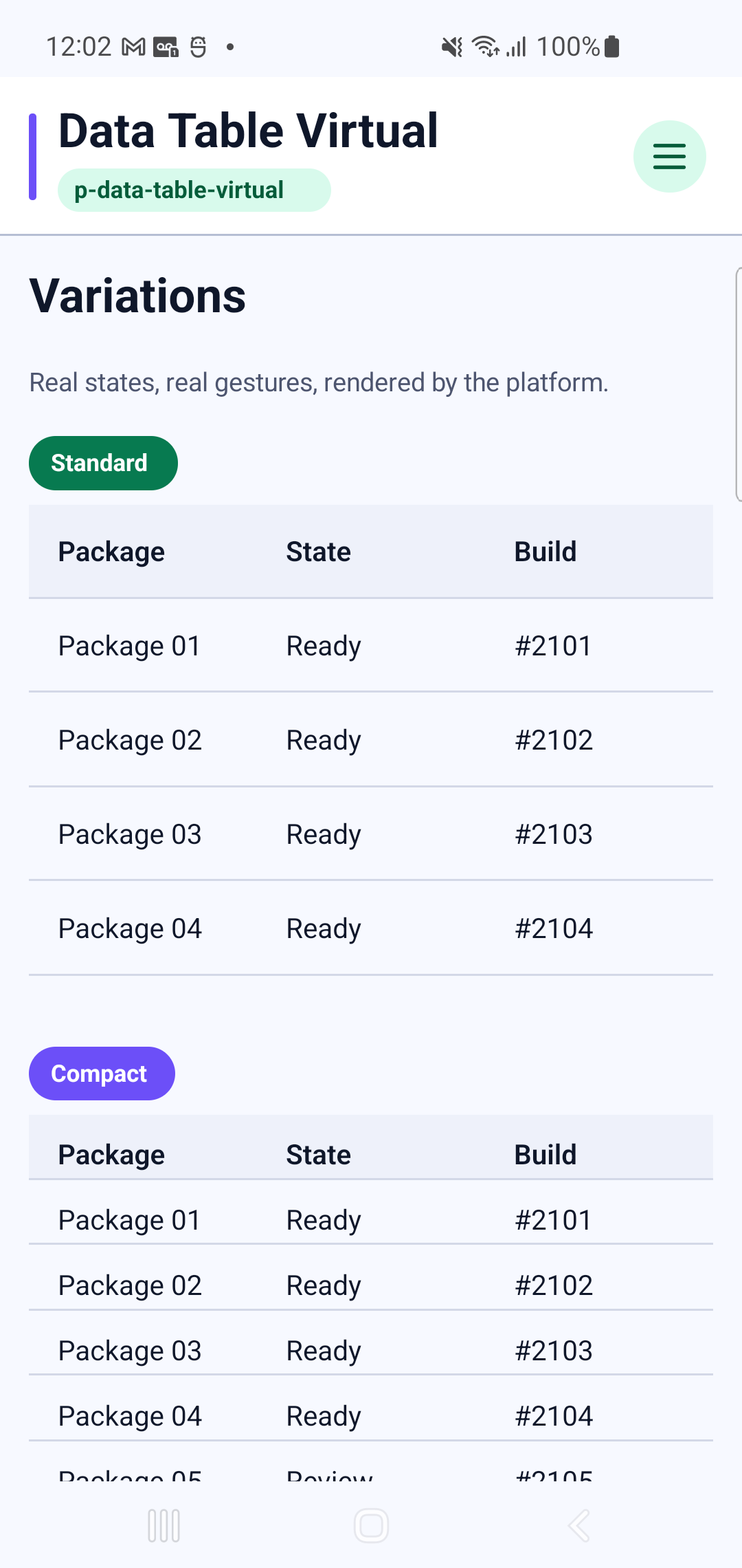
p-data-table-virtualInteraction GIF 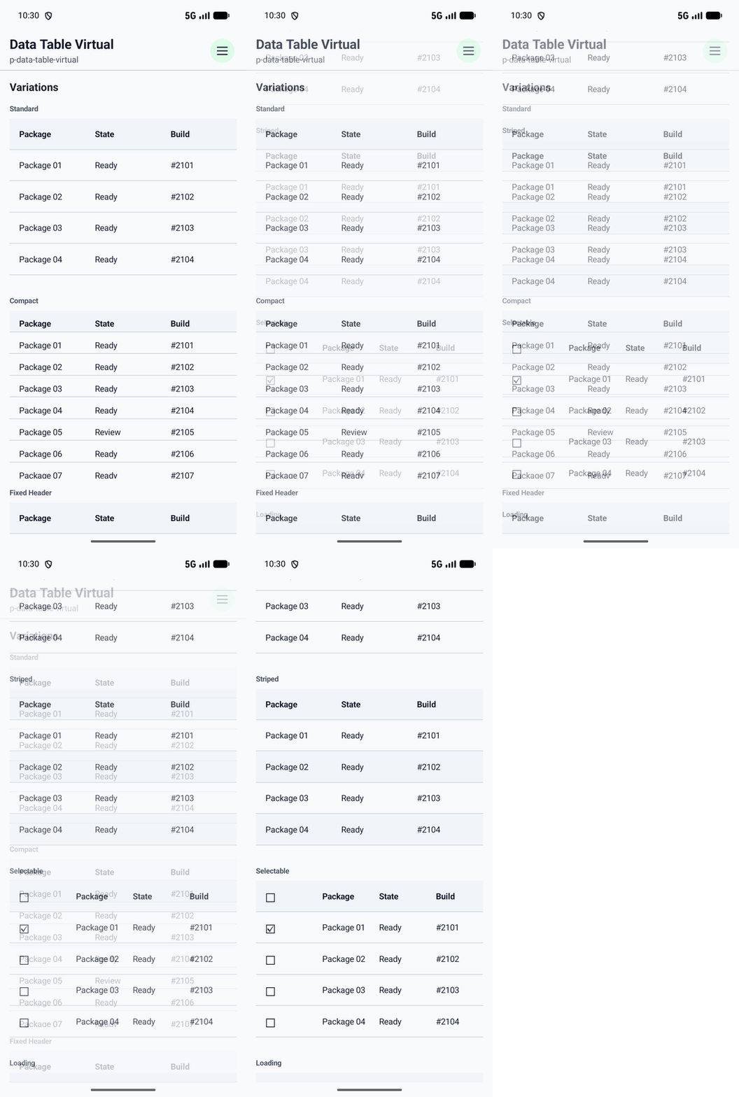
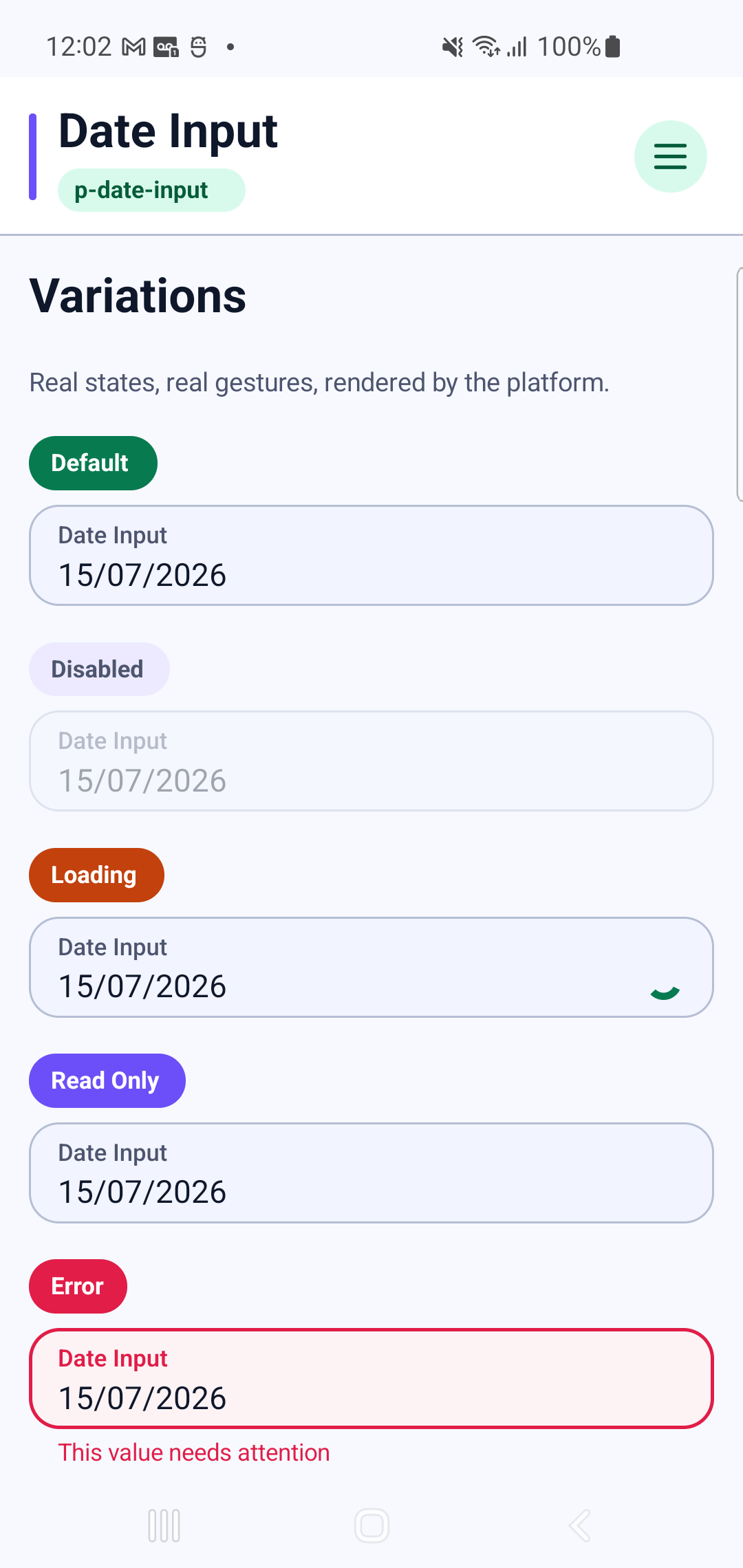
p-date-inputInteraction GIF 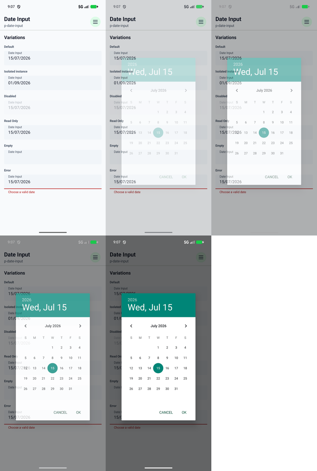
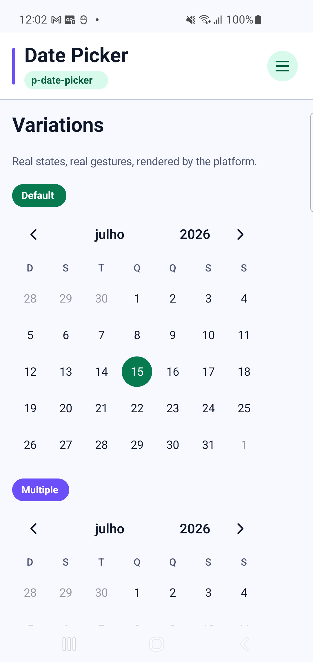
p-date-pickerInteraction GIF 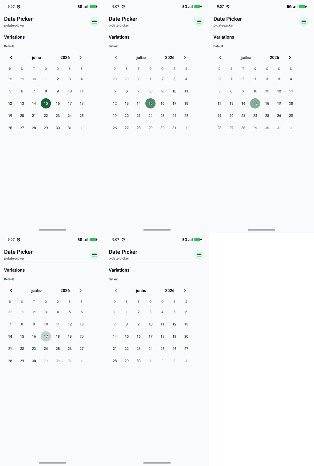
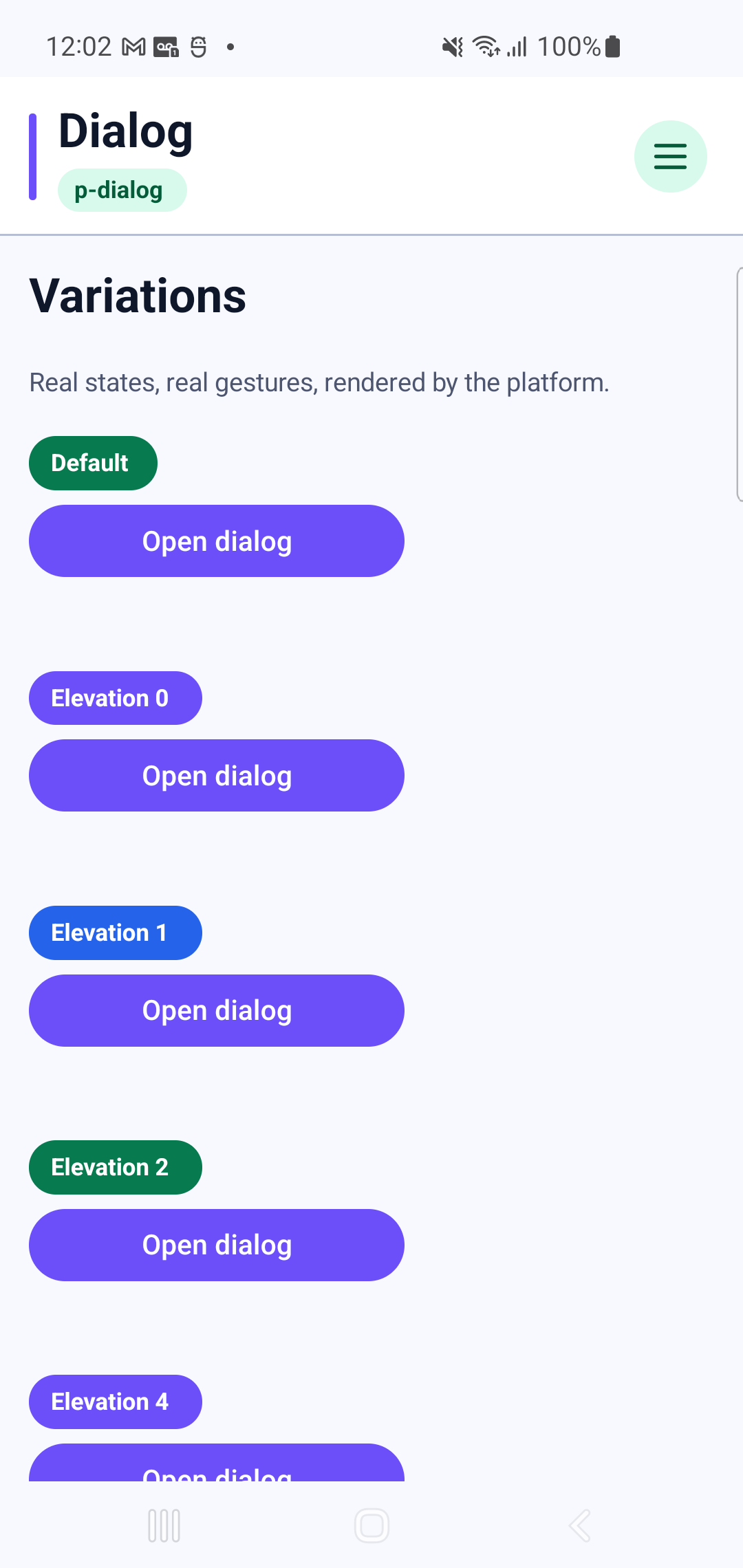
p-dialogInteraction GIF 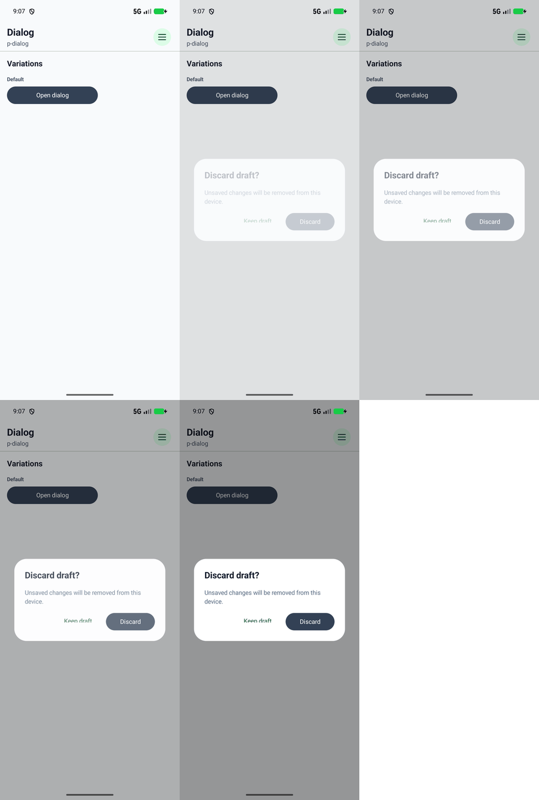
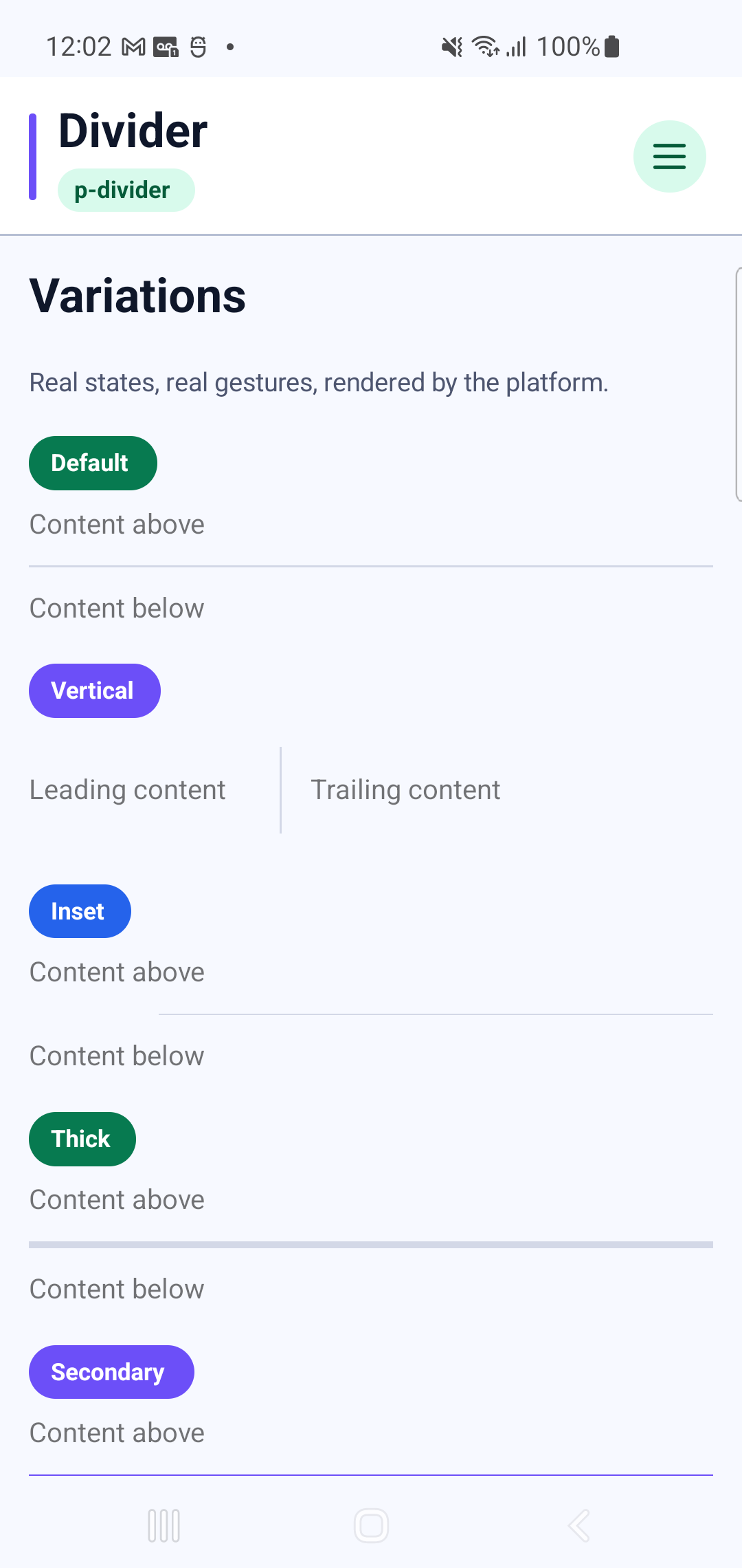
p-divider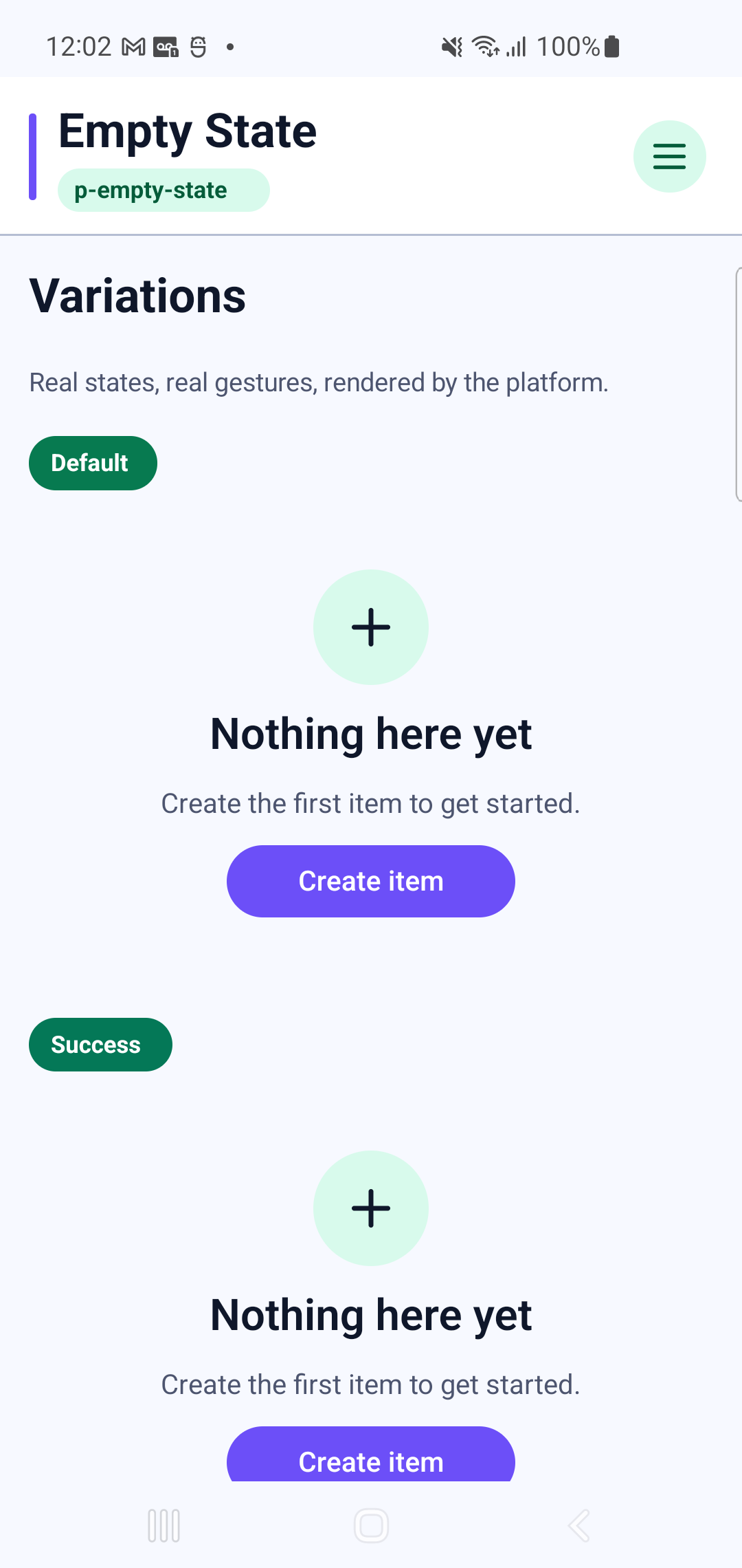
p-empty-state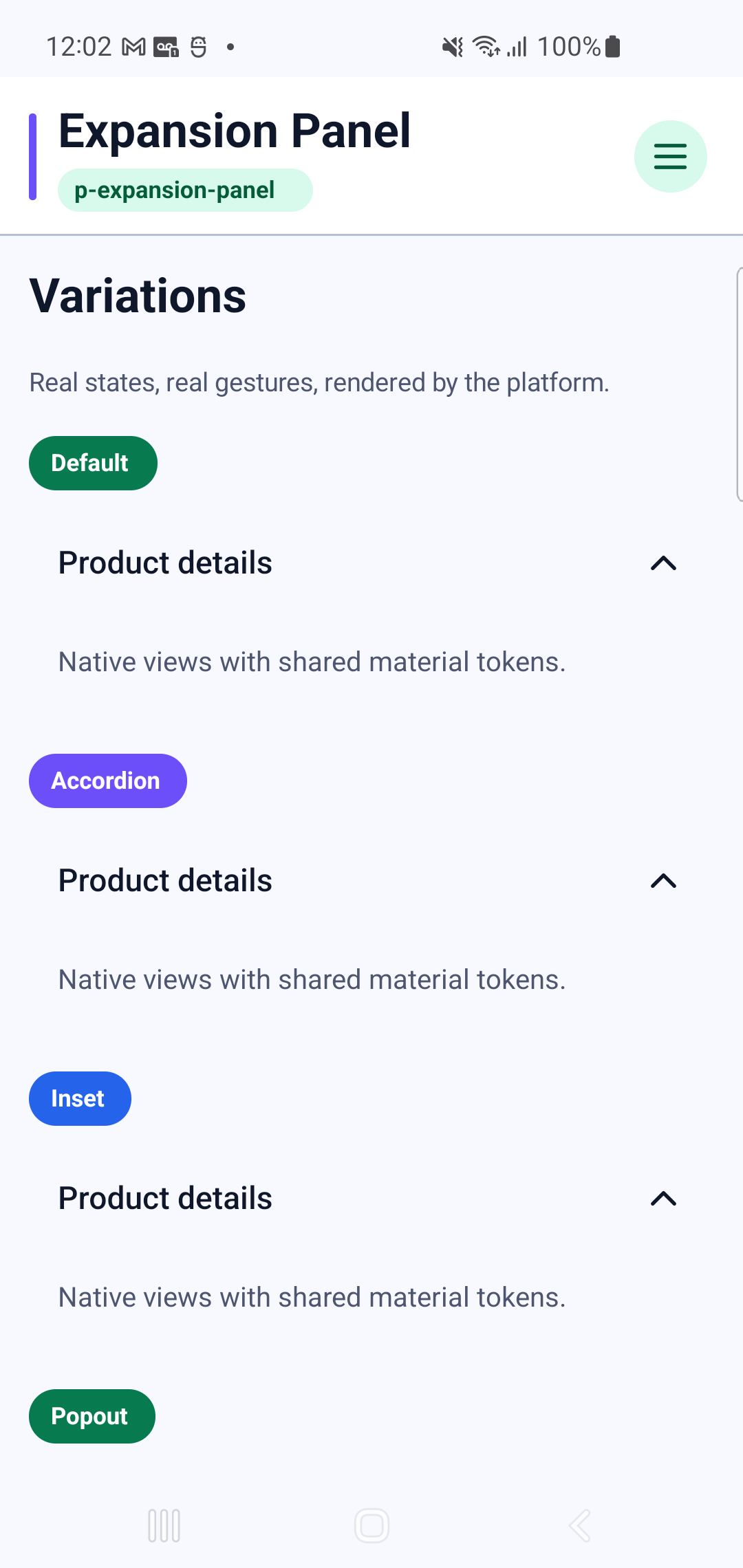
p-expansion-panelInteraction GIF 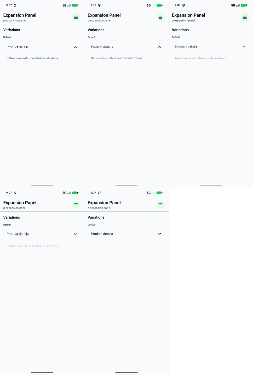
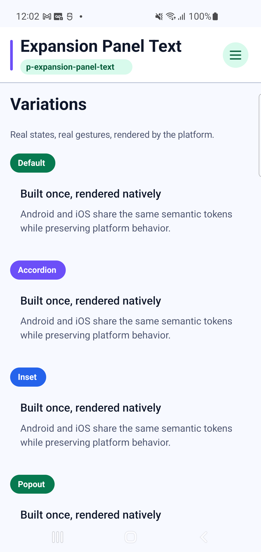
p-expansion-panel-text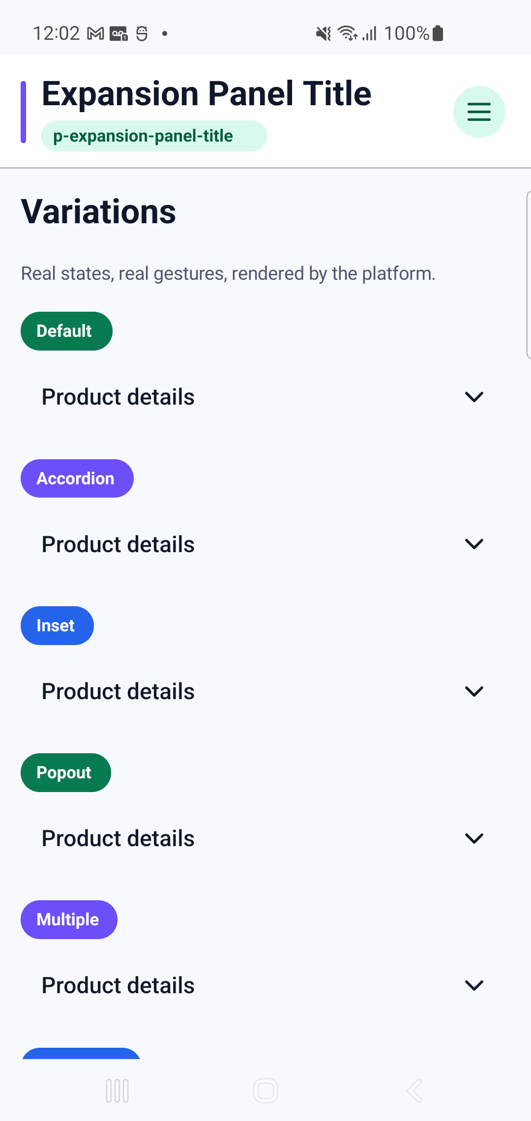
p-expansion-panel-titleInteraction GIF 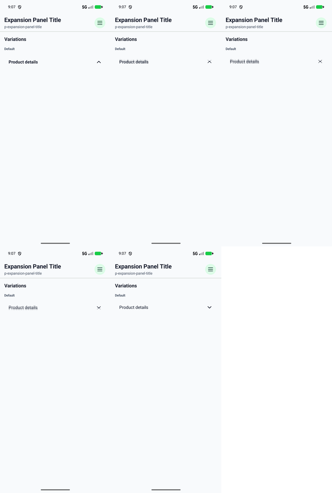
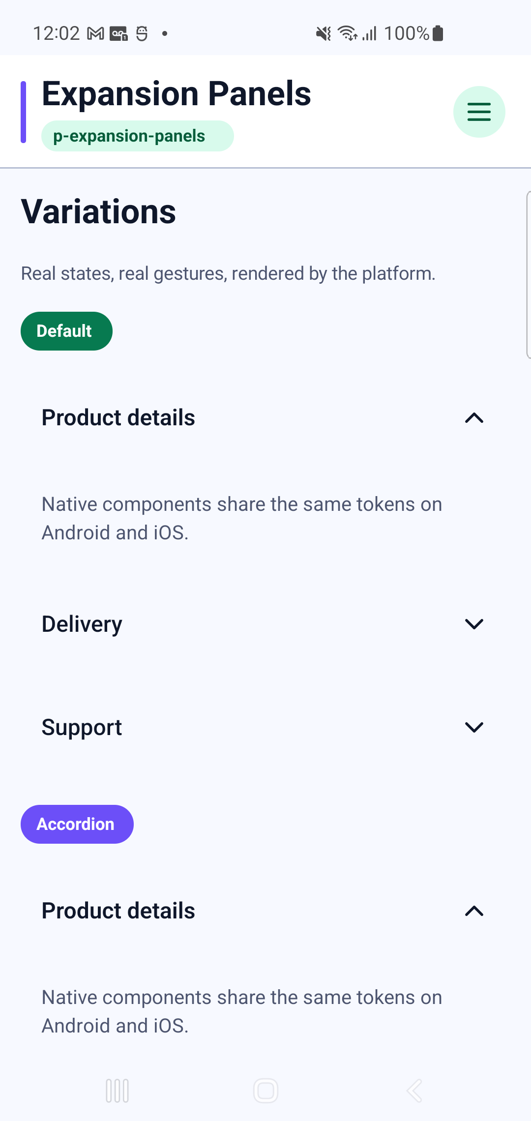
p-expansion-panelsInteraction GIF 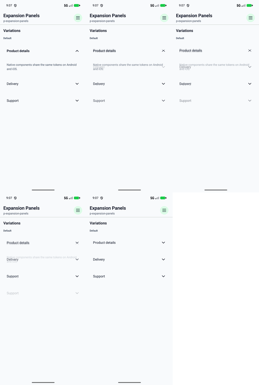
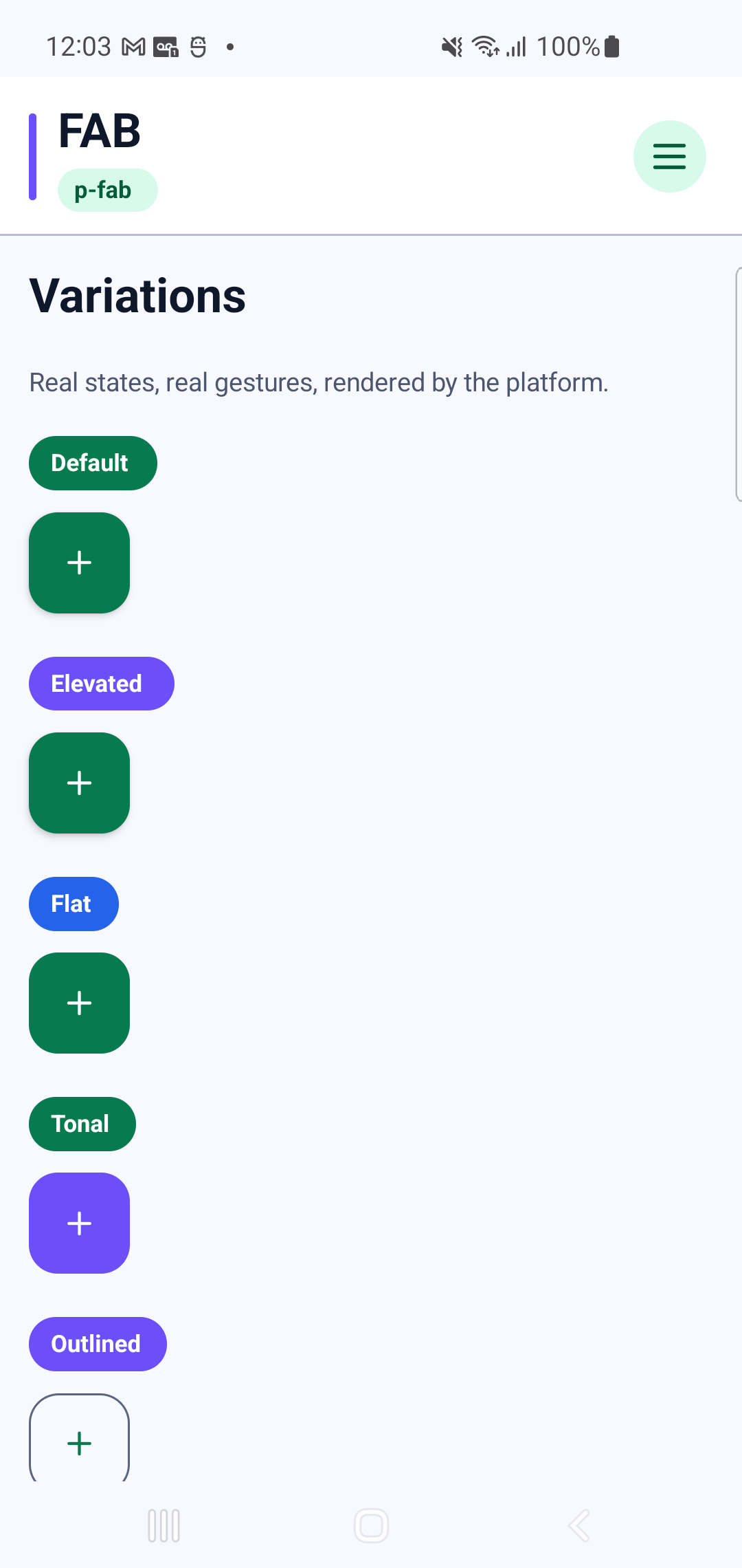
p-fabInteraction GIF 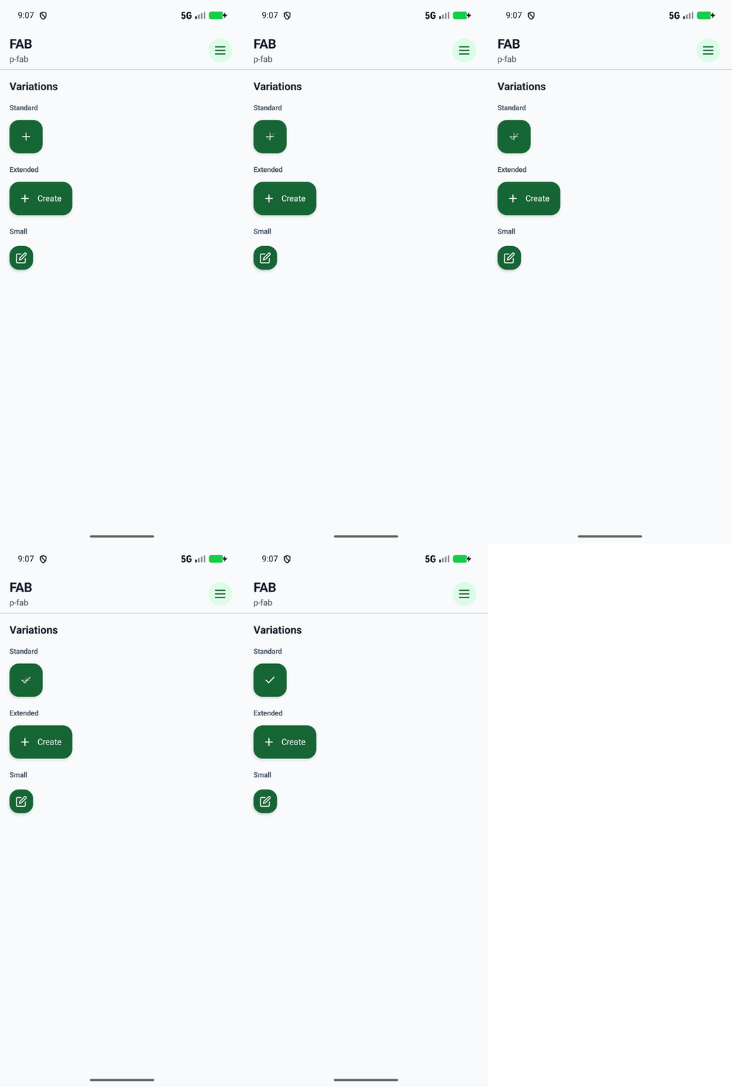
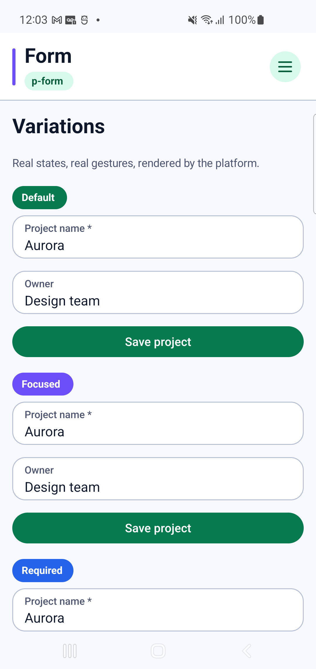
p-formInteraction GIF 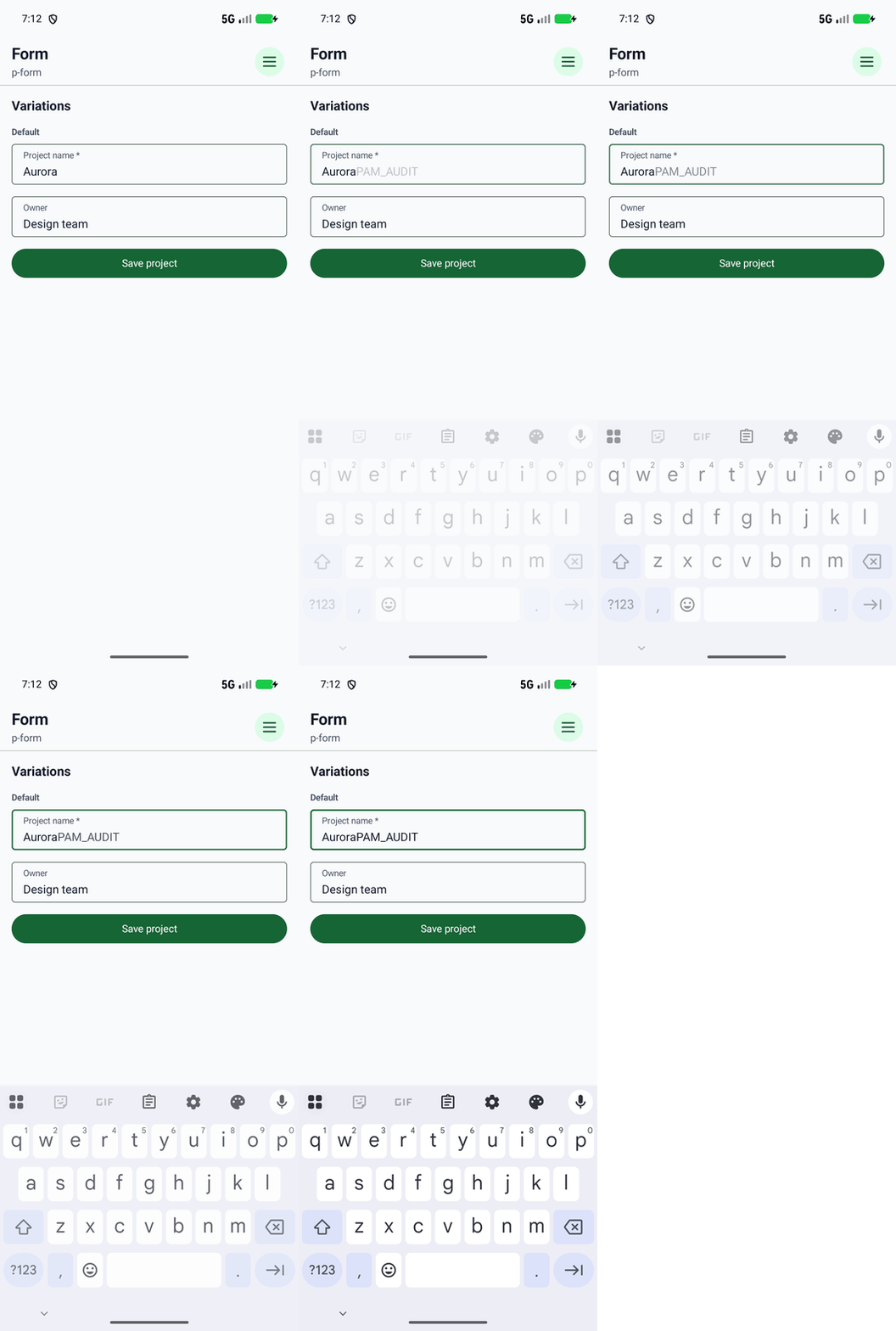
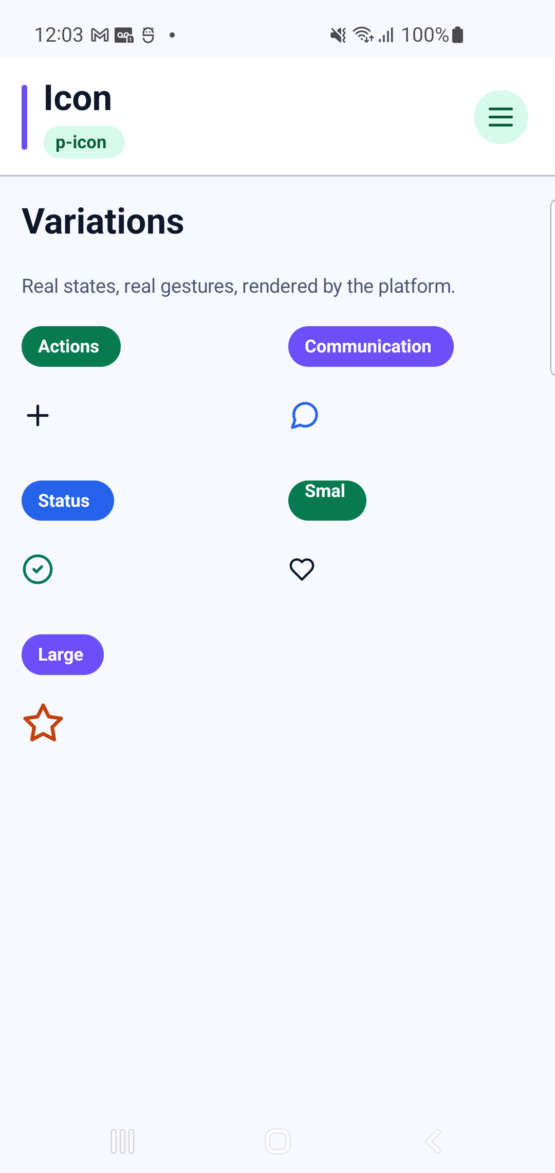
p-icon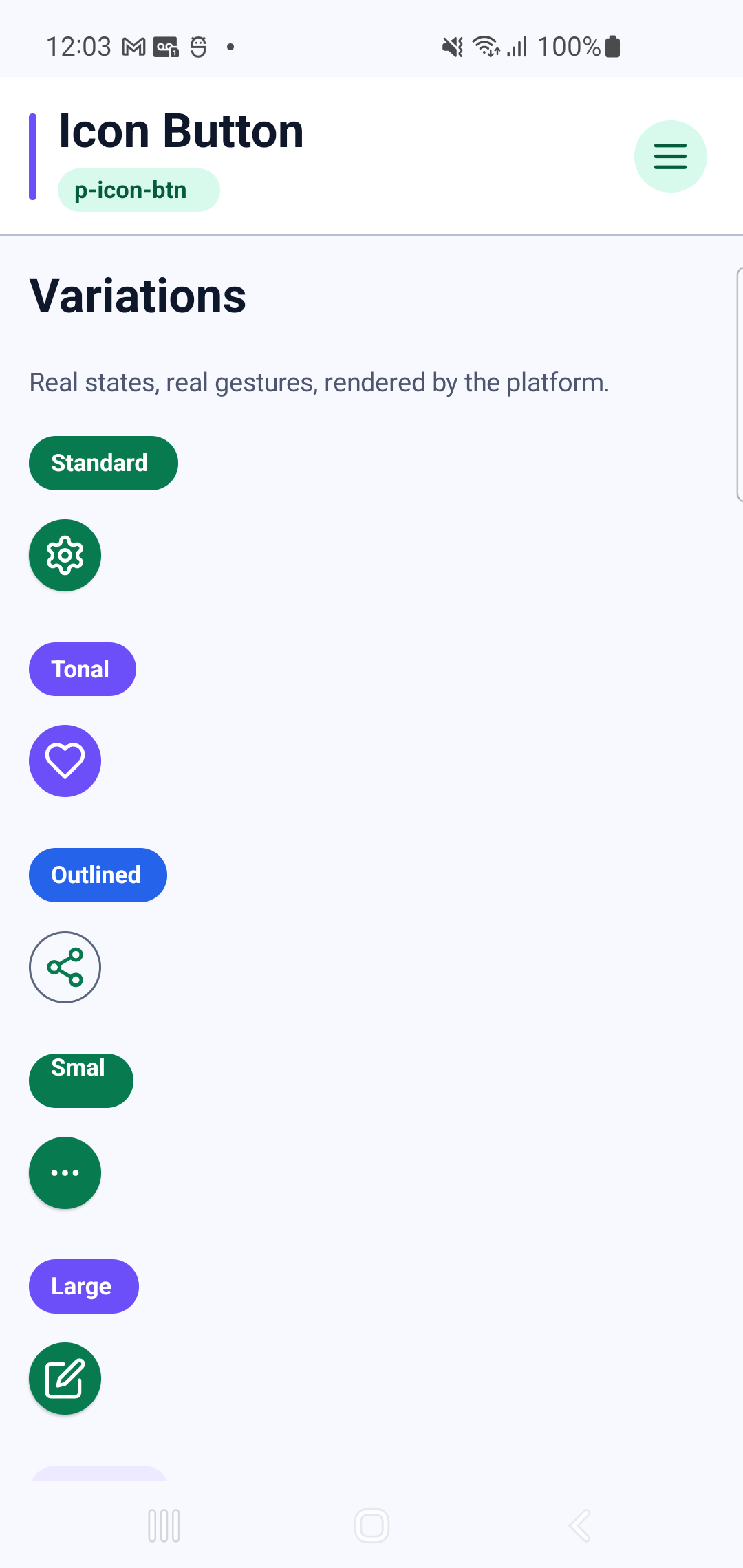
p-icon-btnInteraction GIF 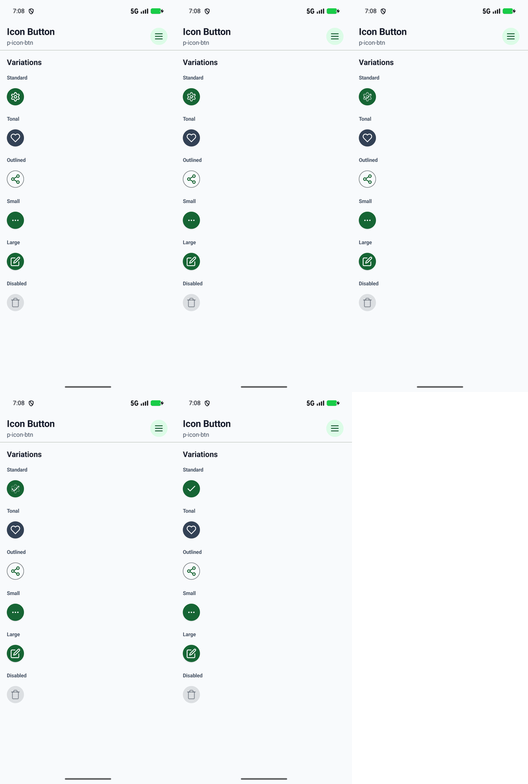
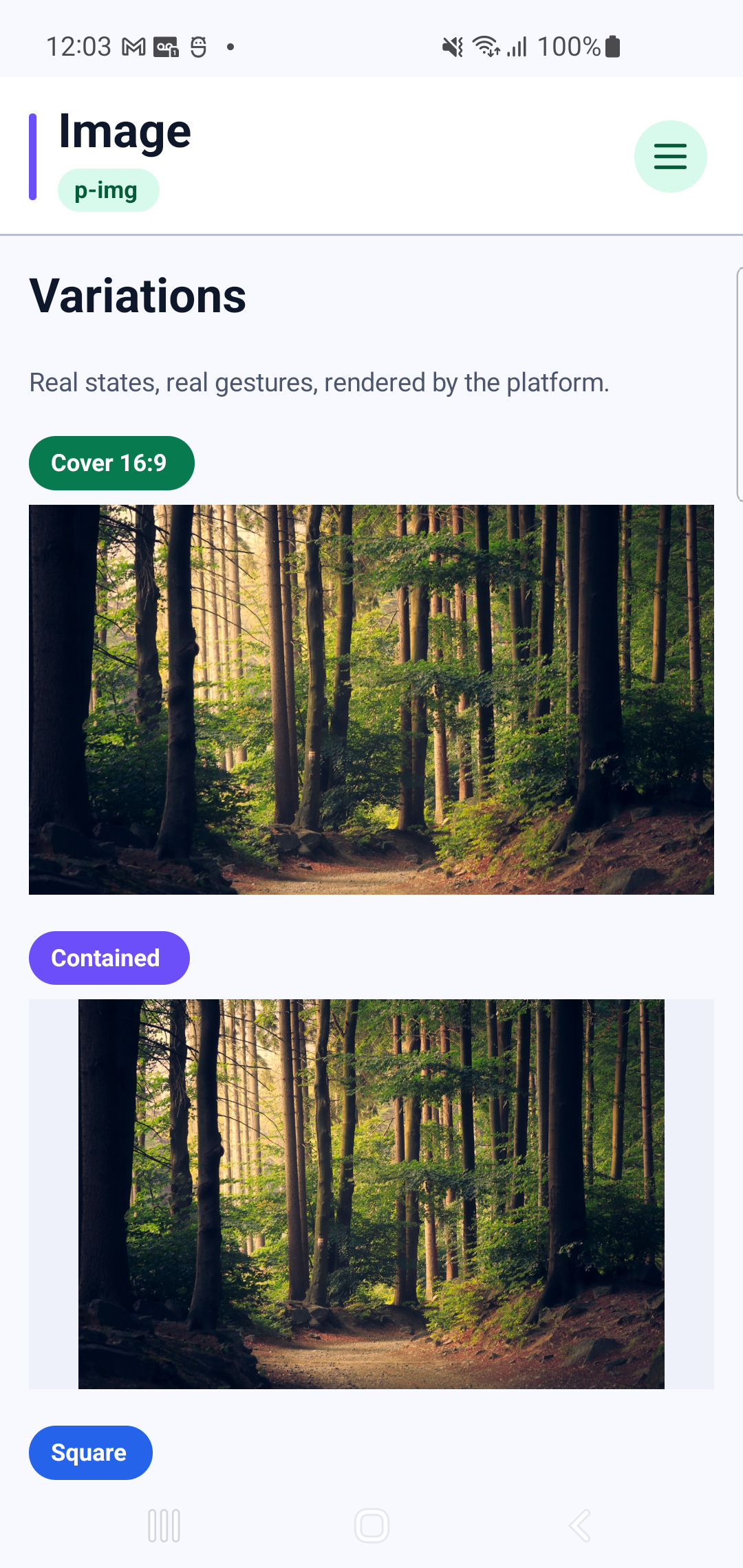
p-img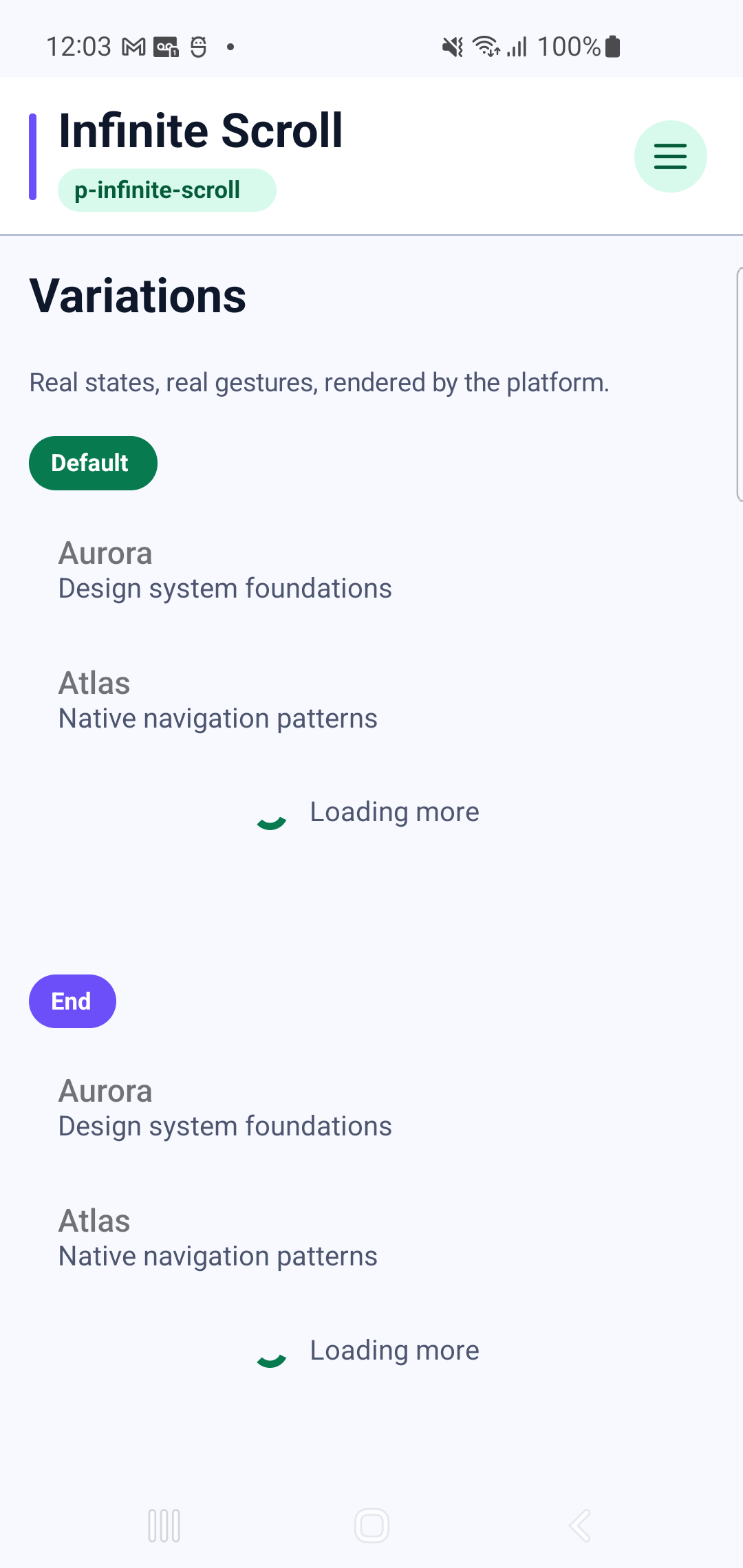
p-infinite-scrollInteraction GIF 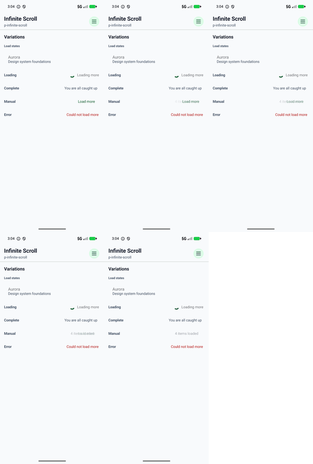
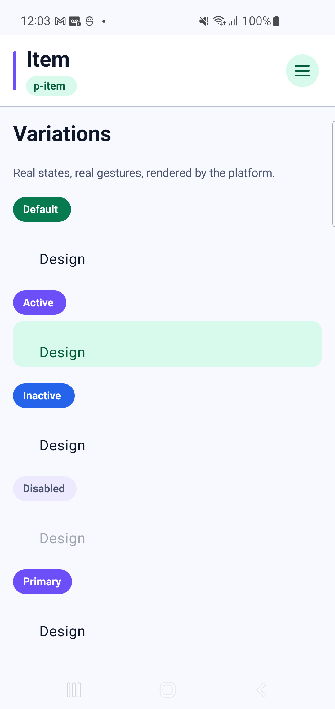
p-itemInteraction GIF 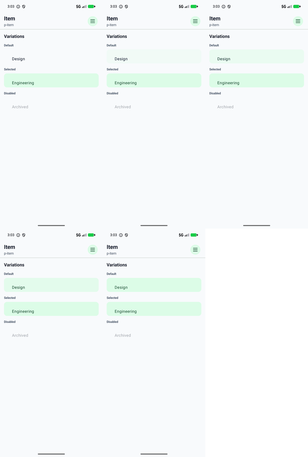
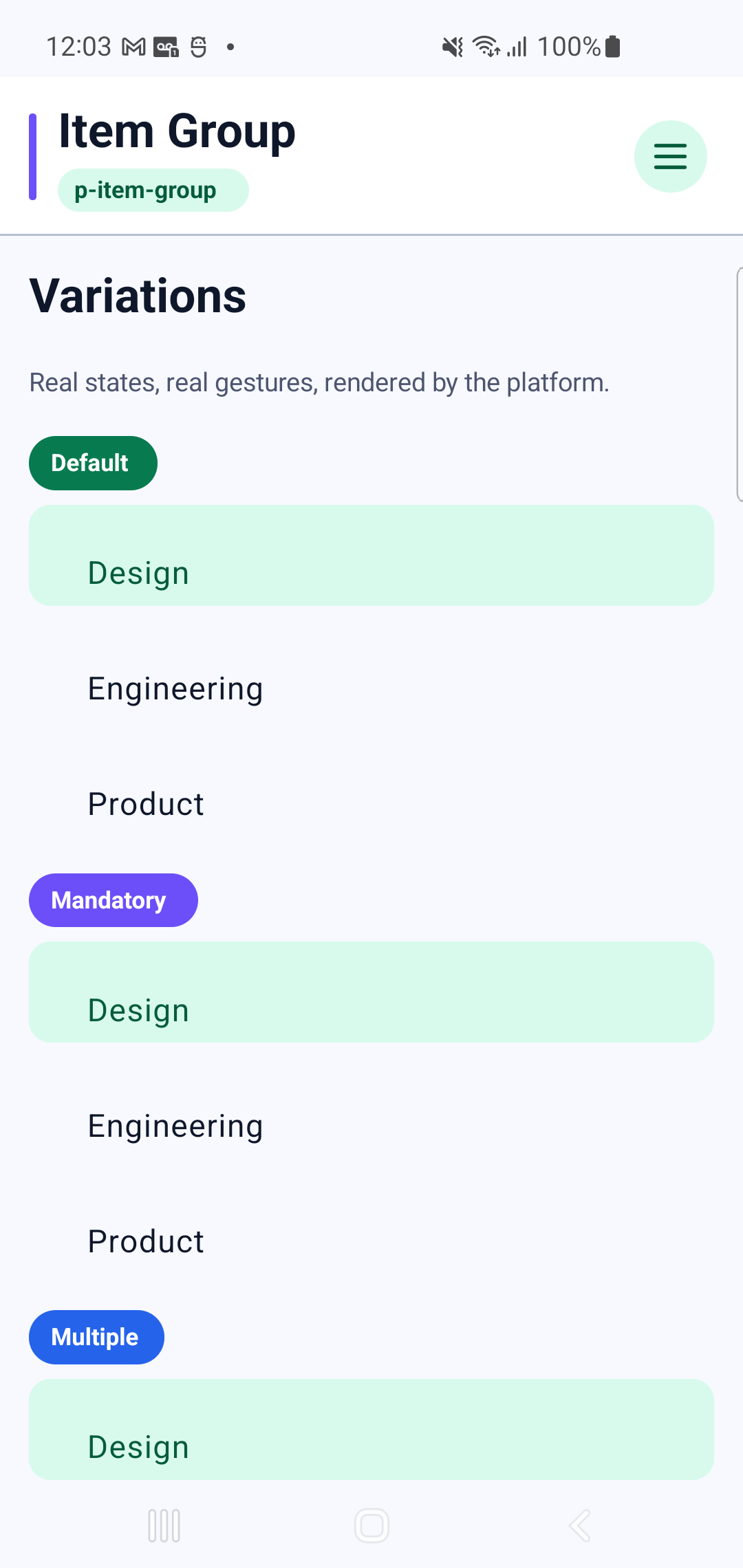
p-item-groupInteraction GIF 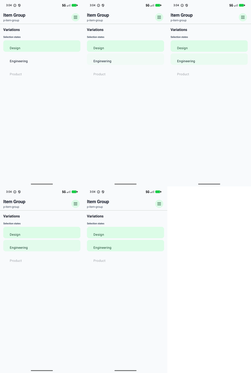
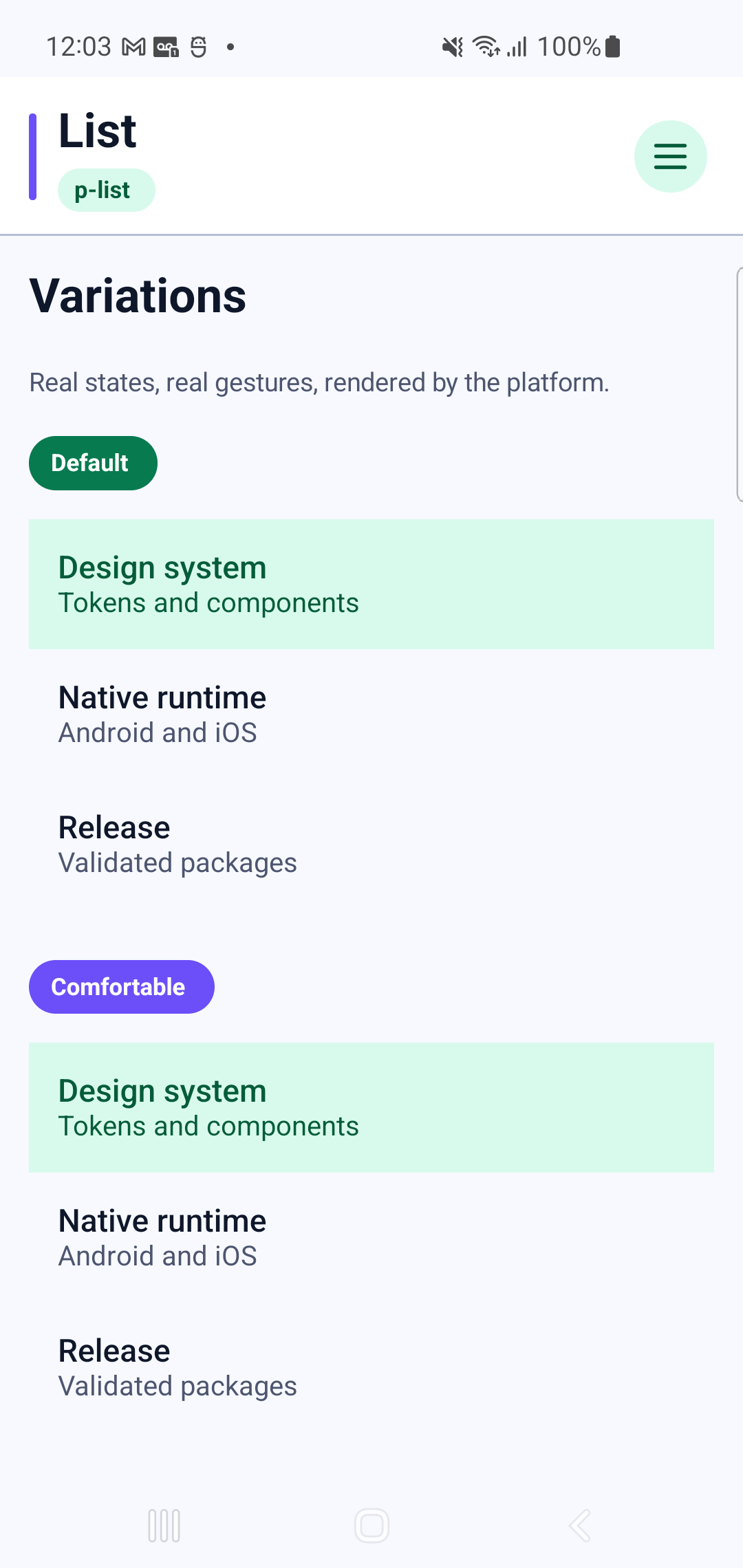
p-listInteraction GIF 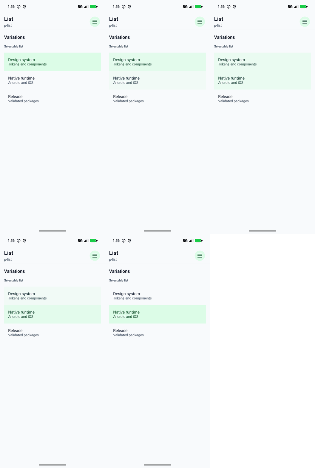
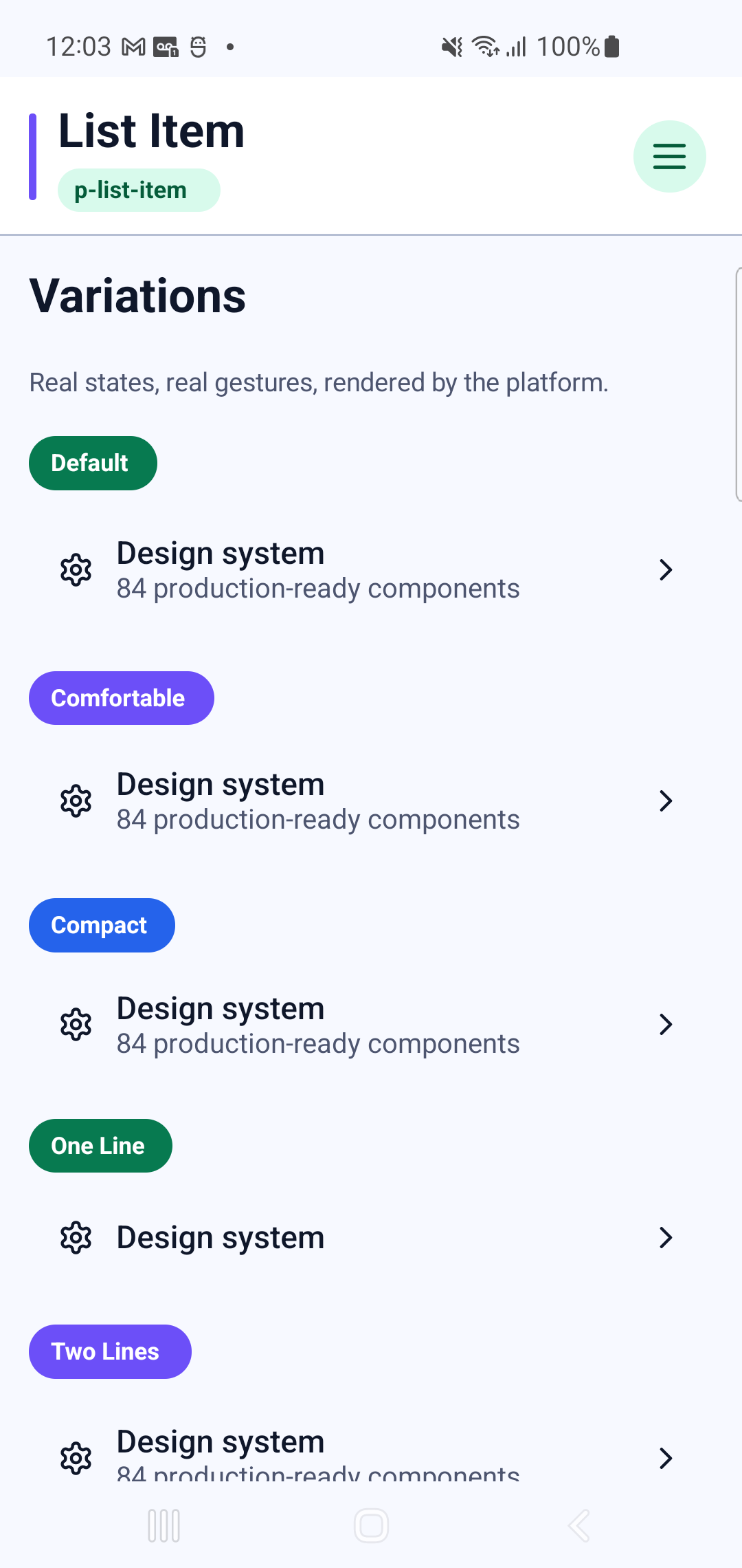
p-list-itemInteraction GIF 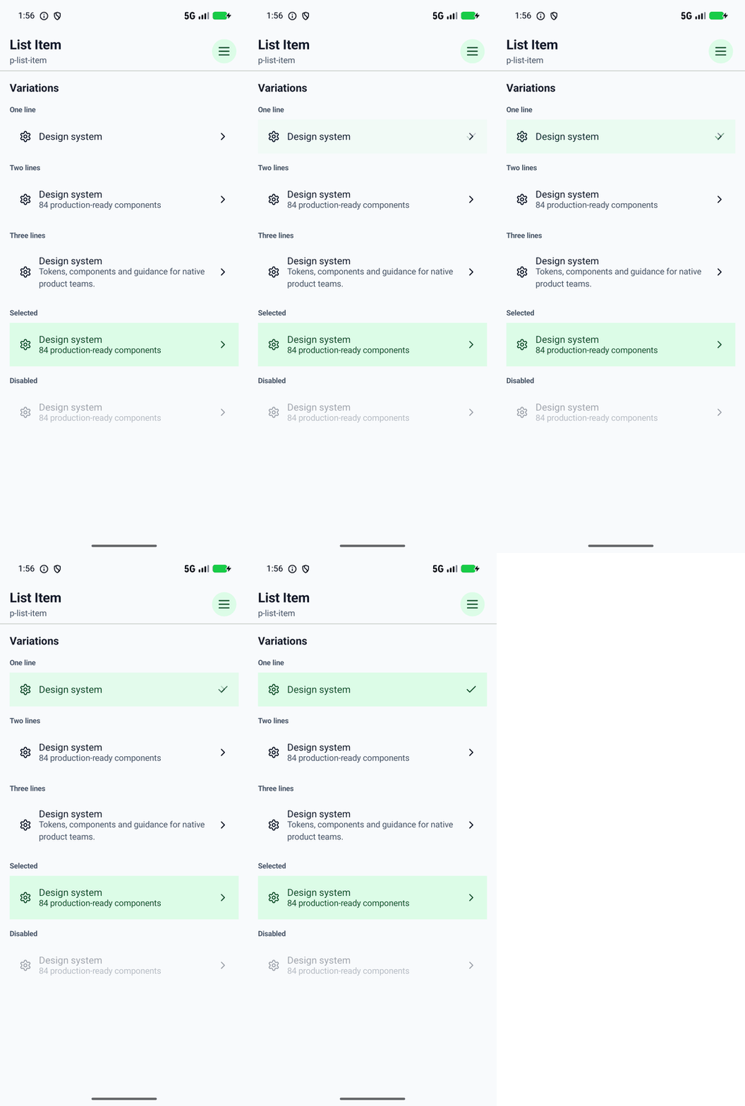
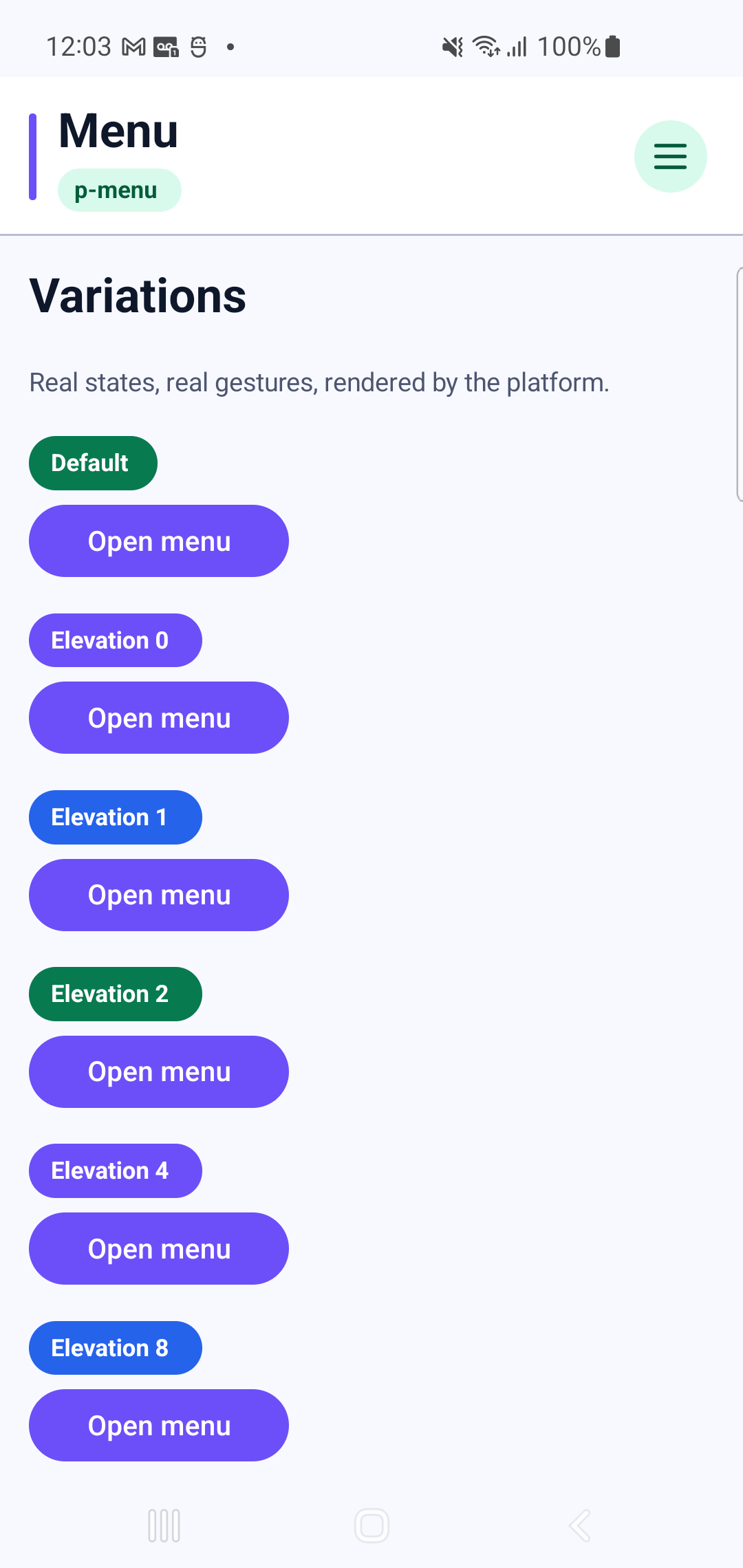
p-menuInteraction GIF 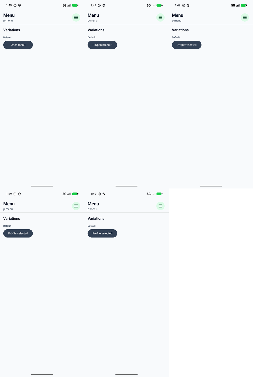
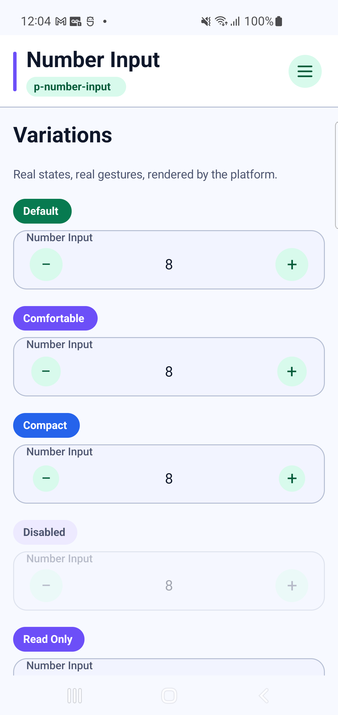
p-number-inputInteraction GIF 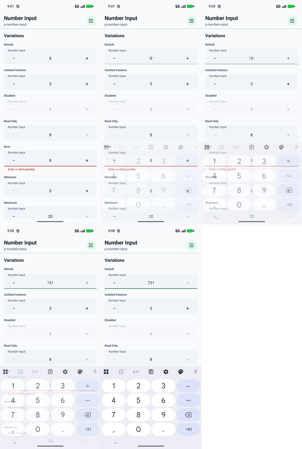
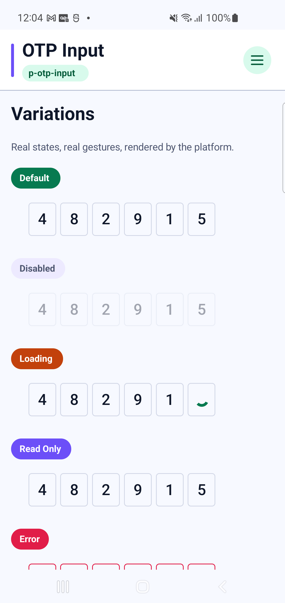
p-otp-inputInteraction GIF 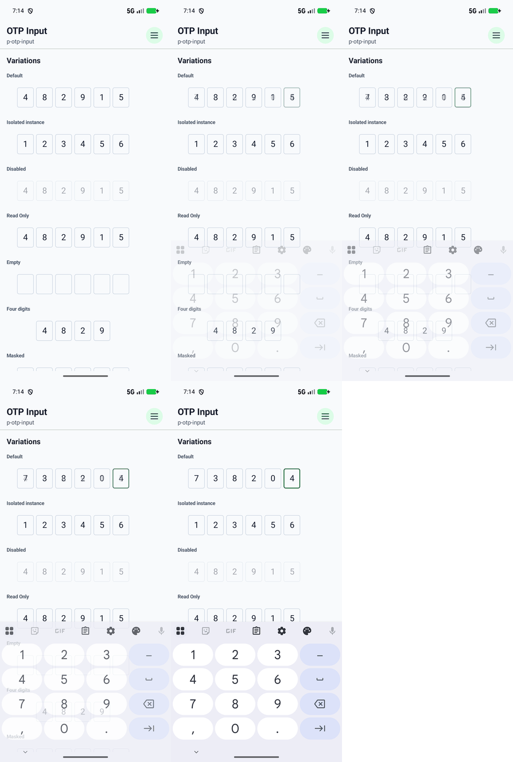
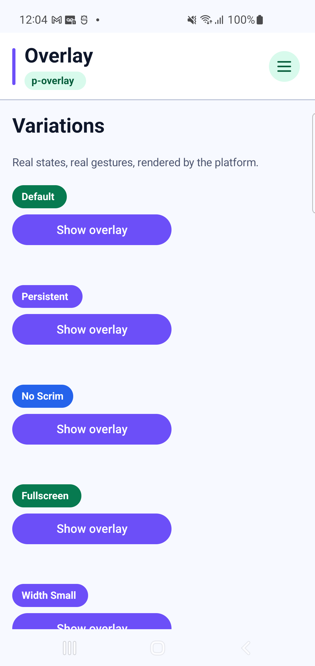
p-overlayInteraction GIF 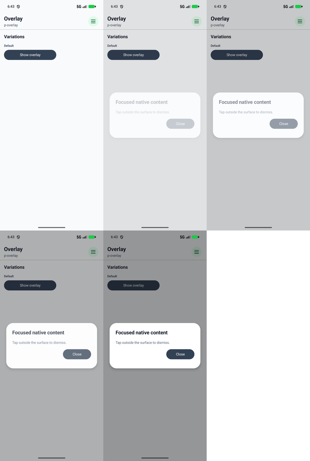
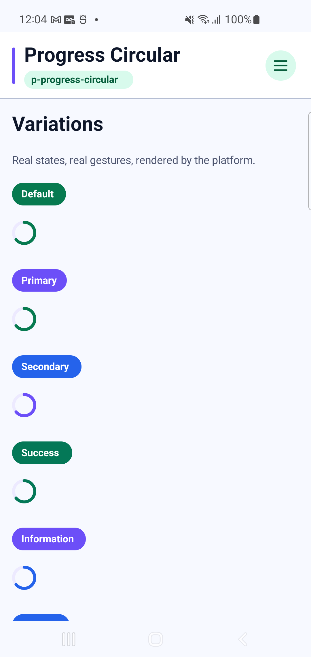
p-progress-circular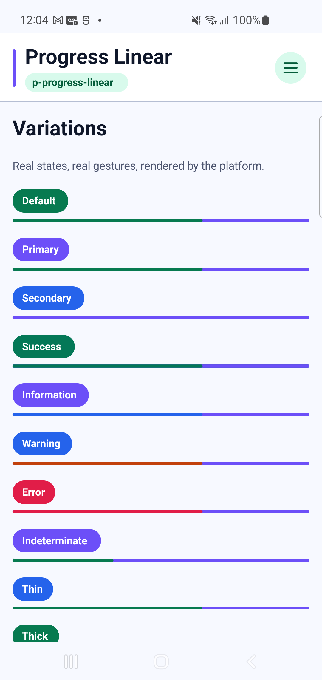
p-progress-linear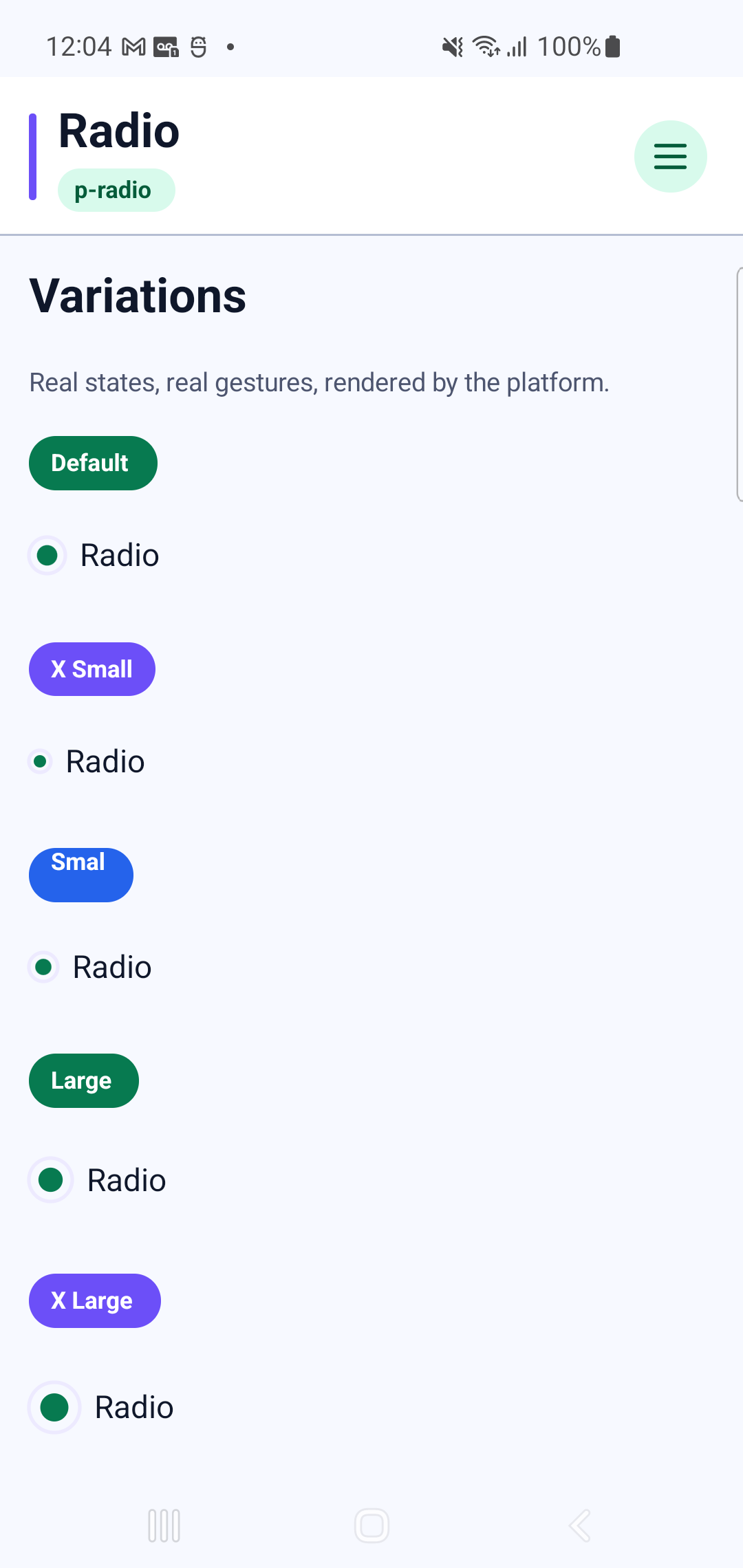
p-radioInteraction GIF 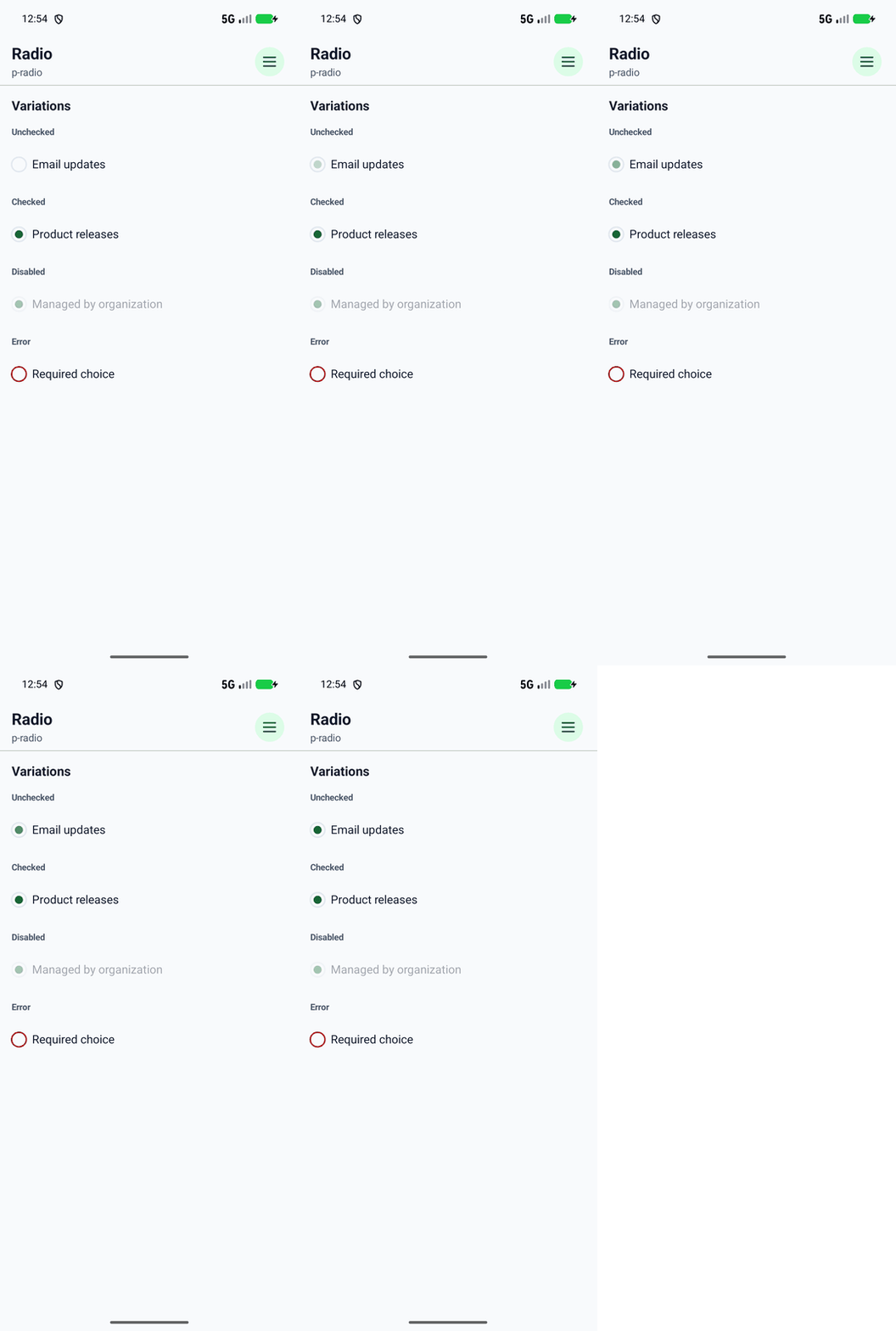
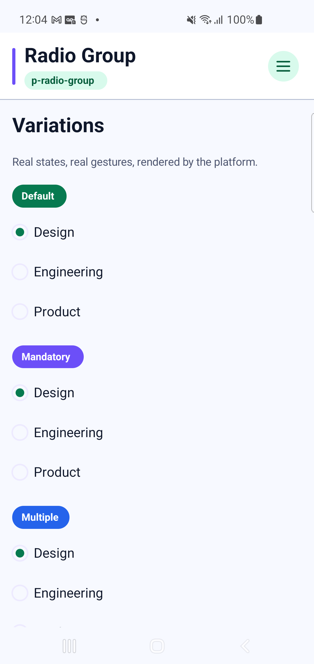
p-radio-groupInteraction GIF 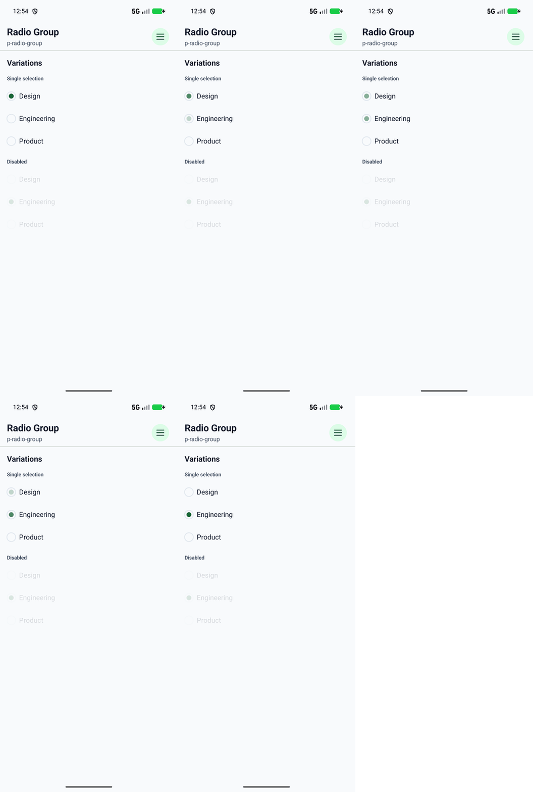
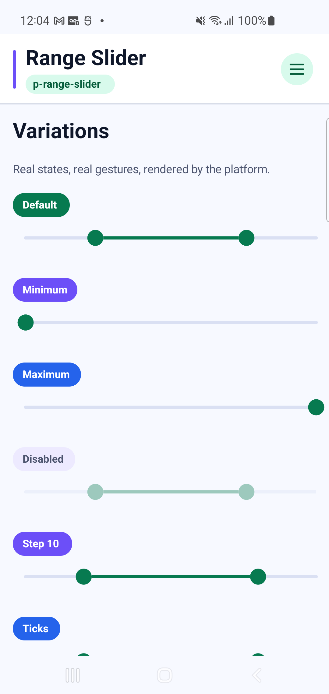
p-range-sliderInteraction GIF 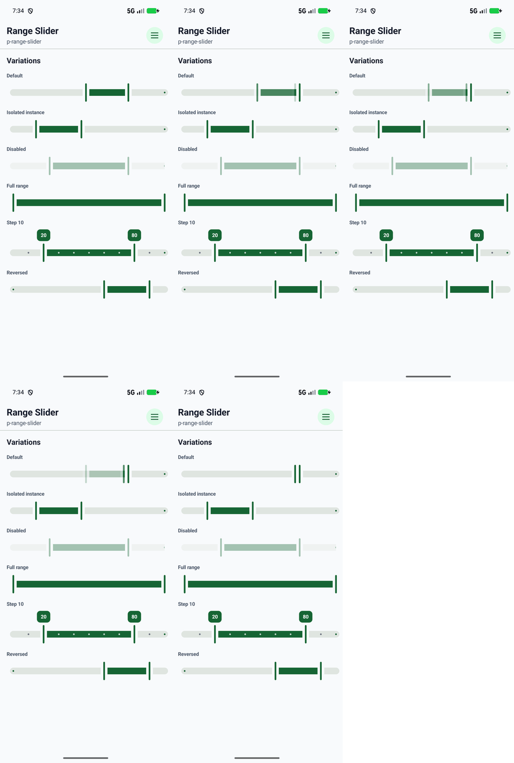
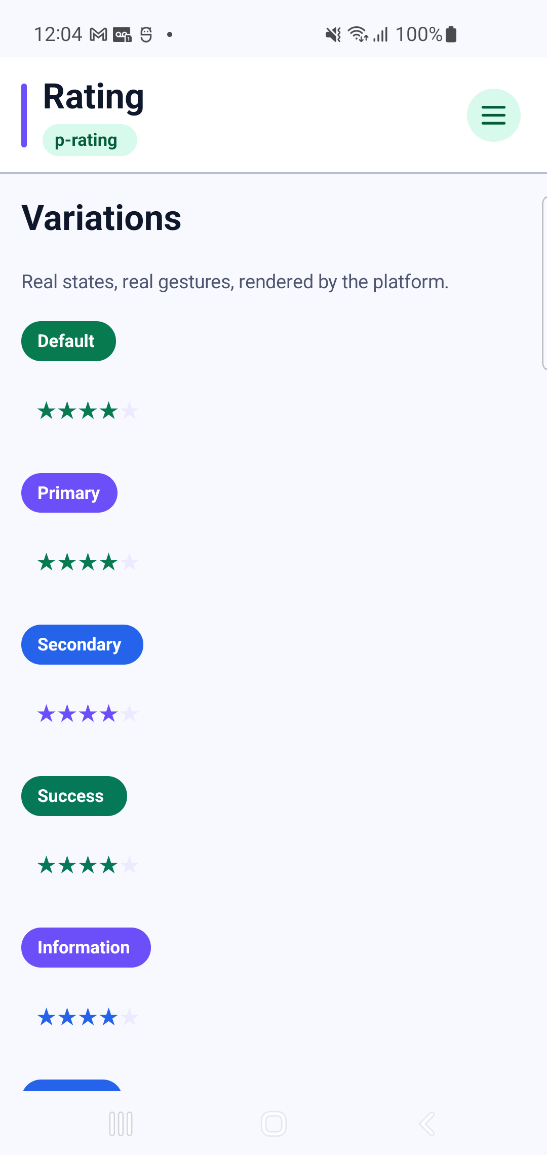
p-ratingInteraction GIF 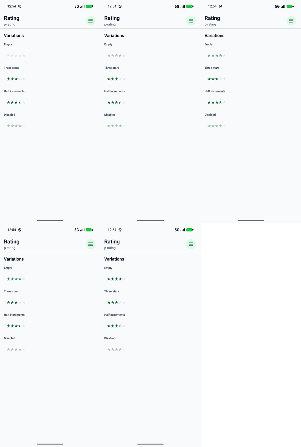
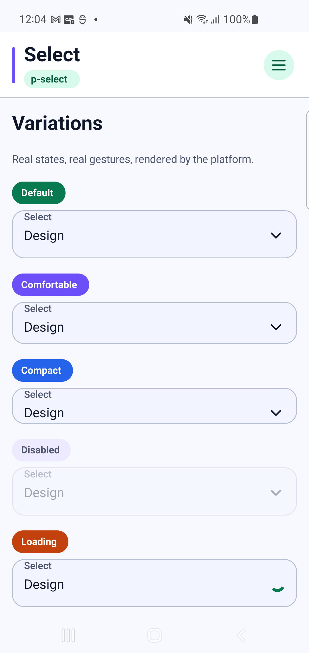
p-selectInteraction GIF 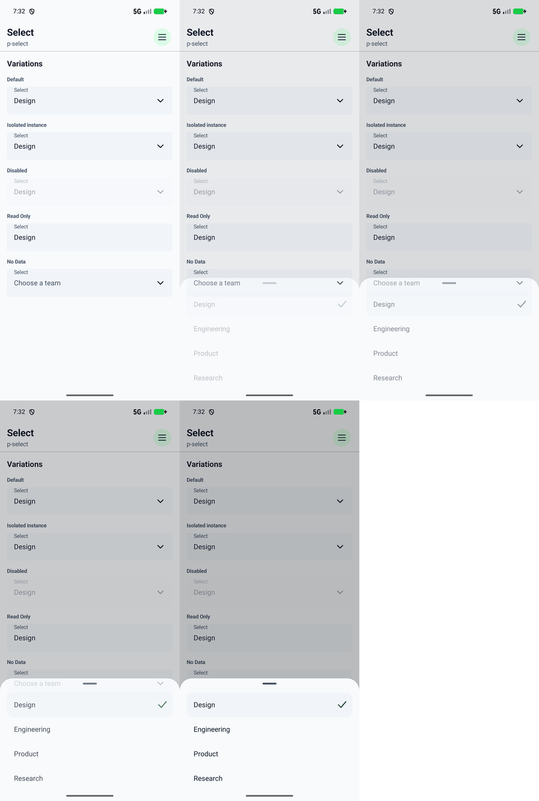
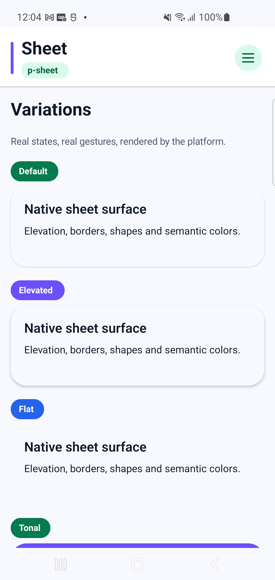
p-sheet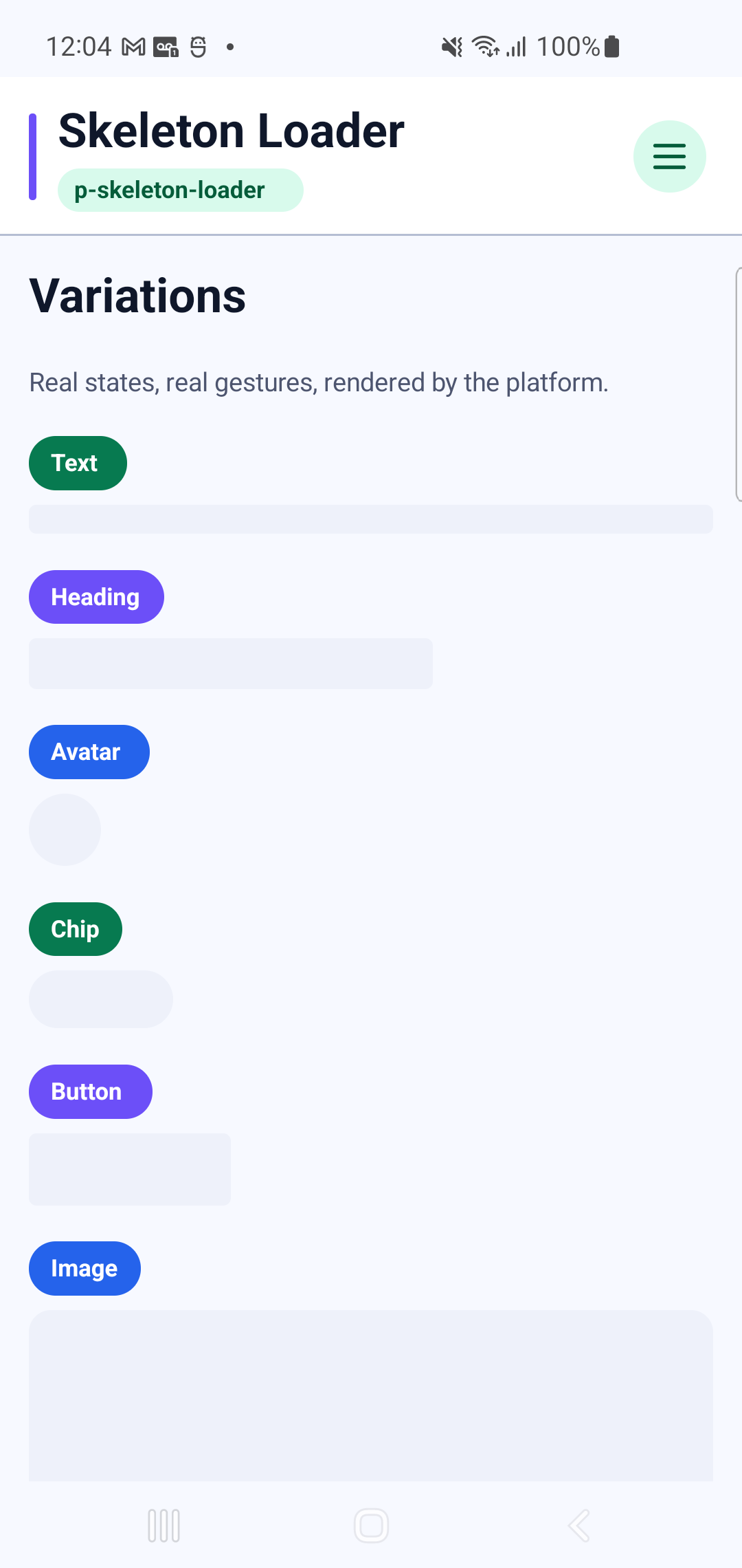
p-skeleton-loader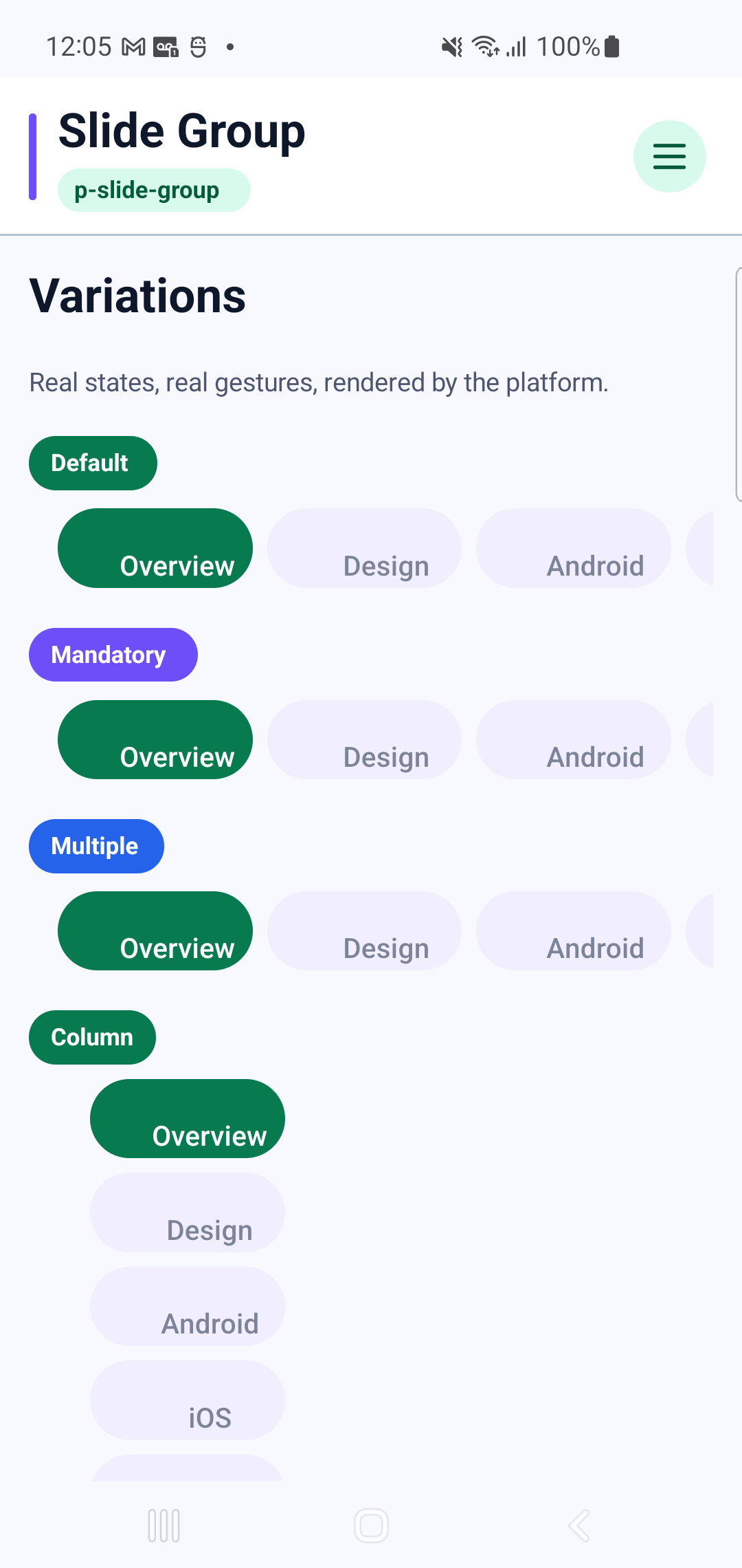
p-slide-groupInteraction GIF 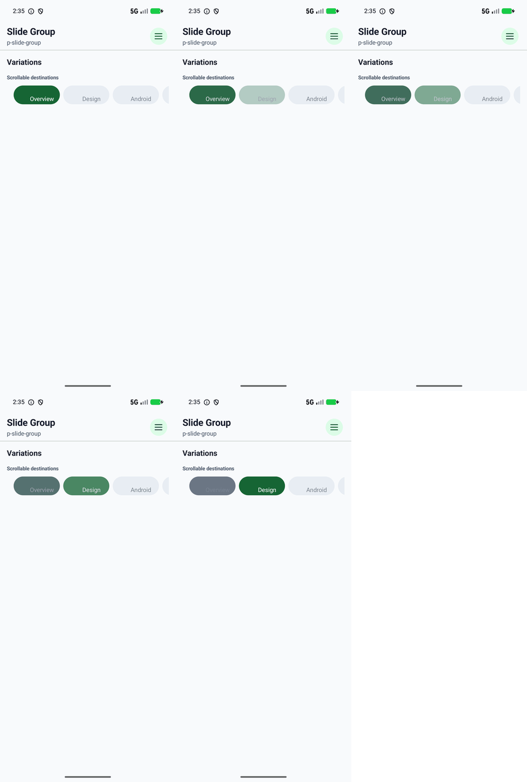
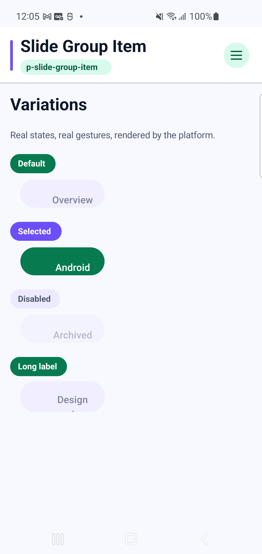
p-slide-group-itemInteraction GIF 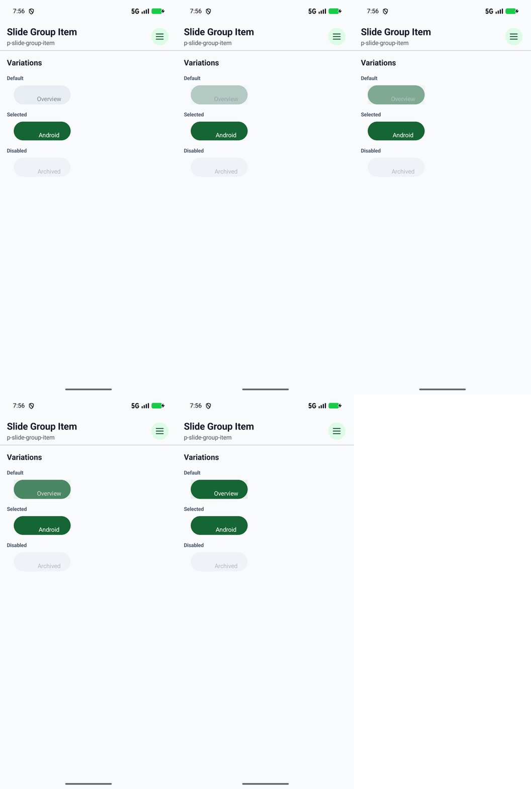
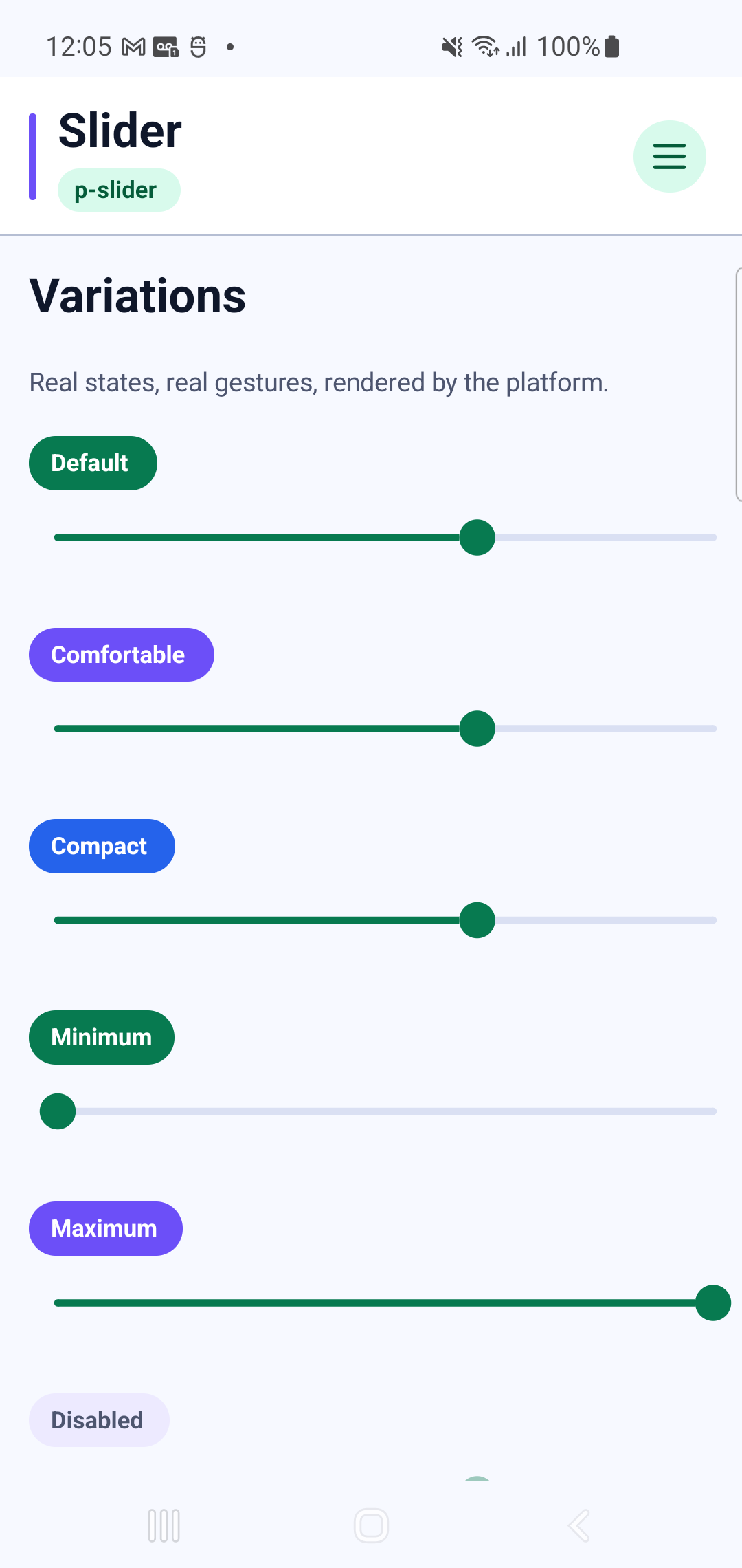
p-sliderInteraction GIF 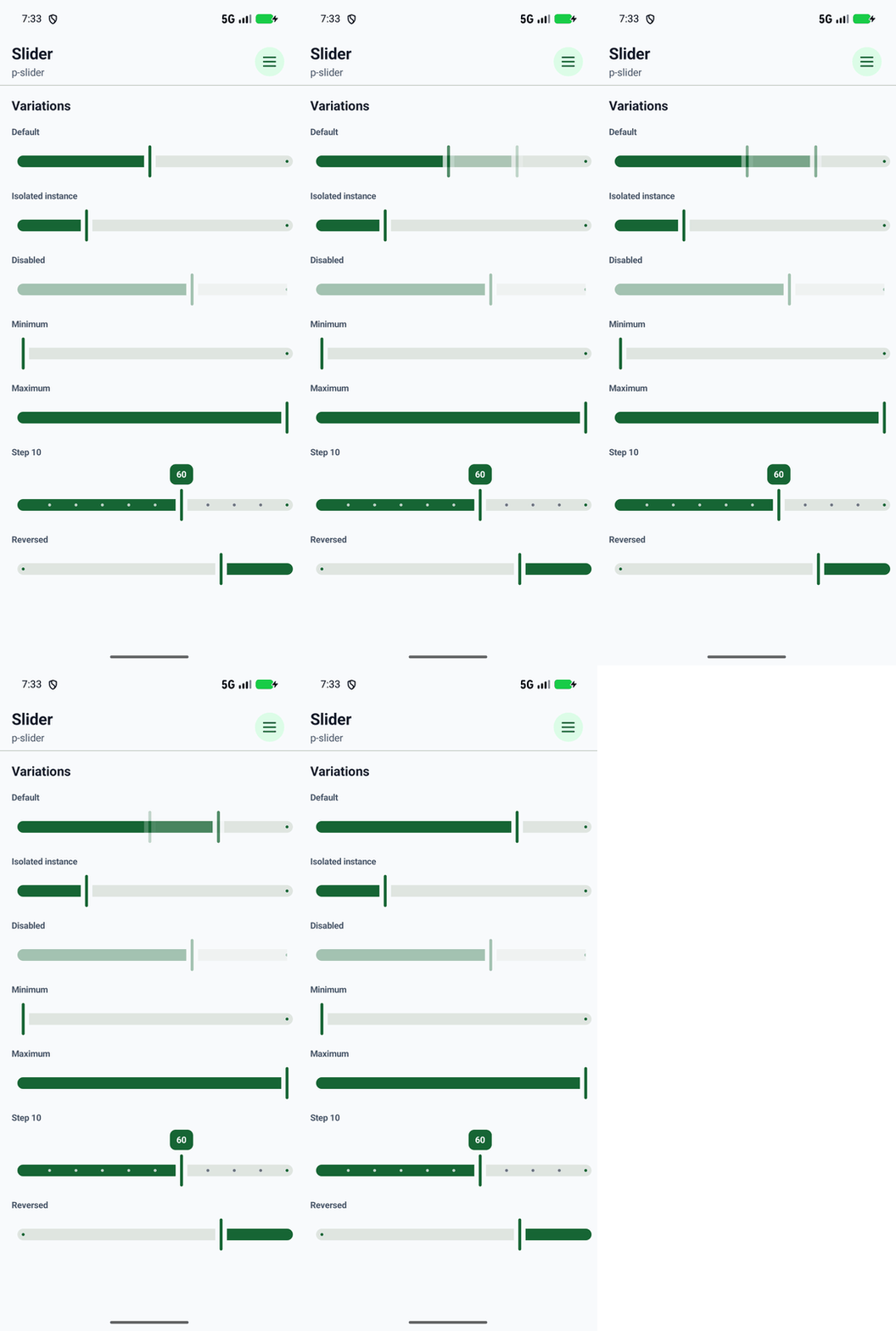
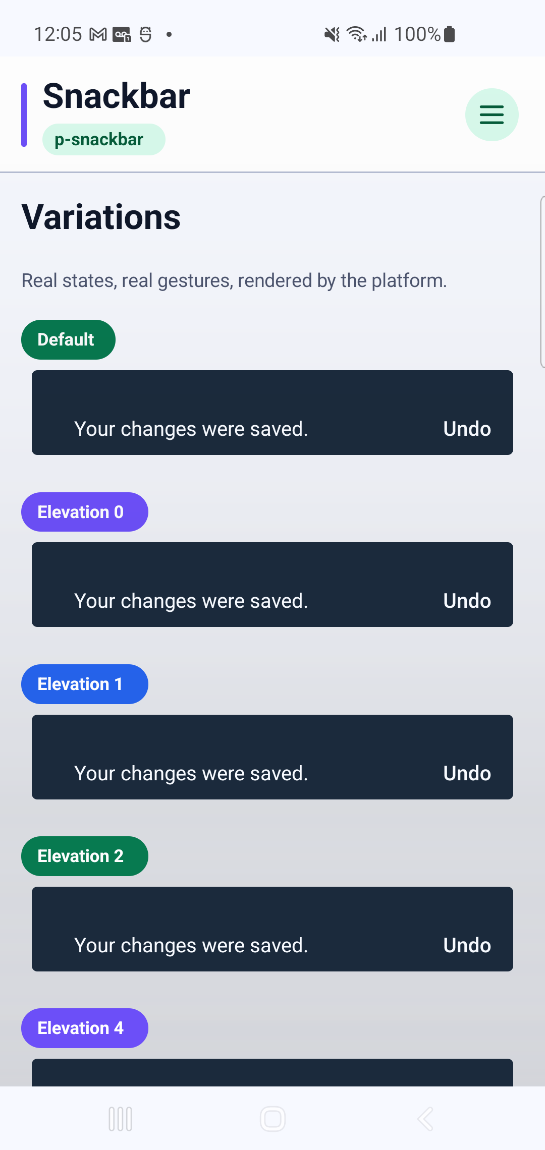
p-snackbarInteraction GIF 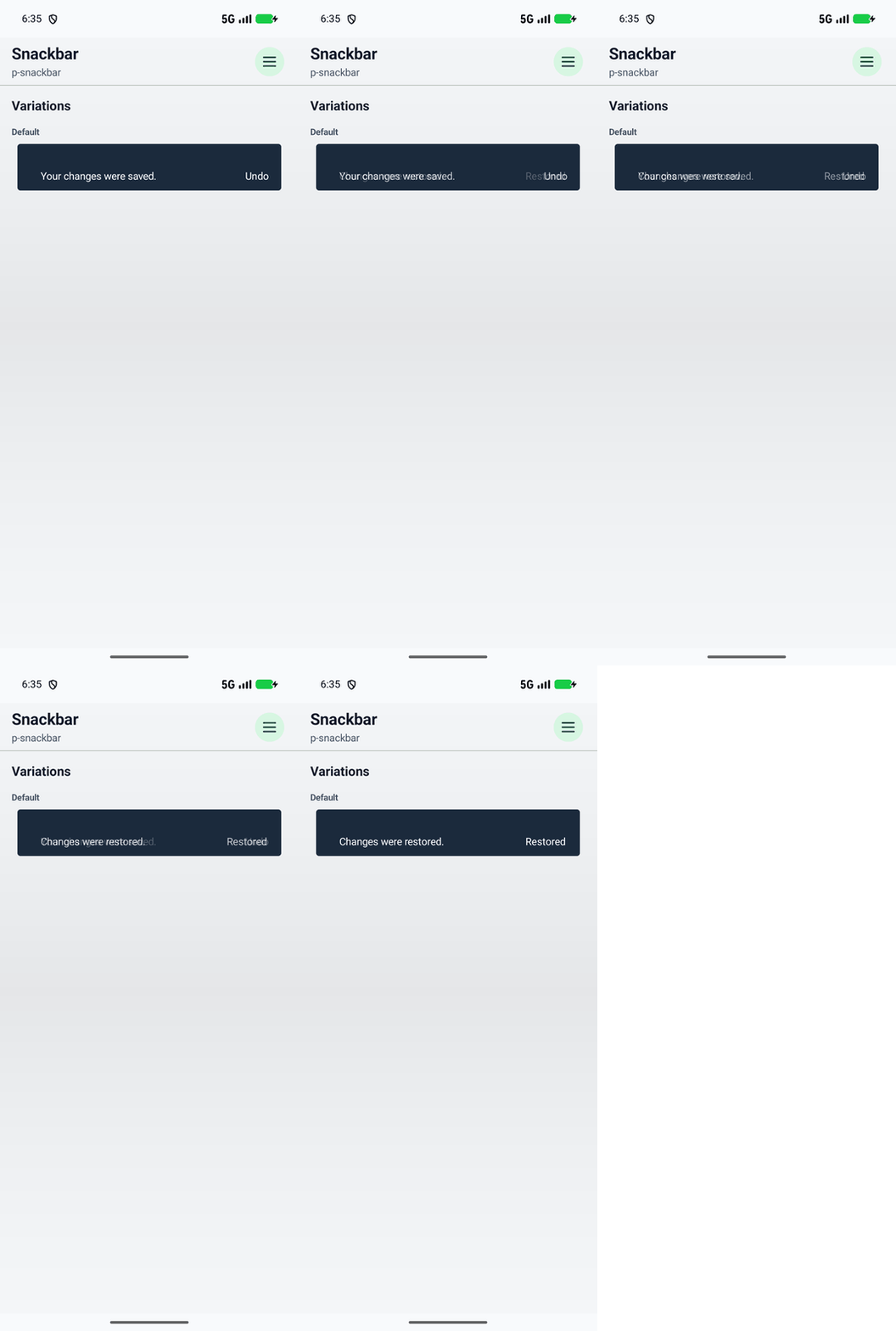
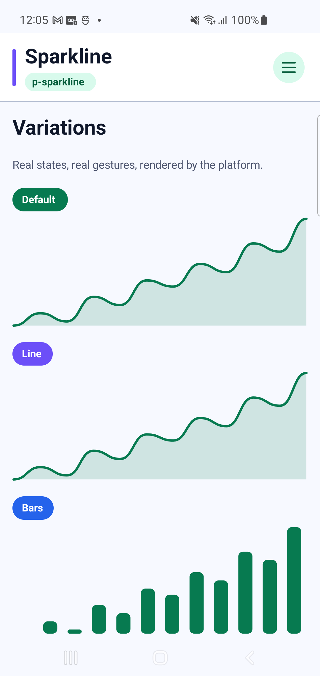
p-sparkline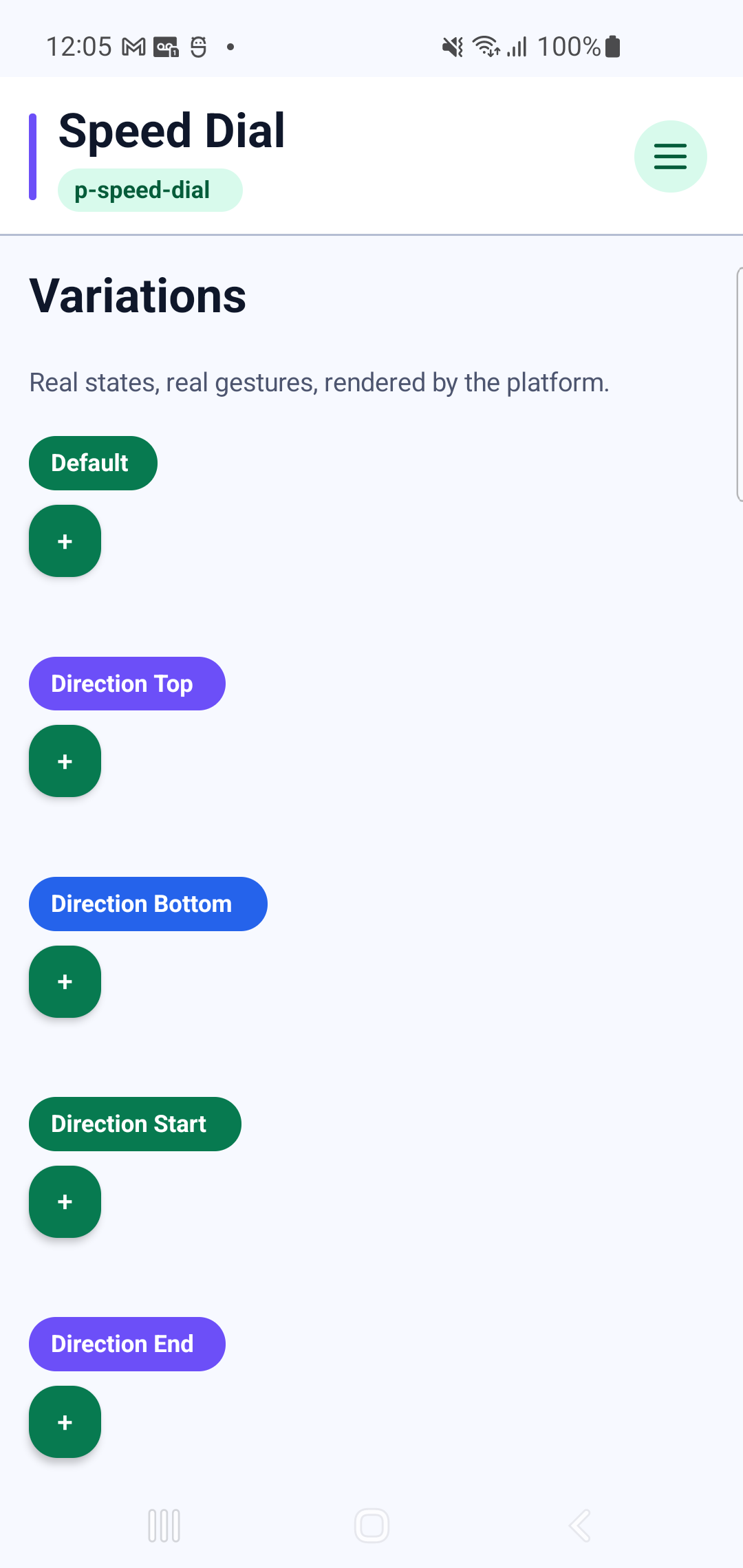
p-speed-dialInteraction GIF 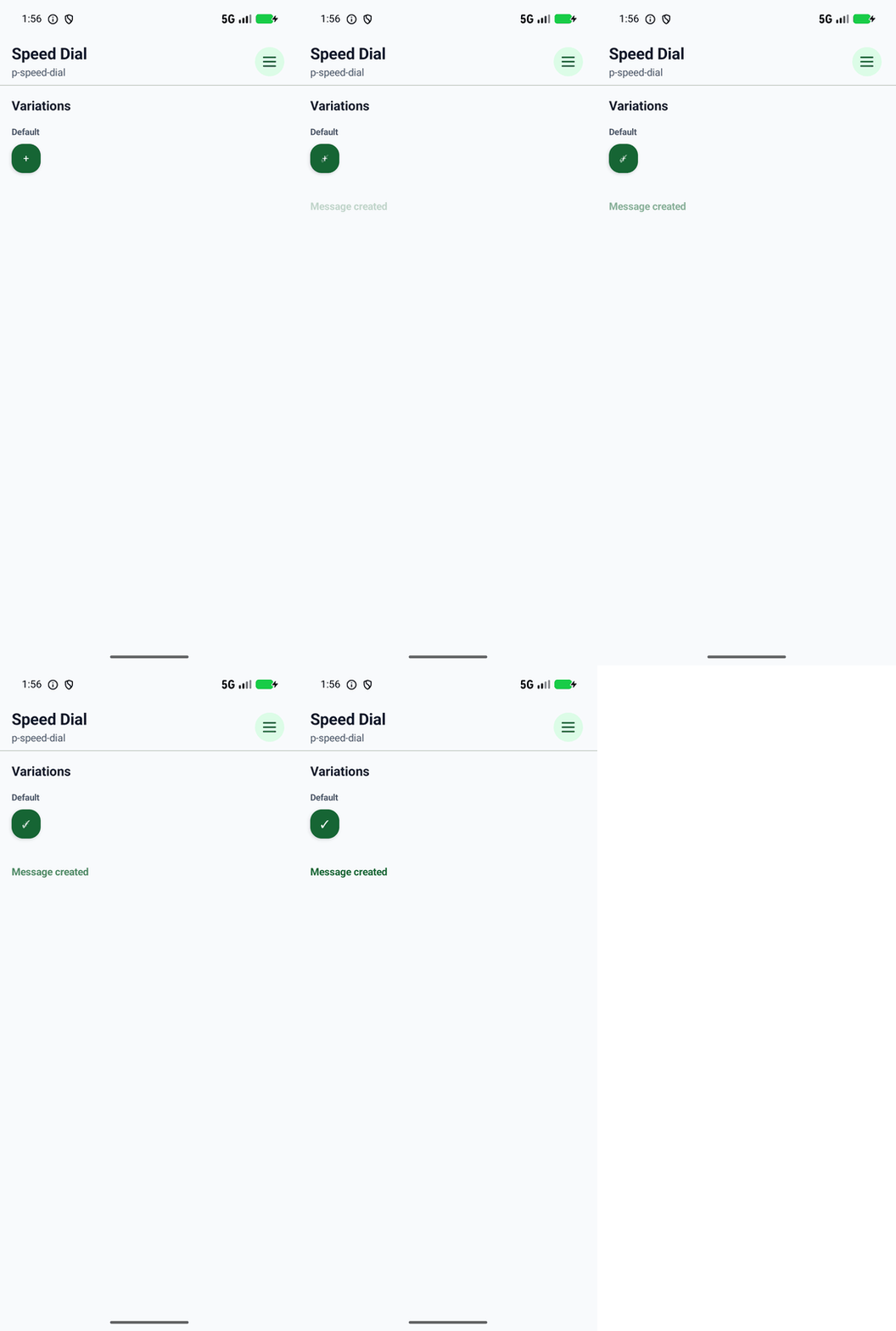
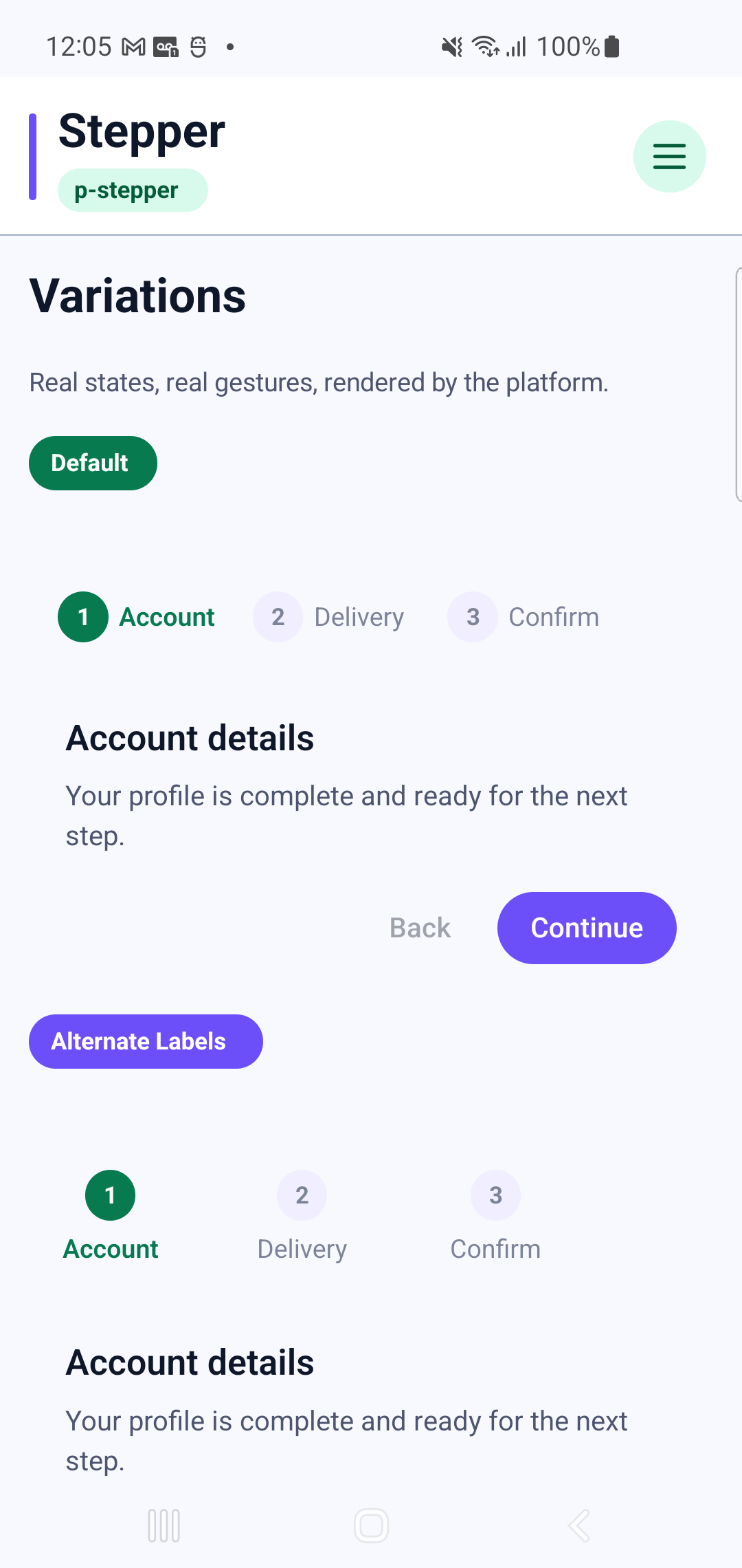
p-stepperInteraction GIF 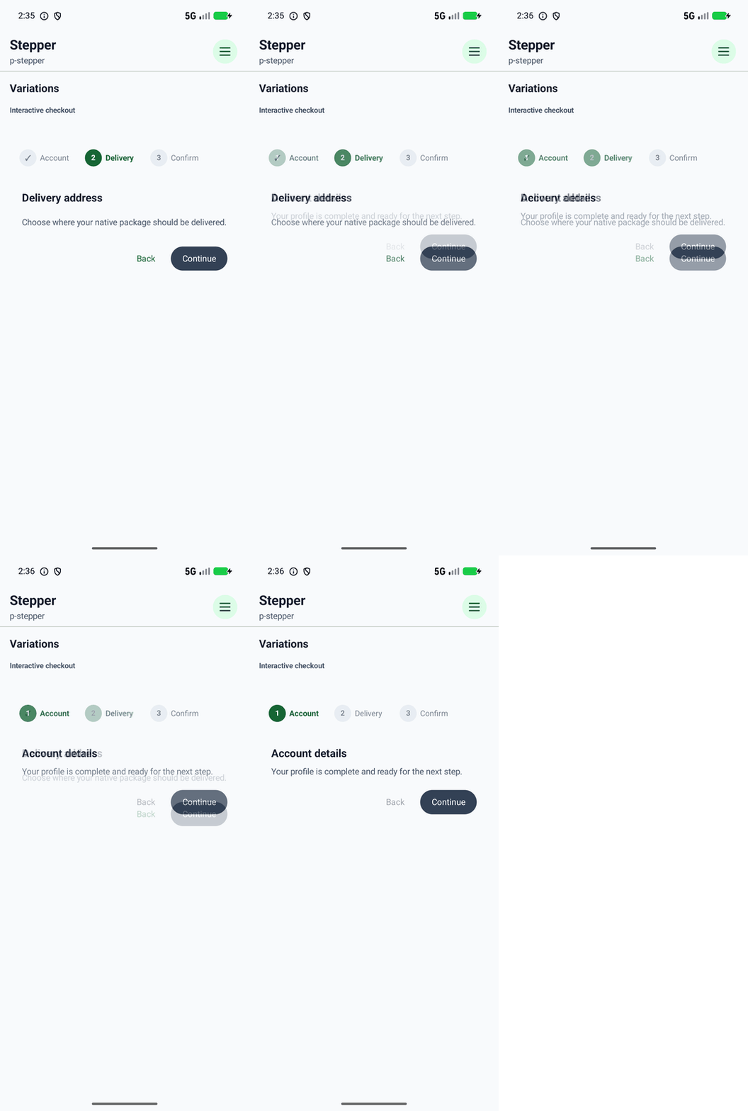
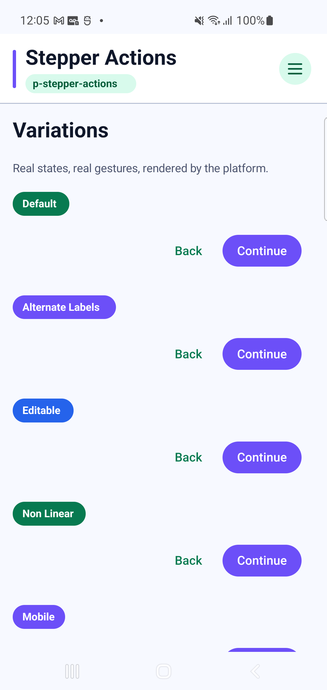
p-stepper-actionsInteraction GIF 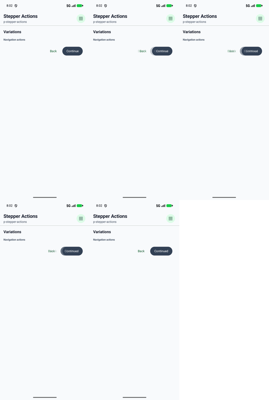
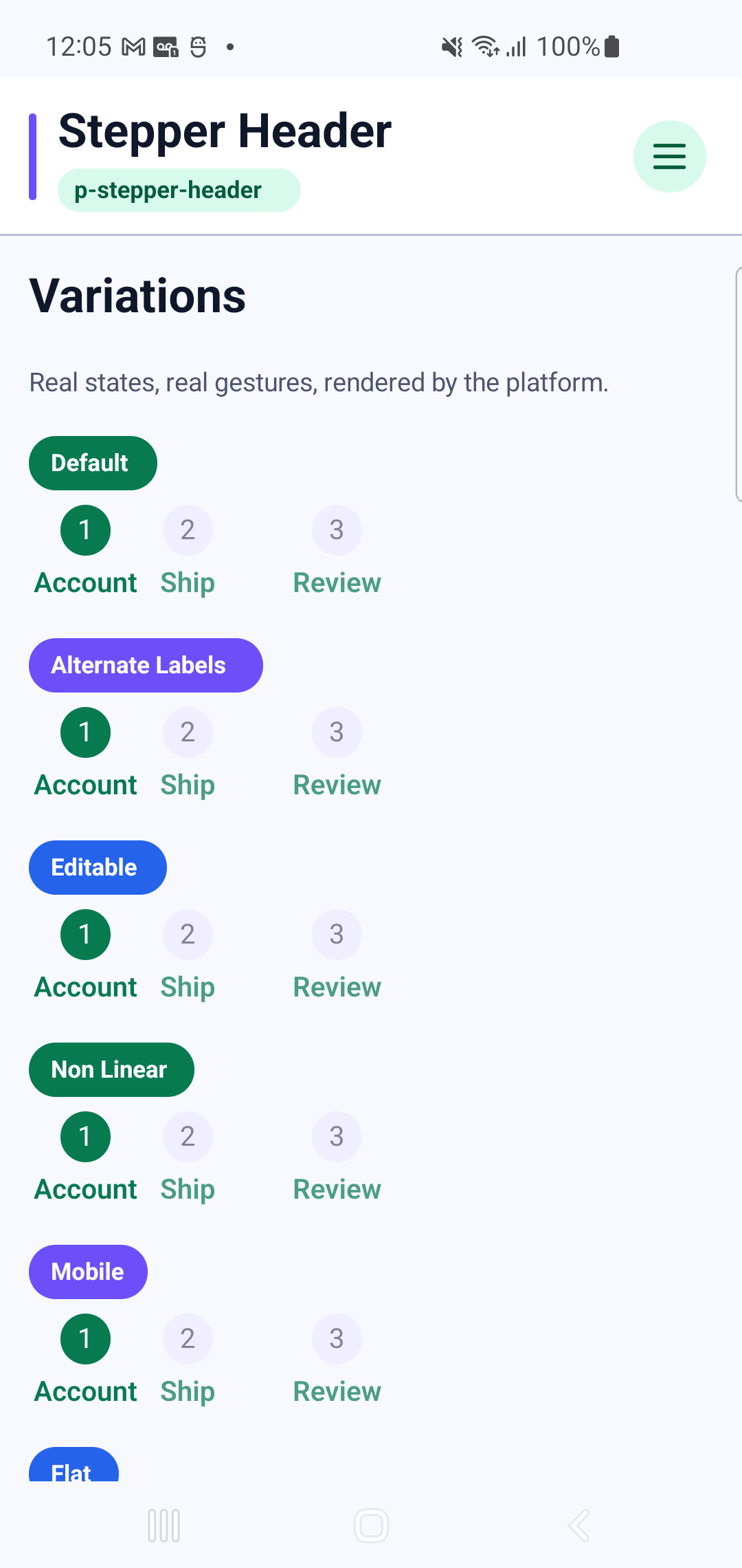
p-stepper-header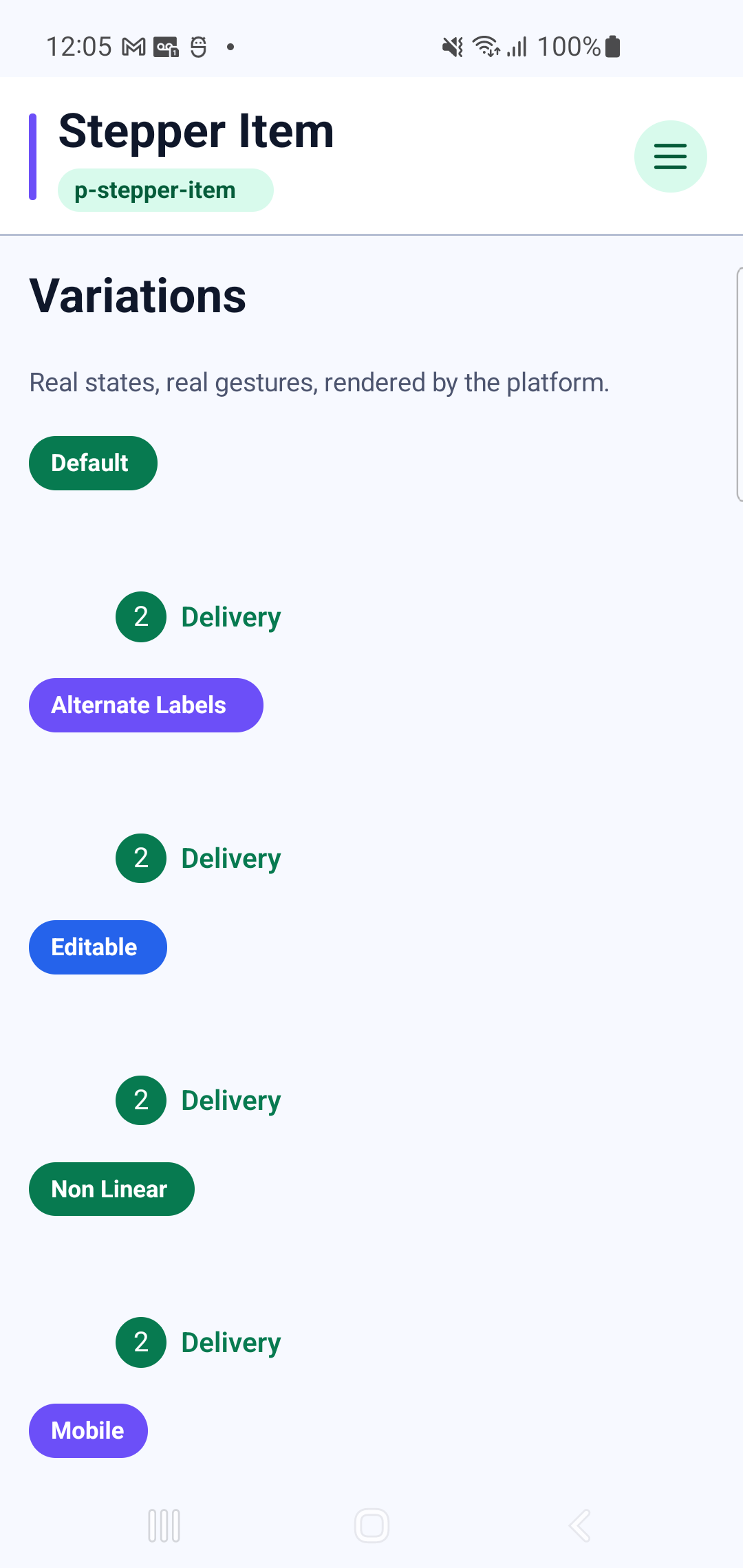
p-stepper-itemInteraction GIF 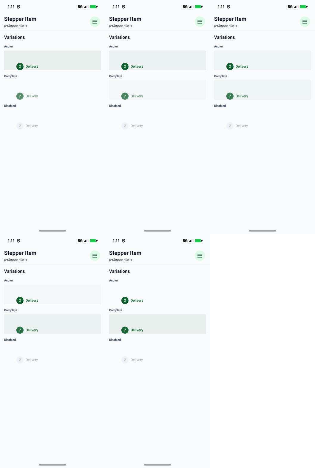
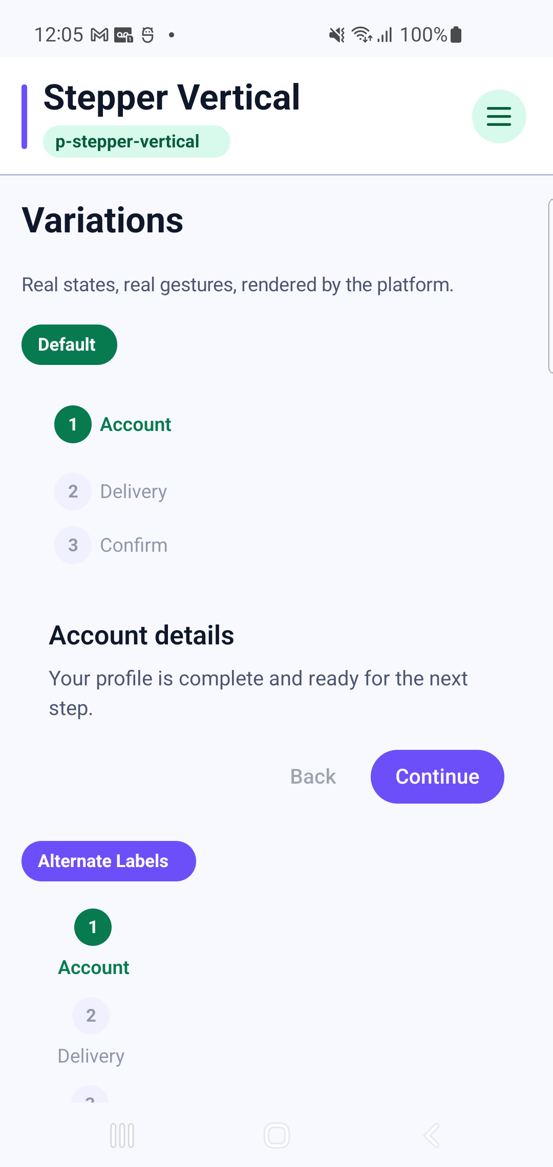
p-stepper-verticalInteraction GIF 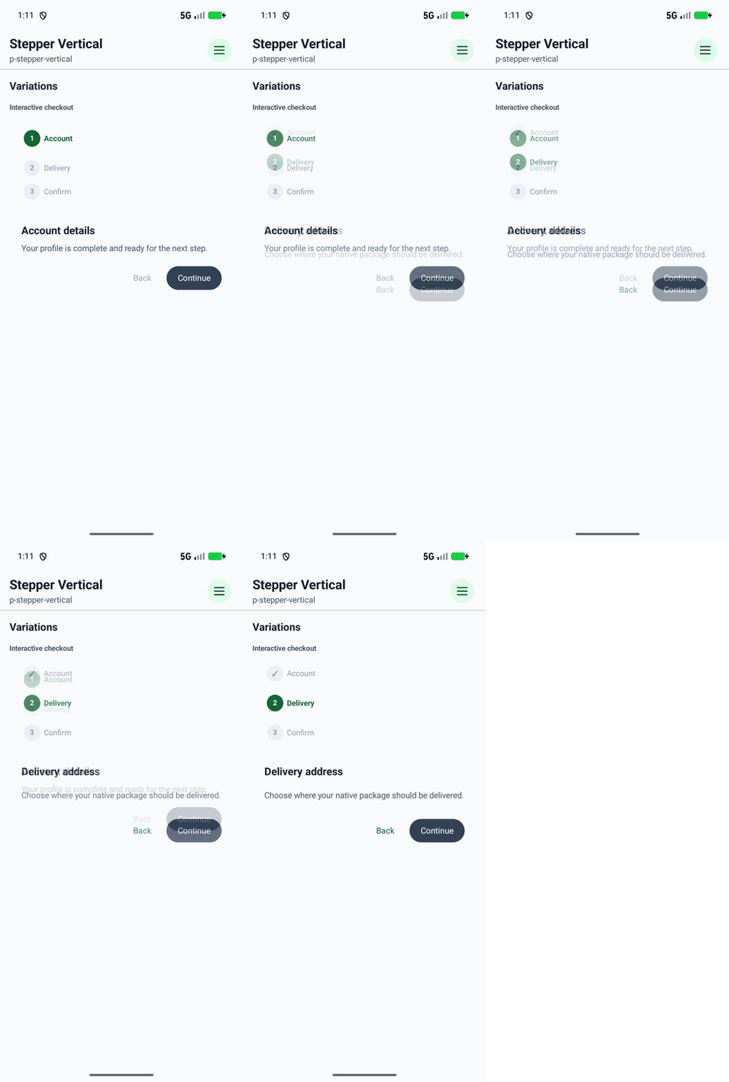
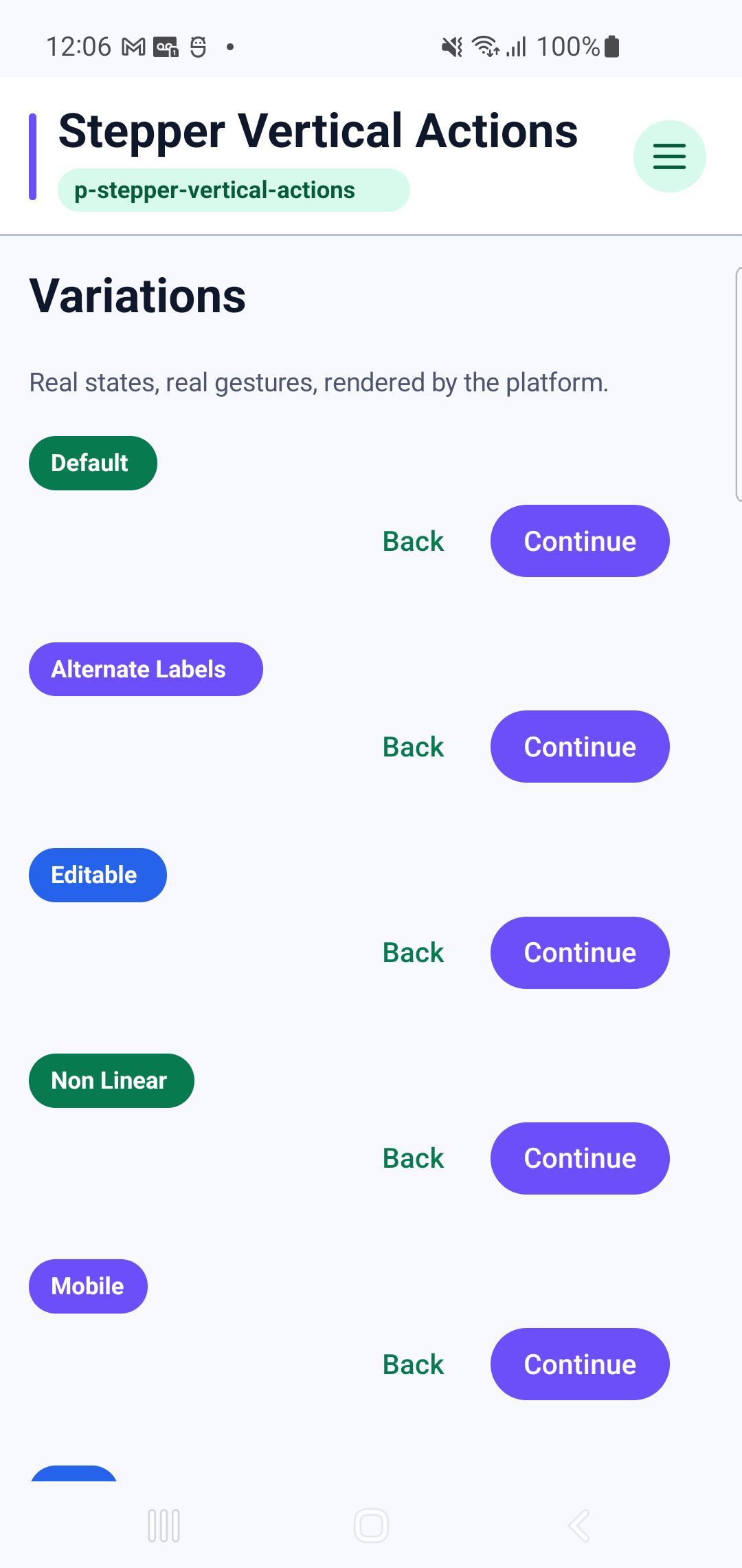
p-stepper-vertical-actionsInteraction GIF 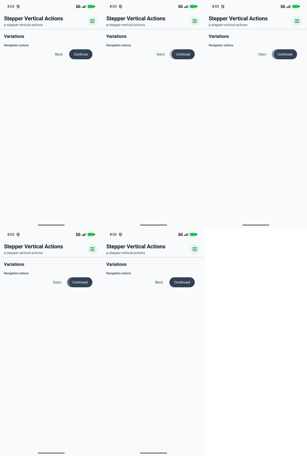
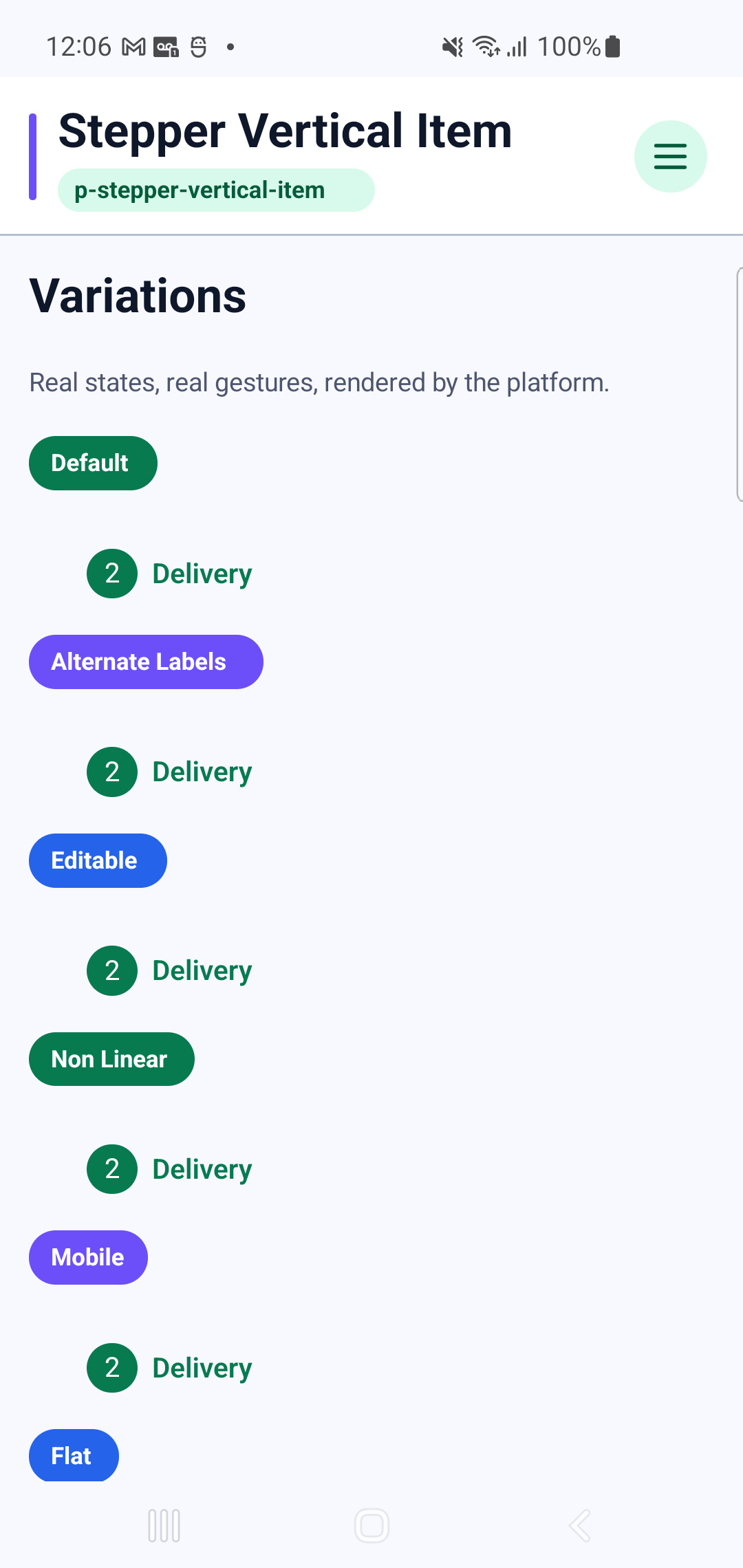
p-stepper-vertical-itemInteraction GIF 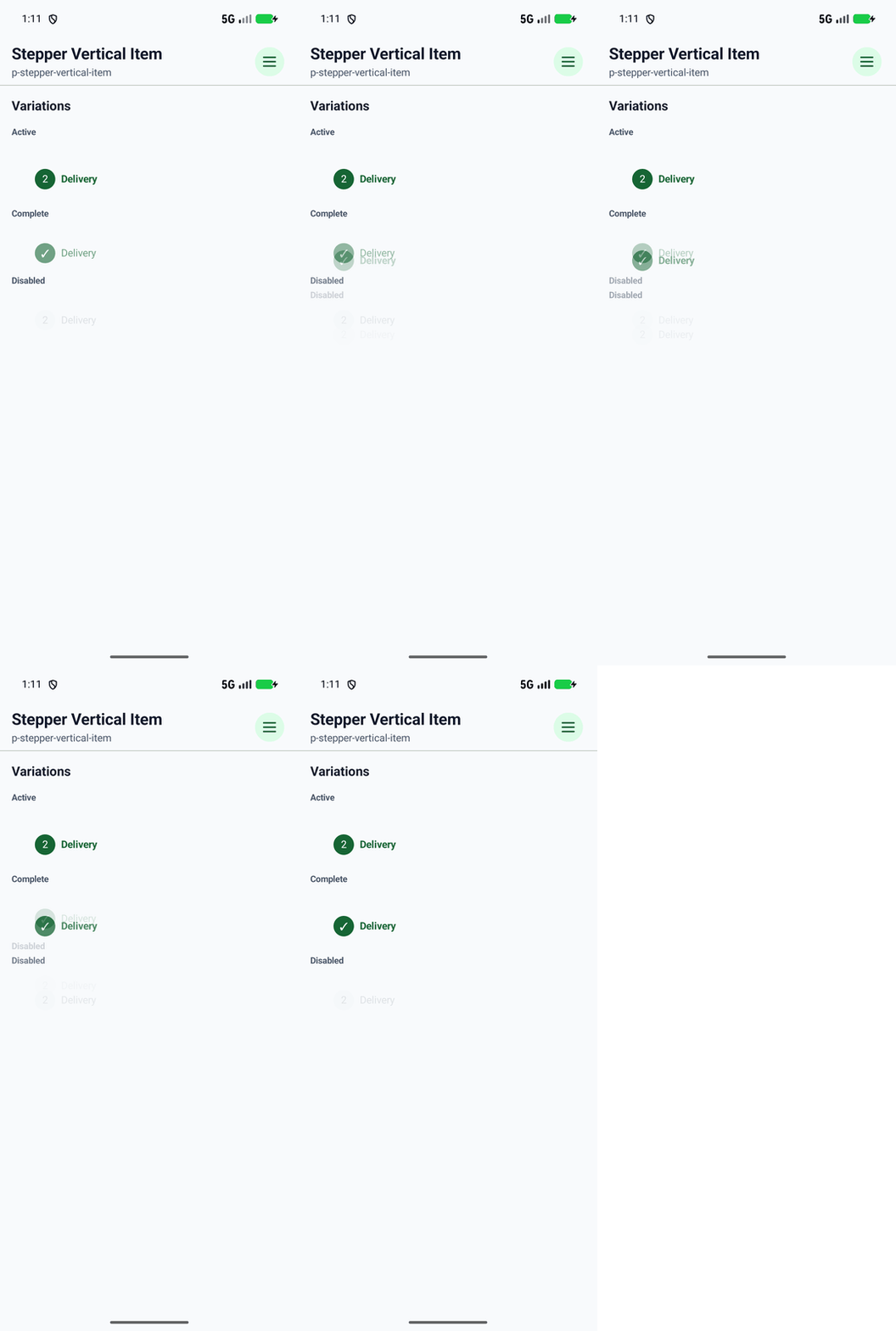
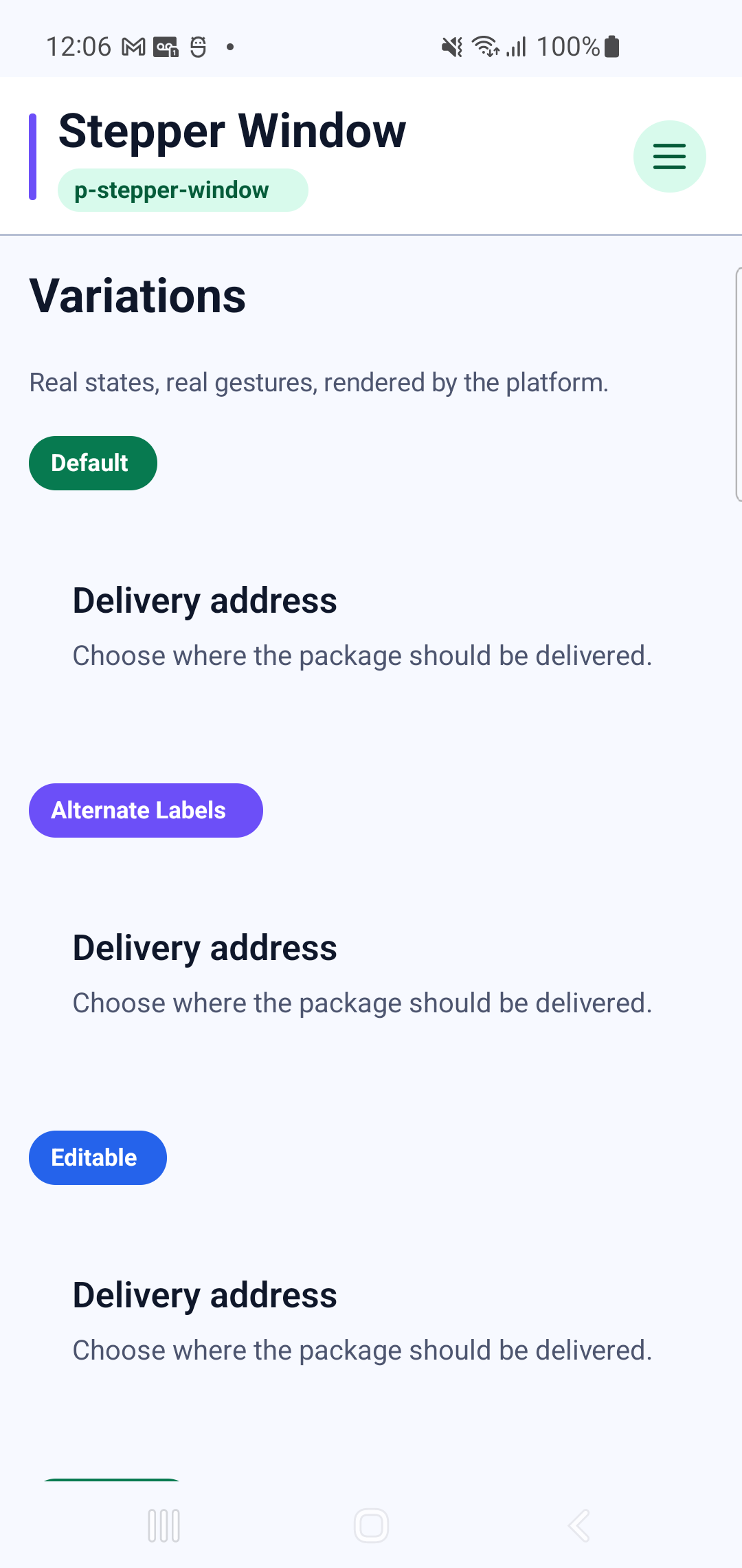
p-stepper-windowInteraction GIF 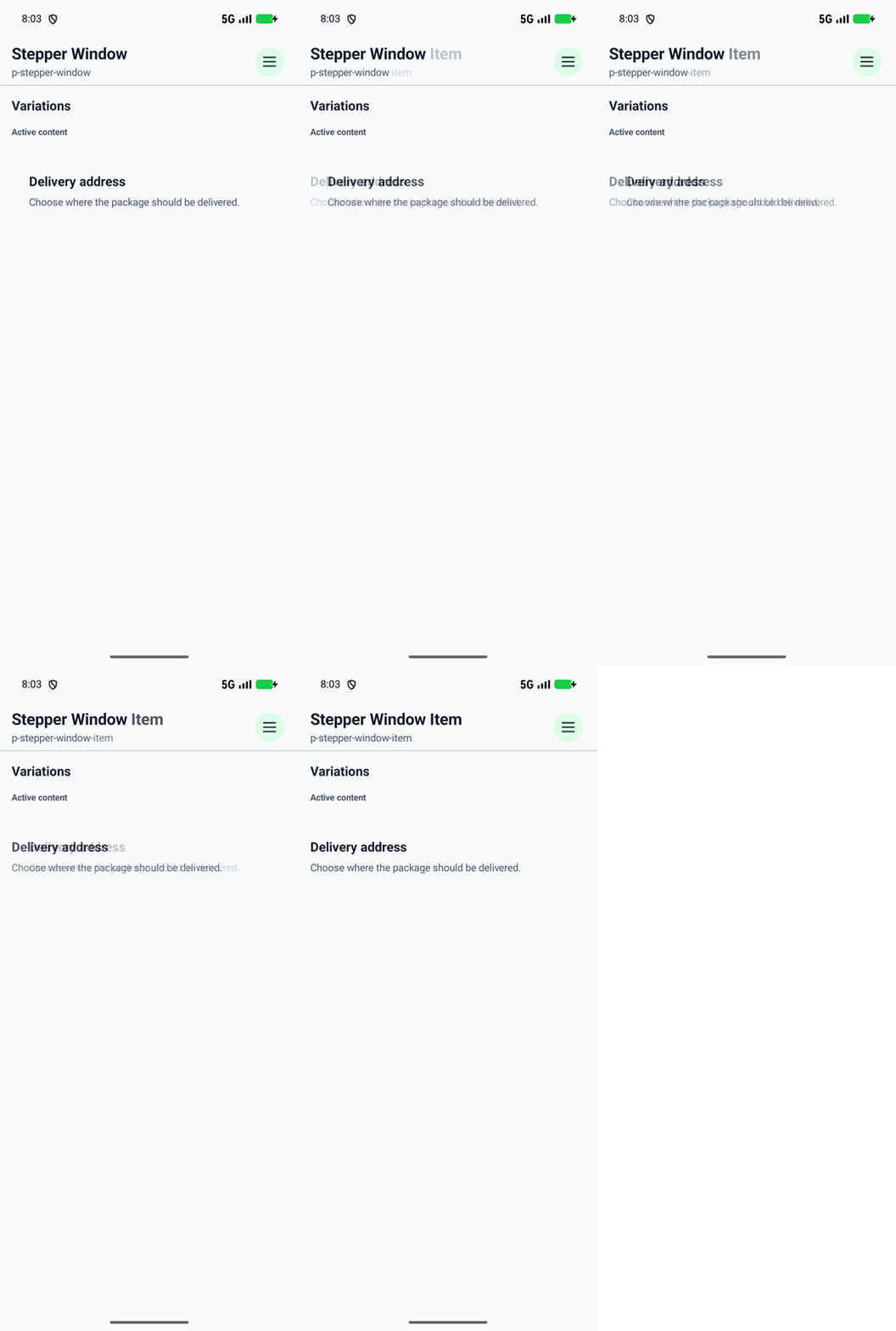
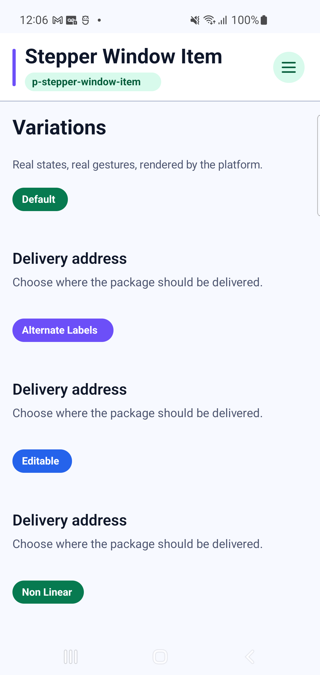
p-stepper-window-item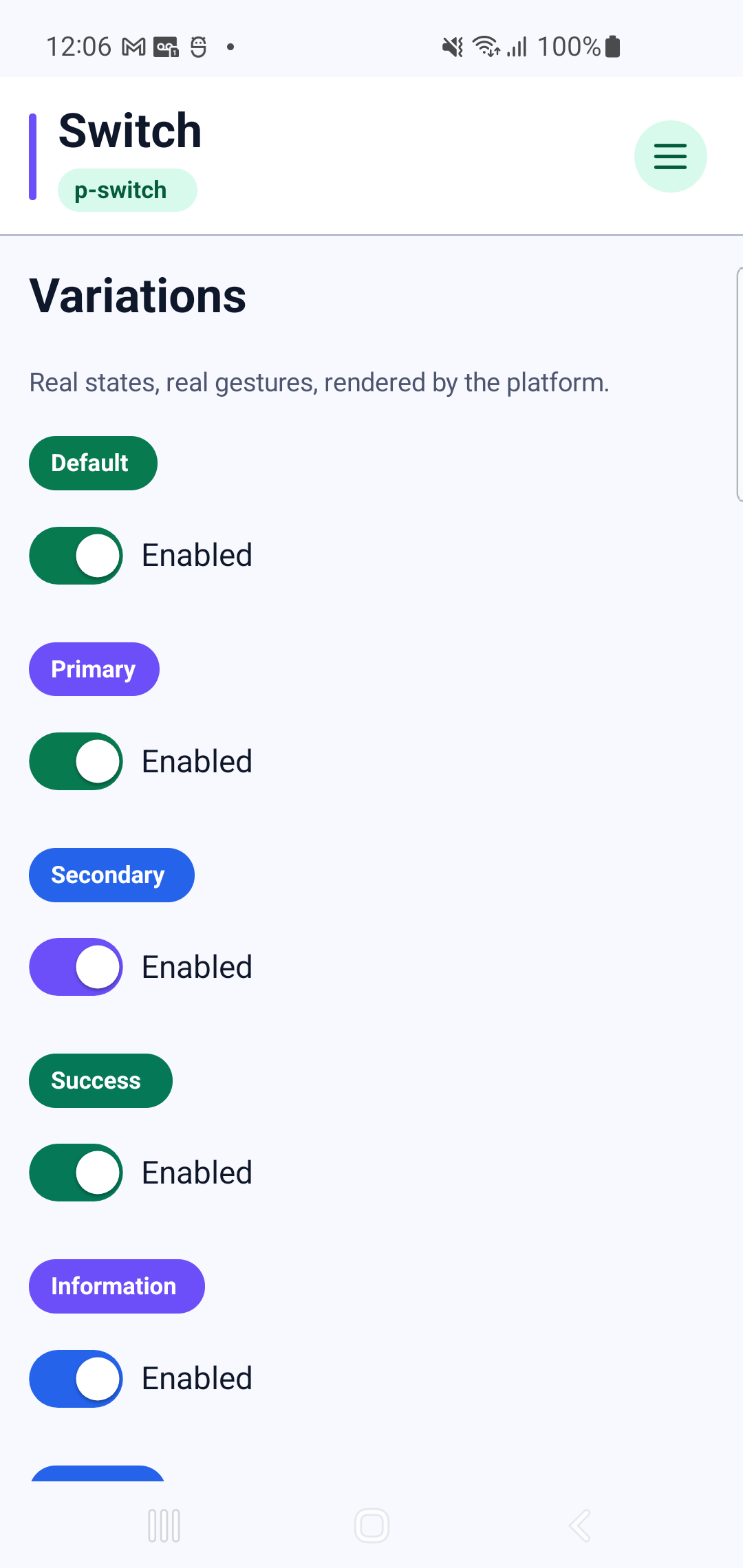
p-switchInteraction GIF 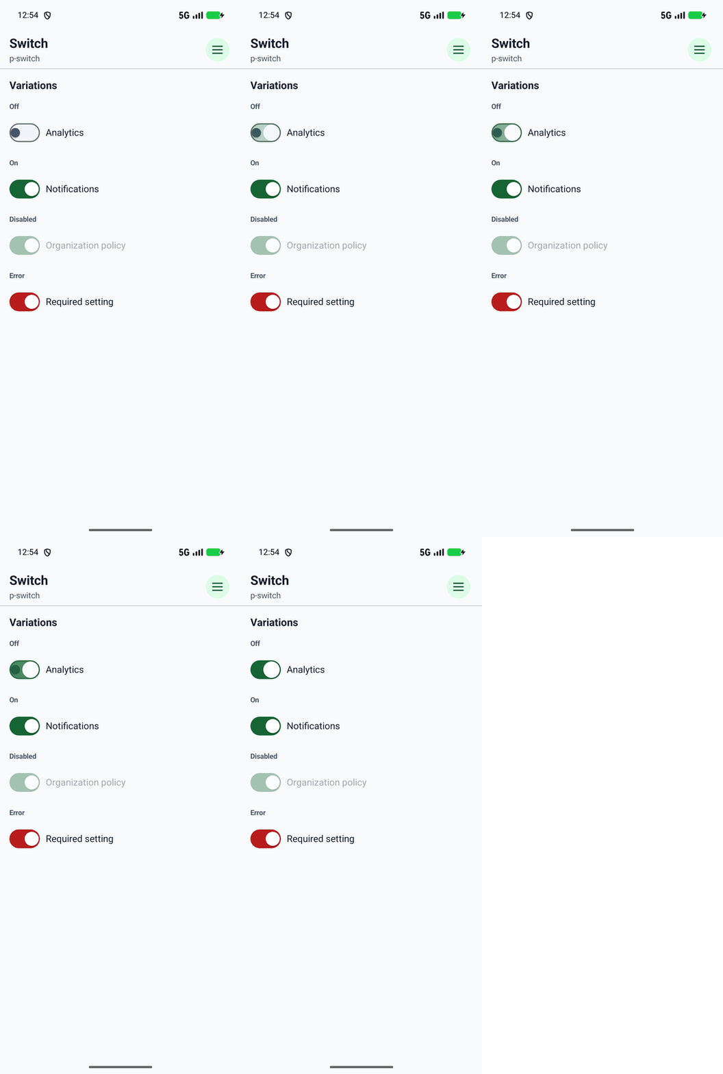
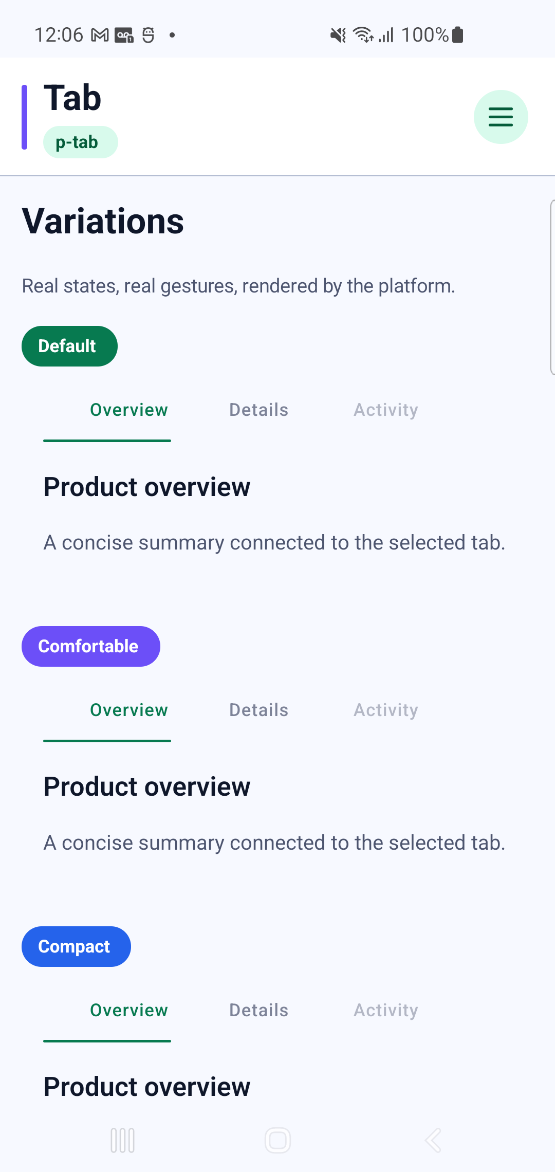
p-tabInteraction GIF 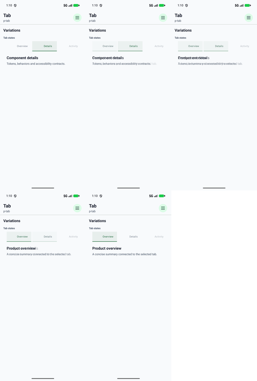
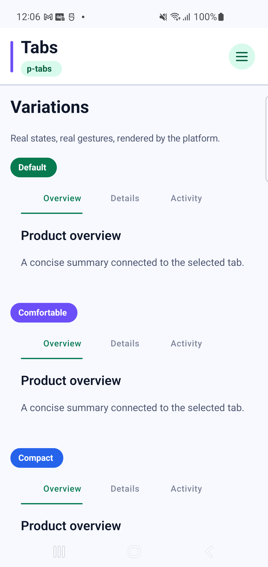
p-tabsInteraction GIF 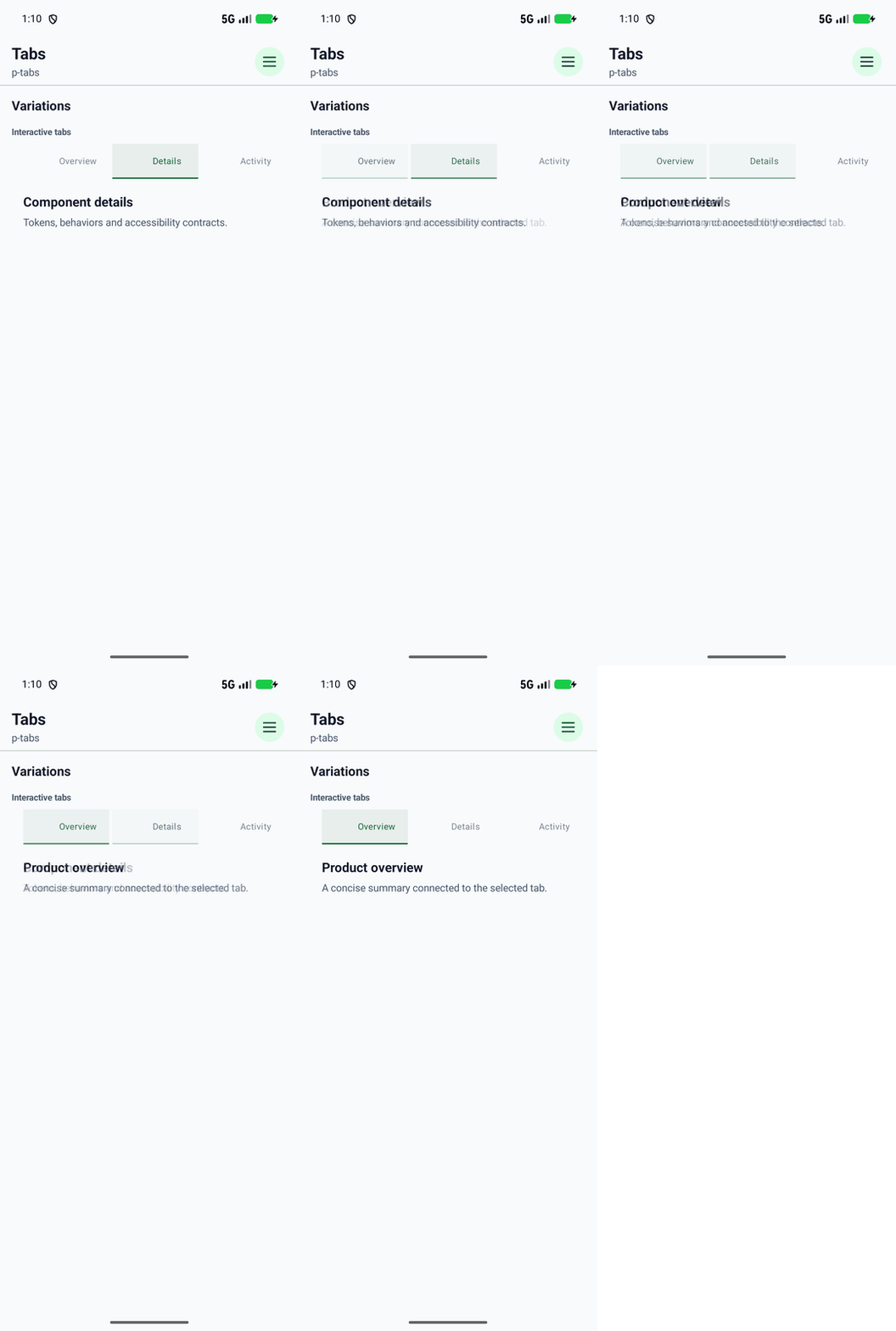
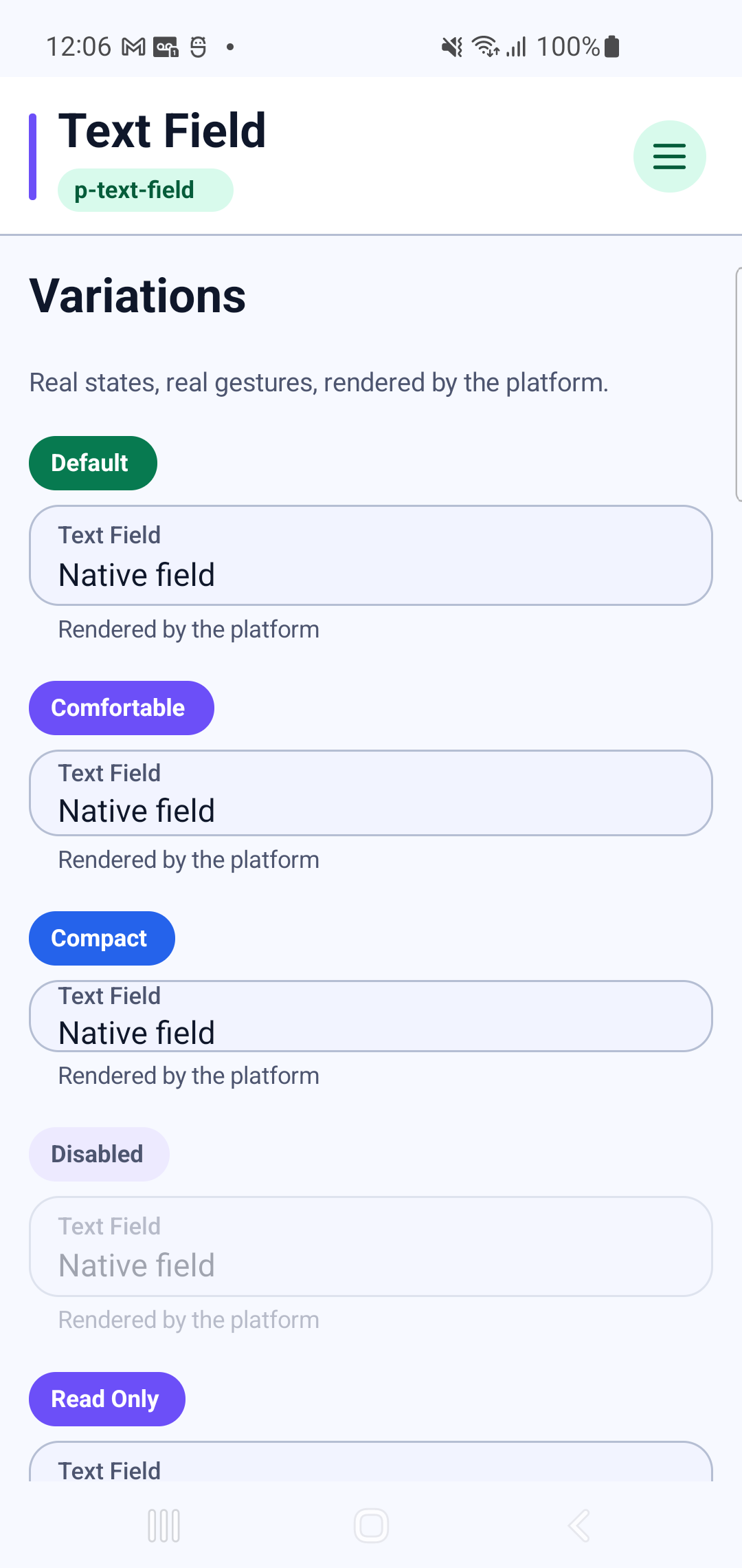
p-text-fieldInteraction GIF 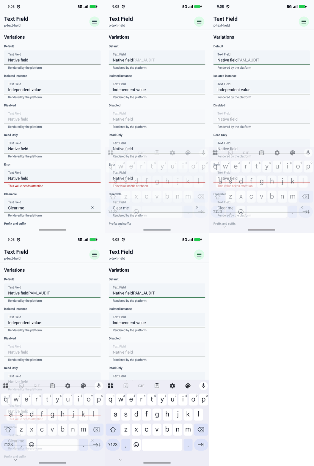
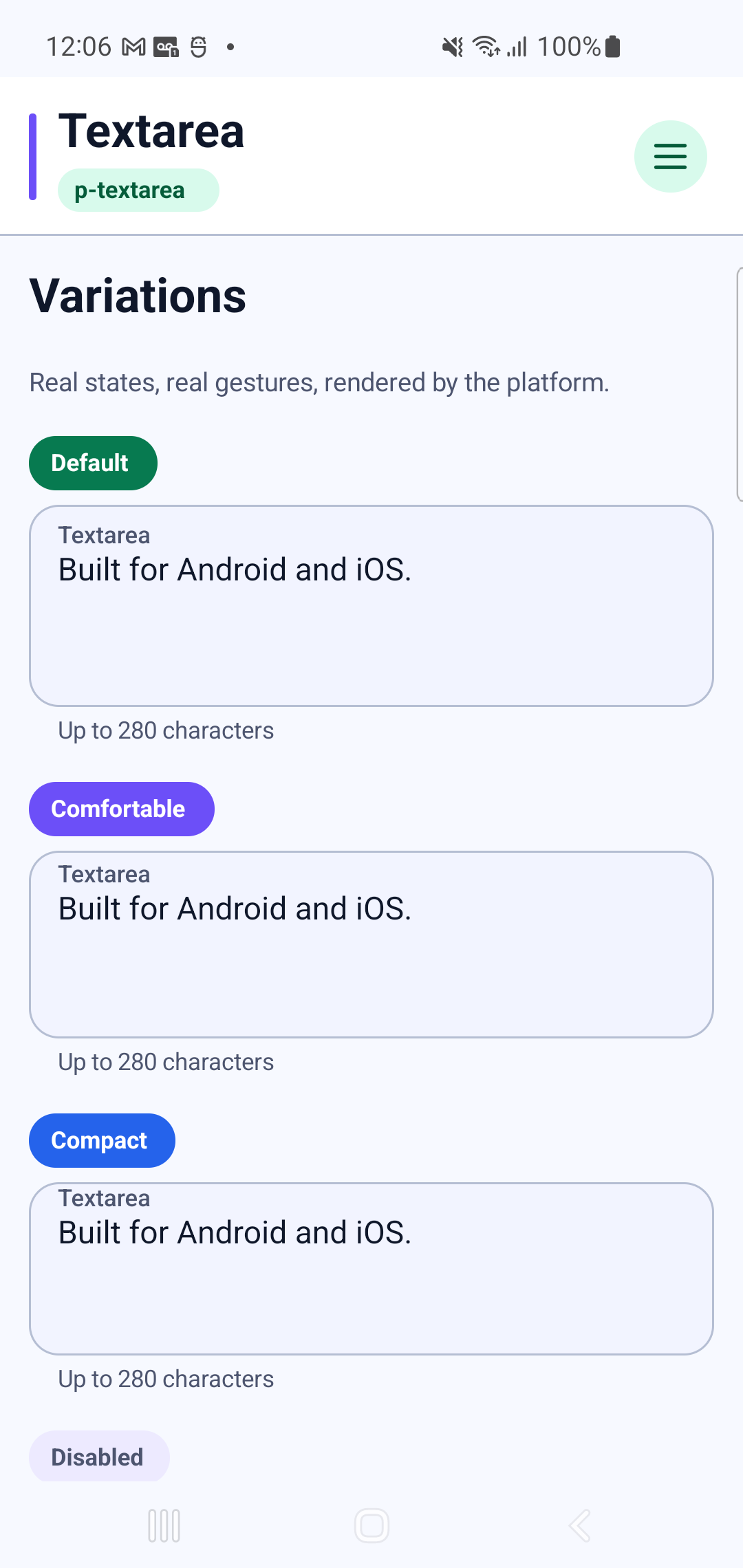
p-textareaInteraction GIF 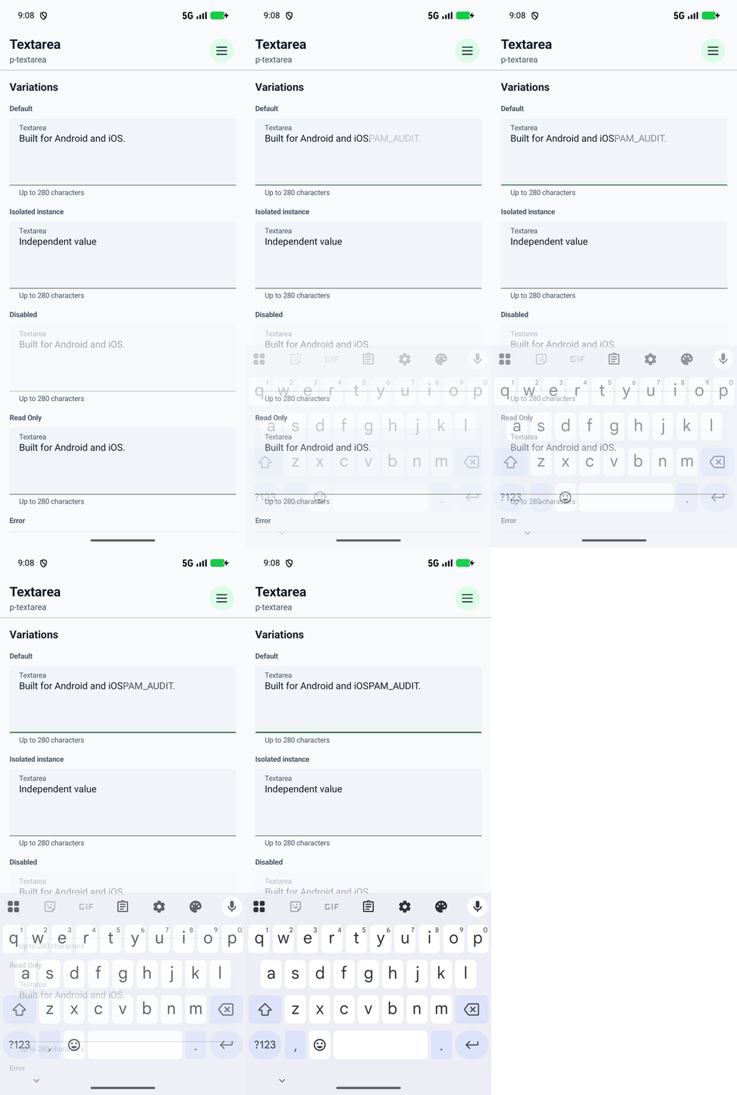
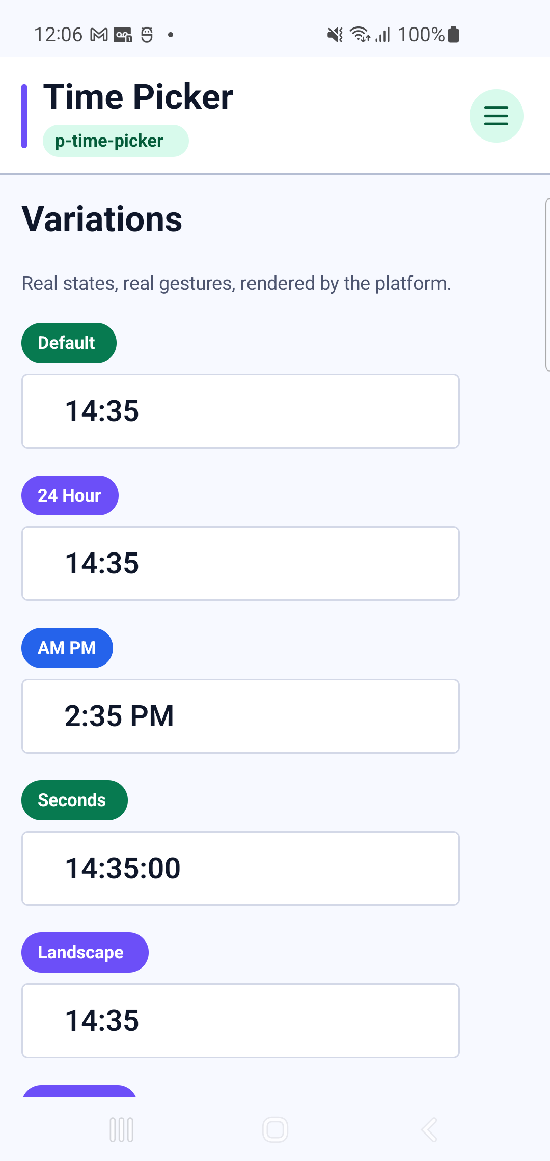
p-time-pickerInteraction GIF 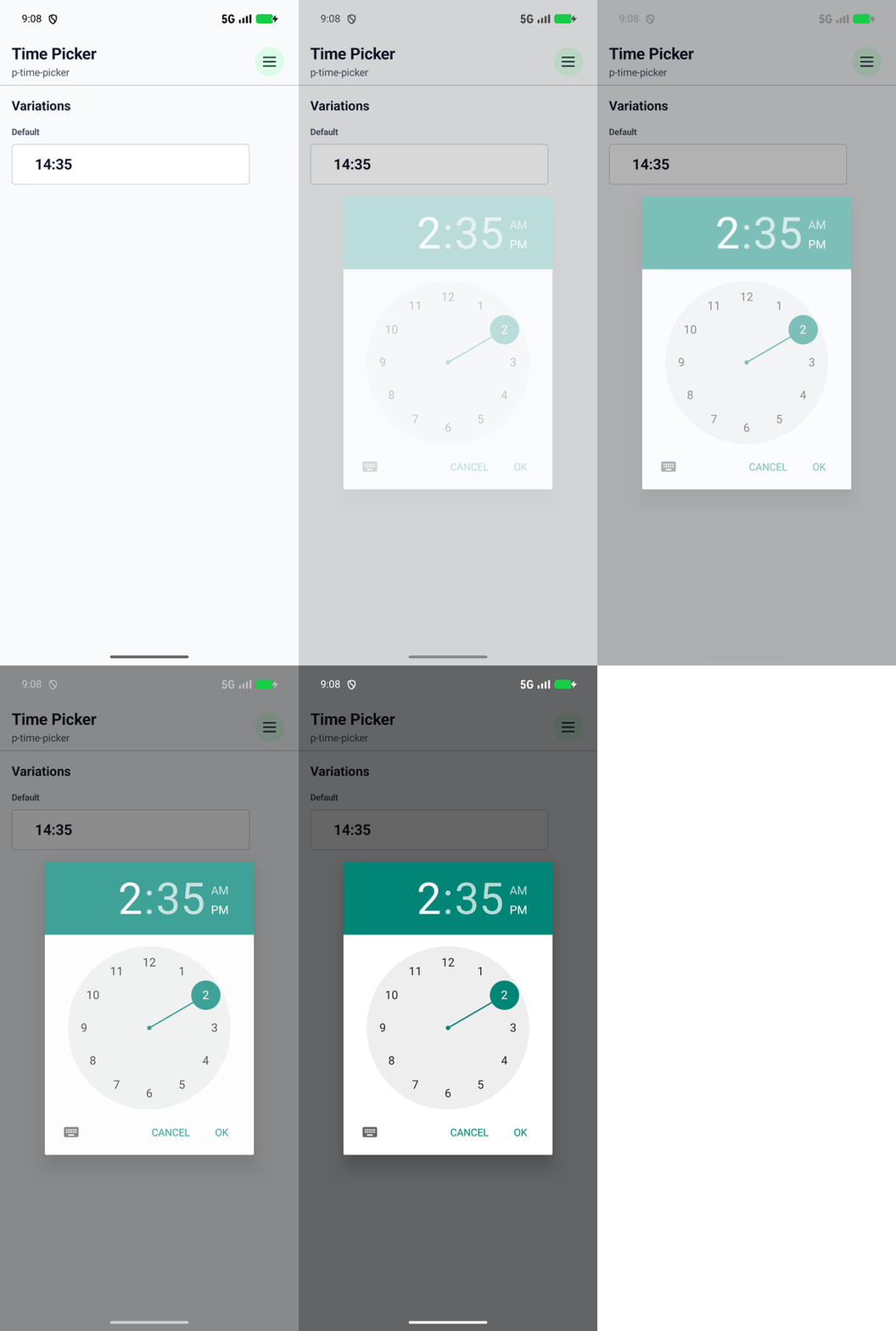
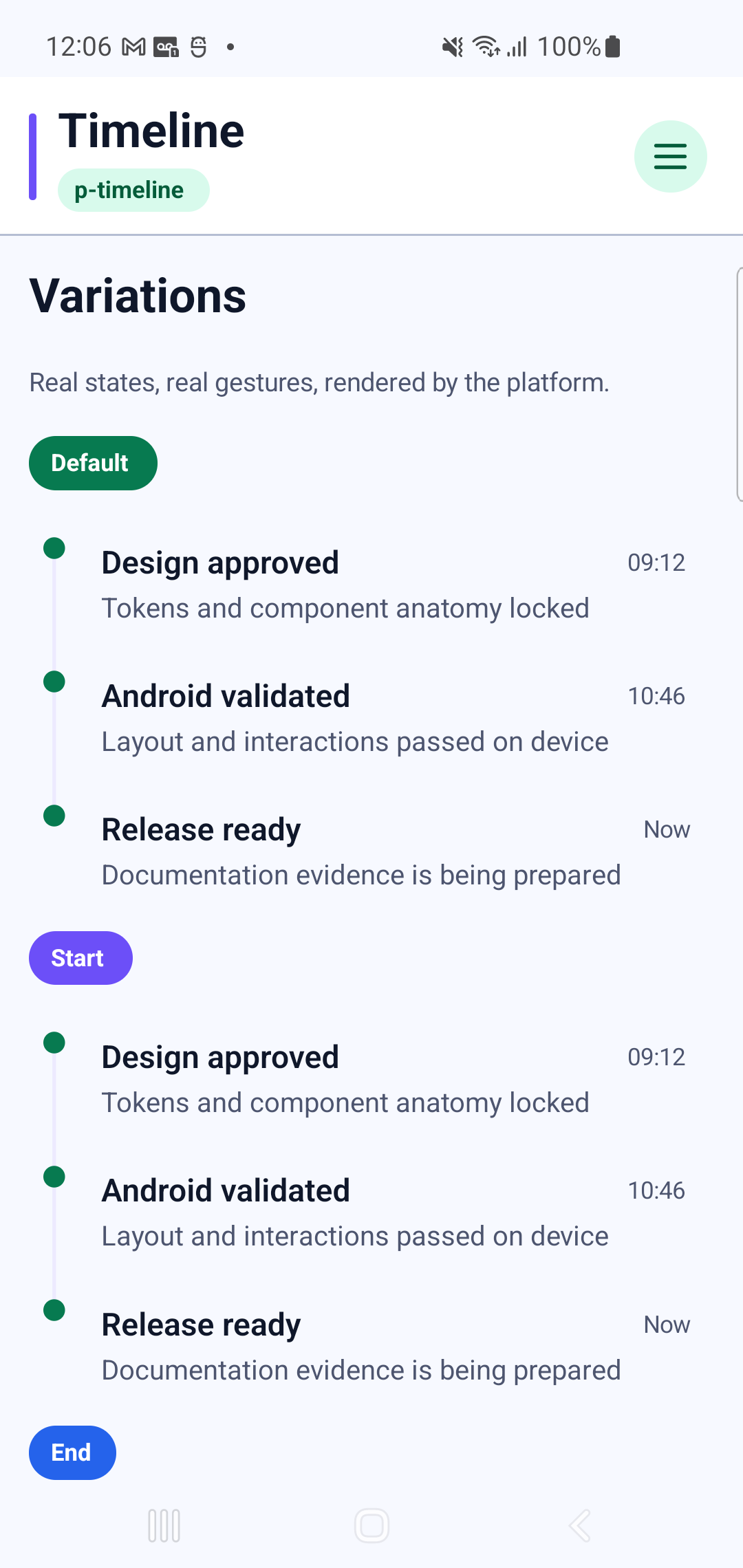
p-timeline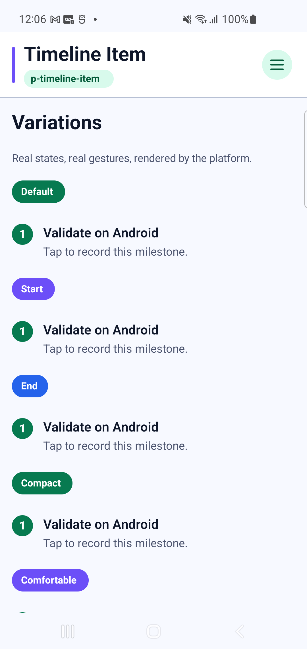
p-timeline-itemInteraction GIF 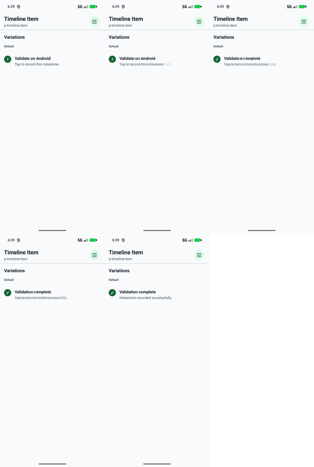
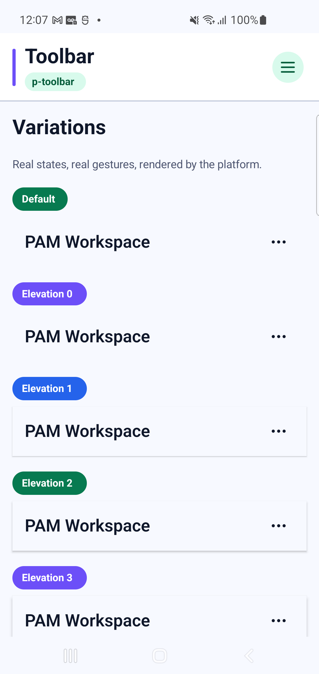
p-toolbarInteraction GIF 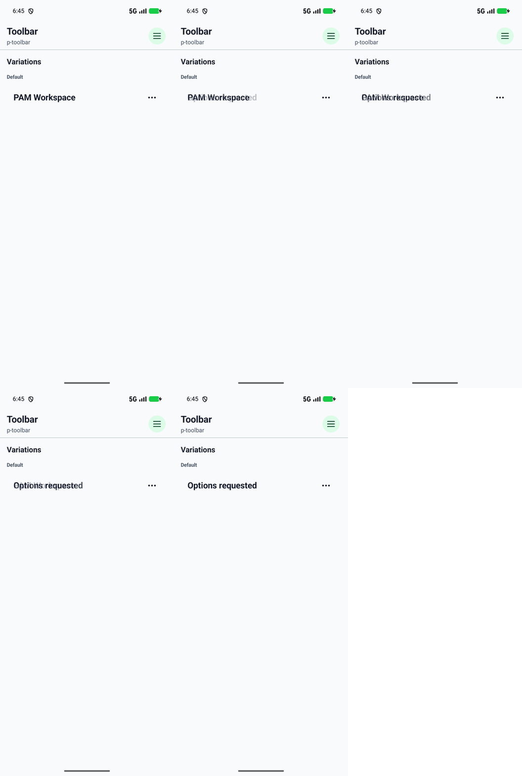
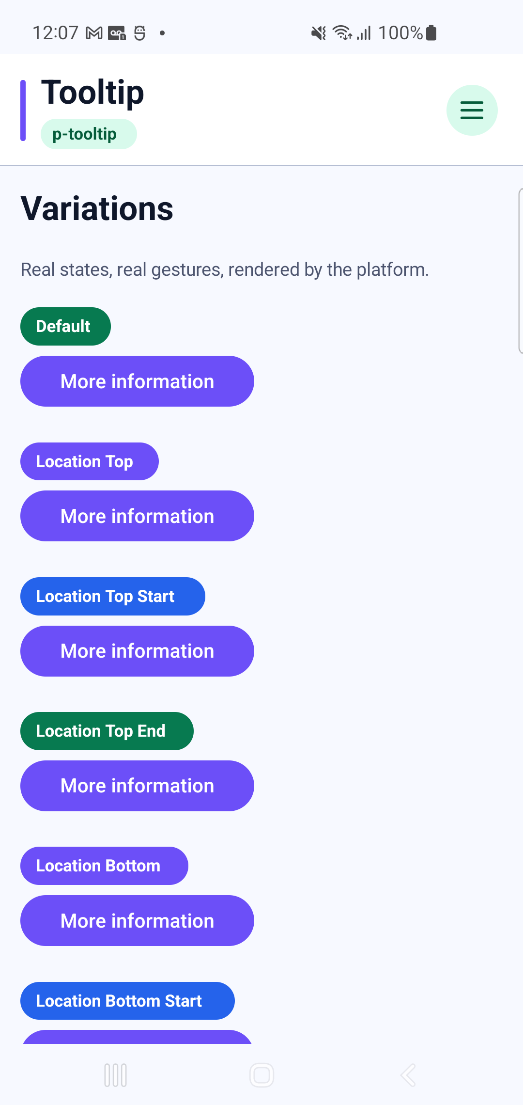
p-tooltipInteraction GIF 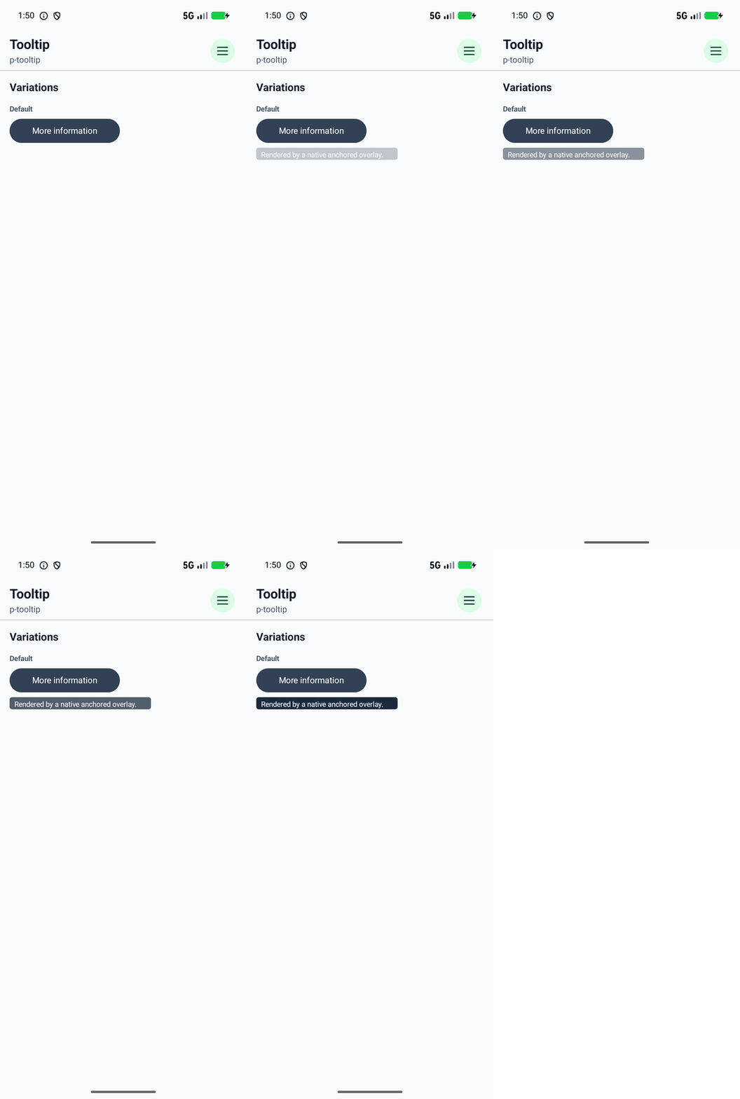
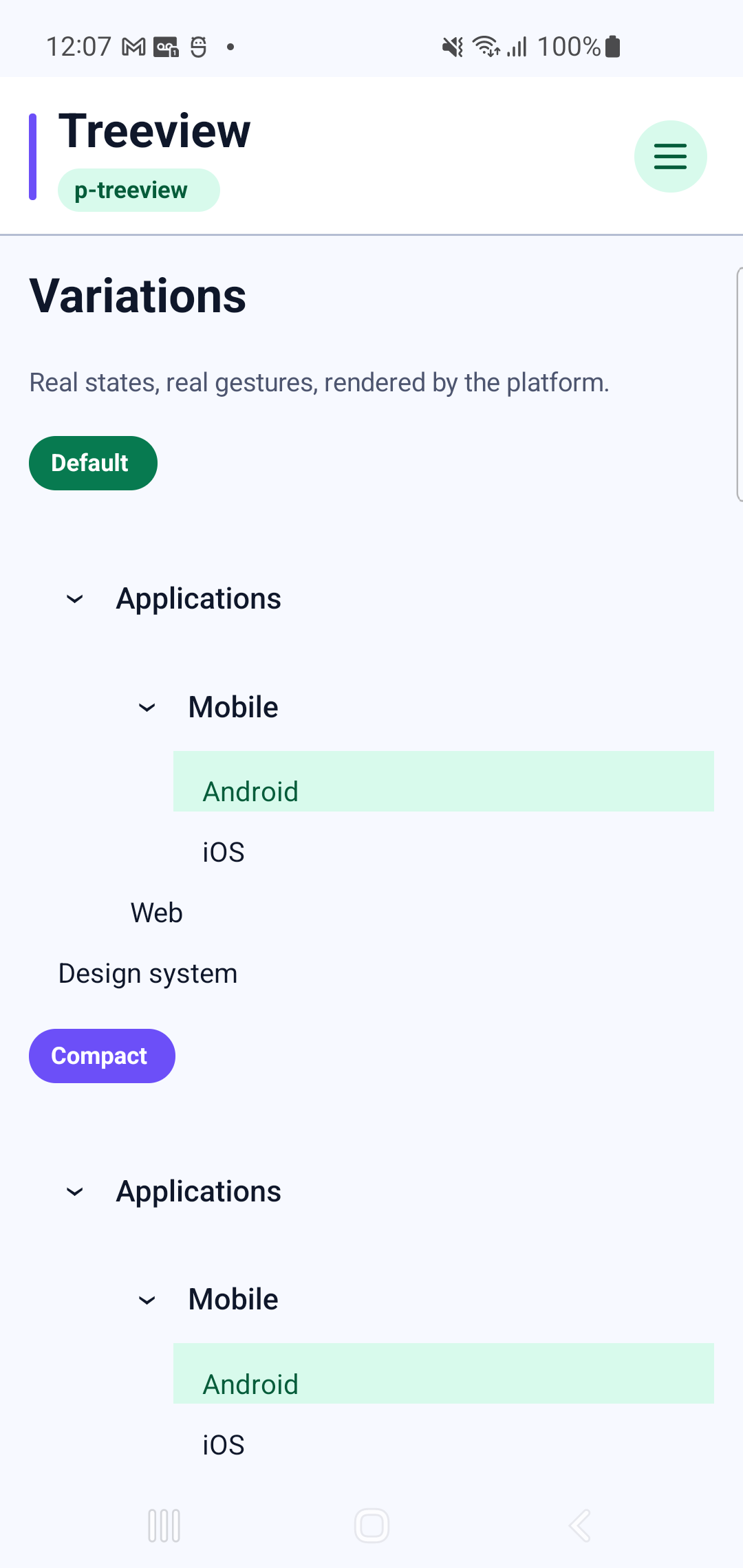
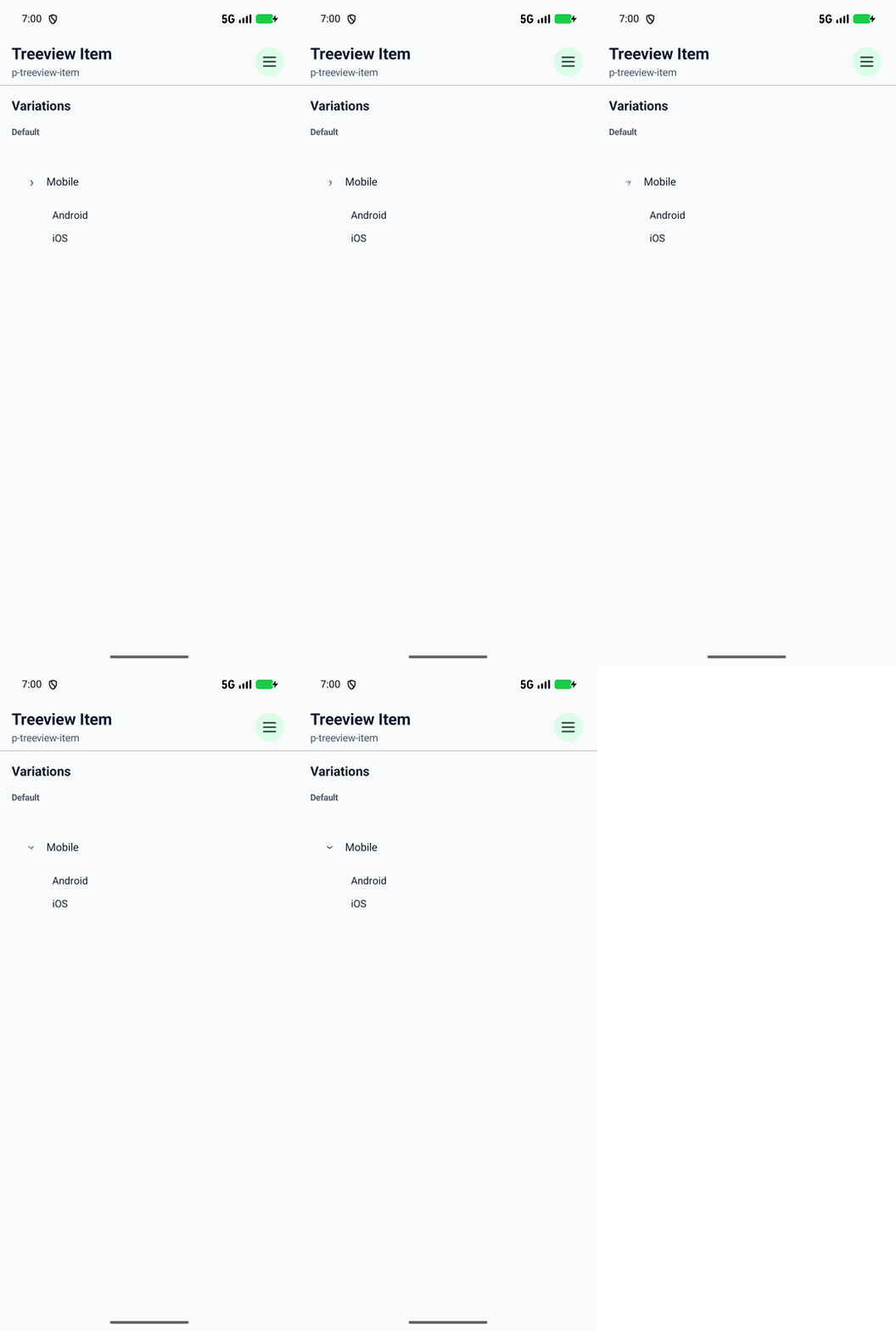
p-treeviewInteraction GIF 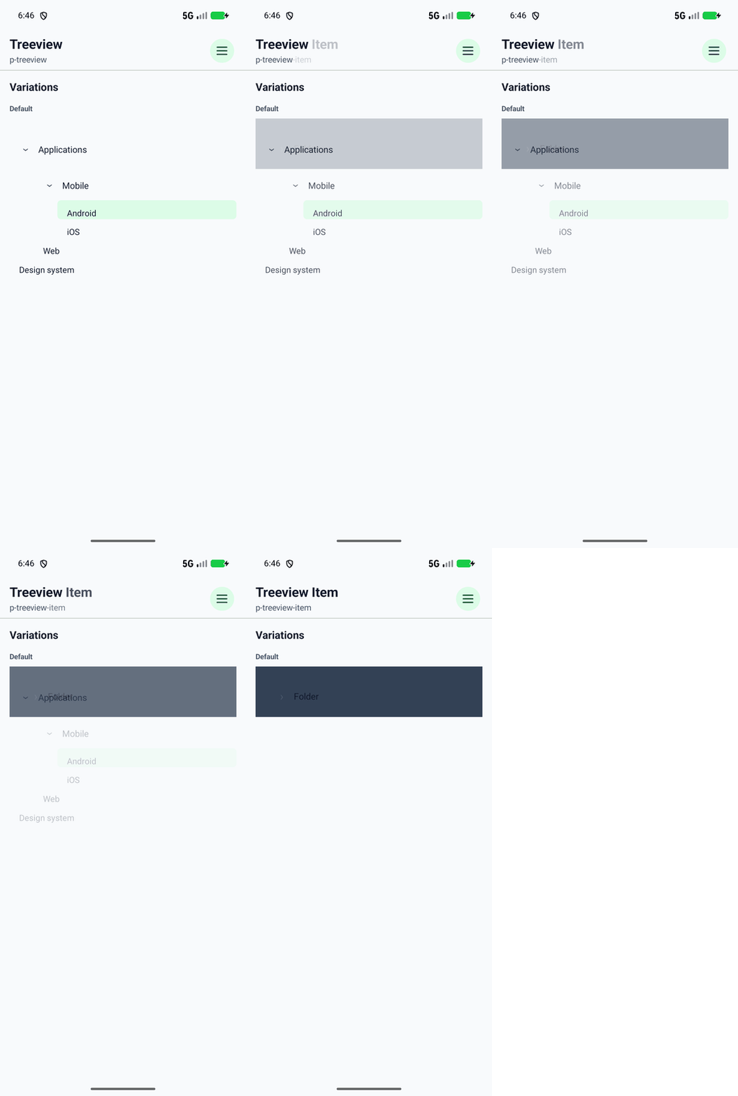
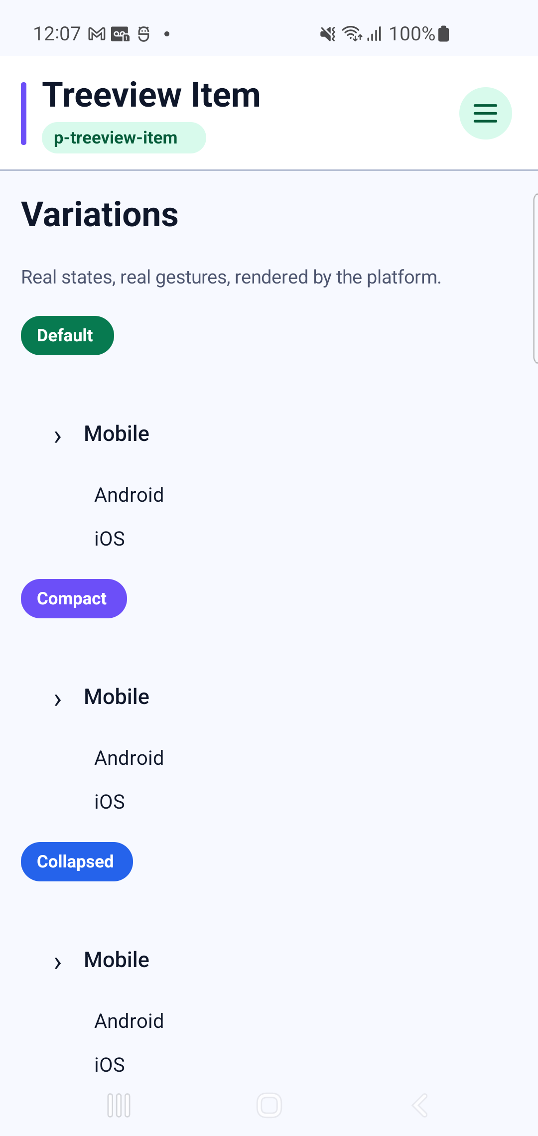
p-treeview-itemInteraction GIF