
Progress Circular — PAM Native UI
PAM Native UI · Android evidence
p-progress-circular rendered by the production retained-native pipeline. The specimen below is a real Physical Samsung SM-G973F Android 12 (API 31) capture at 420 dpi, not an HTML recreation.
Physical Samsung layout and component route verified
- Family
- Overlays and feedback
- Module
progress-circular- PHP facade
PProgressCircular- Native targets
- Android · UIKit
Overlays and feedback component rendered through the retained-native Android and UIKit pipeline.
Android specimen
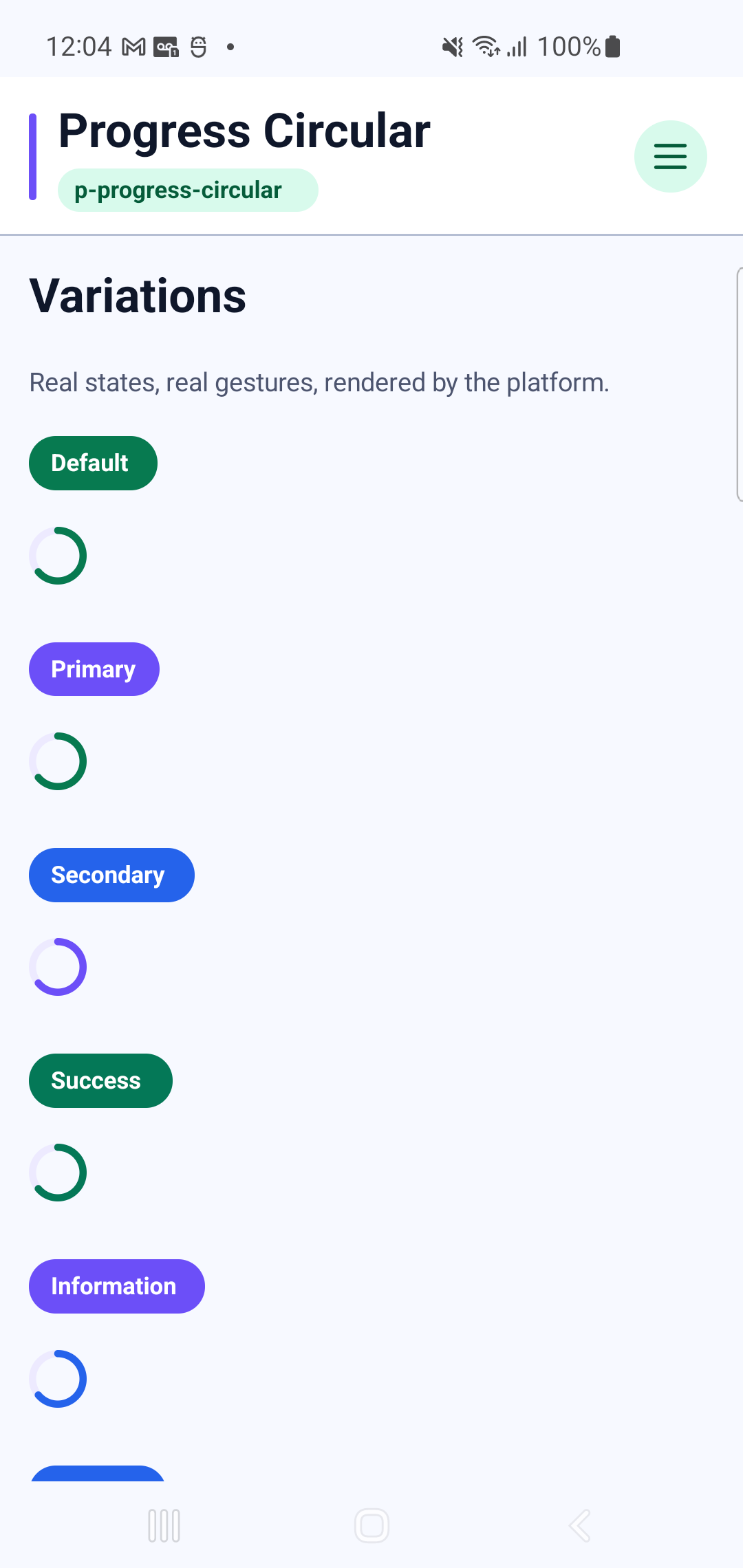
This is a static or anatomical component. Its Android evidence is the rendered specimen; no synthetic interaction recording is published.
Showcase profiles
Every profile below is rendered by the Android catalog route shown above.
- Default
- Primary
- Secondary
- Success
- Information
- Warning
- Error
- X Small
- Small
- Large
- X Large
- Indeterminate
- Thin
- Thick
- Reverse
- Rounded
- Striped
- Stream
- Buffer
- Rotate
PHP usage
use Pam\MobileUi\Material\PProgressCircular;
use Pam\Native\UI\Text;

PProgressCircular::make(
    [
        'accessibilityLabel' => "PProgressCircular preview",
        'bufferValue' => 72,
        'color' => "primary",
    ],
    Text::make('Progress Circular'),
);
The equivalent PAM template entry point is <p-progress-circular>…</p-progress-circular>.
See the PAM Native UI guide for event, state and styling conventions, and the quality contractfor native behavior requirements.
Component properties
| Property | Observed type | Showcase values |
|---|---|---|
accessibilityLabel | string | "PProgressCircular preview" |
bufferValue | int | 72 |
color | string | "primary", "secondary", "success", "info", "warning", "error" |
height | int | 2, 8 |
indeterminate | bool | true |
modelValue | int | 64, 42 |
reverse | bool | true |
rotate | int | 90 |
rounded | bool | true |
size | string | "x-small", "small", "large", "x-large" |
stream | bool | true |
striped | bool | true |
width | int | 2, 6 |